Seattle is a city wealthy in design. Take a stroll through the Emerald City, and you’ll see a large sampling of the various residential design styles of the Pacific Northwest, from the houseboats down on Lake Union, to Victorians on Queen Anne and Capitol Hill, to the craftsman bungalows in Ravenna. It’s also the city that gave us the “Seattle Box” or “Four-Square,” a geometric, two-story, box-like house onto which several styles can be grafted. And, of course, there’s that prime example of Googie architecture, Seattle’s famous Space Needle.
It’s no wonder that design-savvy couple Jim Goodspeed and Stacy Segal chose to build their home in Seattle. Jim, an architect who has worked in cities across the globe, including in Daniel Libeskind’s studio, owns Goodspeed Architecture, a Seattle-based practice focusing on residential, small commercial, interior design, and urban-character projects. Meanwhile, Stacy serves as the Executive Director of the Seattle Architecture Foundation, whose mission is to connect people to the architecture, design, and history of Seattle.
As we get ready for next weekend’s Seattle Modern Home Tour – which will feature Stacy and Jim’s Lake Union condo – we sat down for a chat with the Seattleites about all things design.
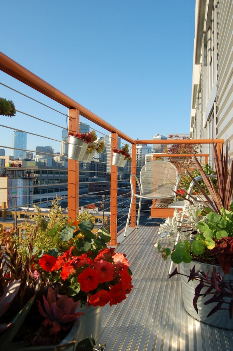
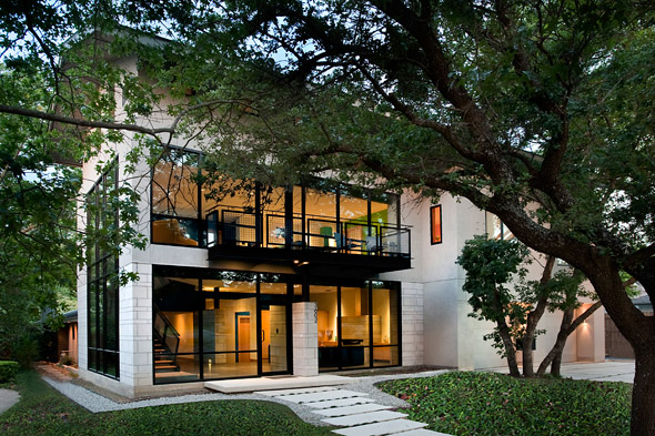
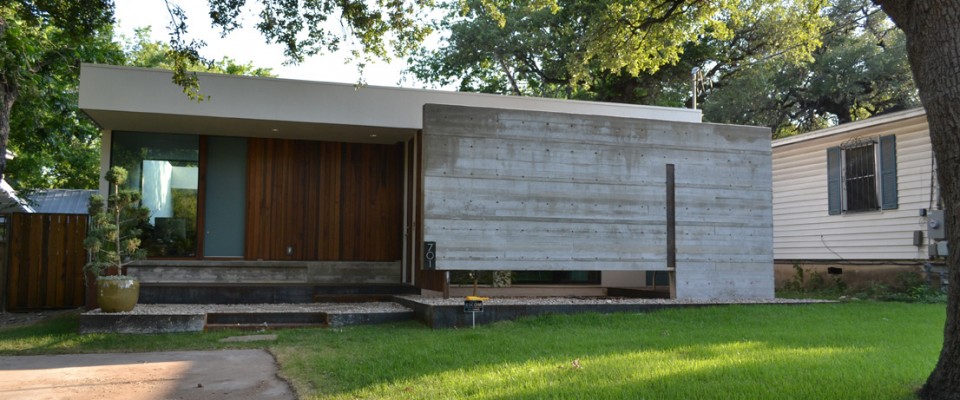
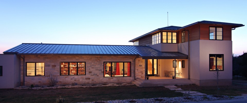
All photography in this post is from Jim and Stacy’s Lake Union Loft. To see the home in person, be sure to grab your tickets for the tour!
Q&A w/ Jim Goodspeed & Stacy Segal
Our non-profit partner for the tour is the Seattle Architecture Foundation. As the Executive Director, how do you think that design is able to shape communities? Specifically, how do you think the design scene in Seattle reflects the city?
Stacy: Over the years, residents have been involved in shaping the design of their communities. Neighborhood Design Review Boards play a role in this process, inviting residents to express concerns and share ideas any time a new development is underway. One of our roles at the Foundation is to educate people about how they can personally play a role in this public process.
Seattle neighborhoods have a distinctive charm, which has largely come about because of the way in which the community has evolved over time. For example, in a neighborhood like Queen Anne, you can literally see shifts in the demographics by looking at the buildings. You’ll see signs of family life as well as single residents. You will also find older mansions that have been restored or renovated, which reflects a different era when only the wealthy lived atop the hill. In between, there are a few striking modern gems, a sign of how our tastes have changed. I think this mix of styles and forms of housing, with the addition of a retail core, is essential in order to keep our neighborhoods thriving.
Jim, I read that you have worked in Daniel Libeskind’s studio. Very cool! Who are or what else has really influenced your creative vision?
Jim: My biggest influence is traveling, observing, and experiencing – not just buildings but urban spaces, landscape, and human activity. Even the natural environment – a lot can be learned about space, form, light, and materials from Antelope Canyon, for example. I spent time in Europe and Southeast Asia before I realized there was plenty to see and appreciate in North America, too. It’s also important to learn from mistakes – I once spent a week in Detroit specifically to learn what not to do.
You’ve worked or done projects in several cities across the globe – Seattle, Chicago, New York, London, Berlin. Design-wise, what makes Seattle distinct from other cities? What made you decide to found your architecture firm in Seattle?
Jim: Seattle architects have a great affinity for natural materials and tying the work into the landscape – in a way that Chicago architects don’t – at least for residential work, anyway. I’m finding that occasionally that sensibility is showing up in some commercial work, and I hope that grows stronger.
I’d also say that Seattle architects aren’t trying to out-conceptualize each other, but instead are going for an emotional response. Every year at the local AIA awards show, the jurors – flown in from across the nation – are usually stunned by the quality of work, but then complain that it wasn’t intellectual enough.
As for us – we moved here because of the balance of urban living and the outdoors. But that combination also makes great opportunities for design. One can have a condo in the city – yet with a view to the mountains, for example. A project like that is inspiring in so many ways.
Your personal condo, the Lake Union Loft, is a stop along the tour. What are a few features of the home that tour-goers should be sure to keep their eye out for?
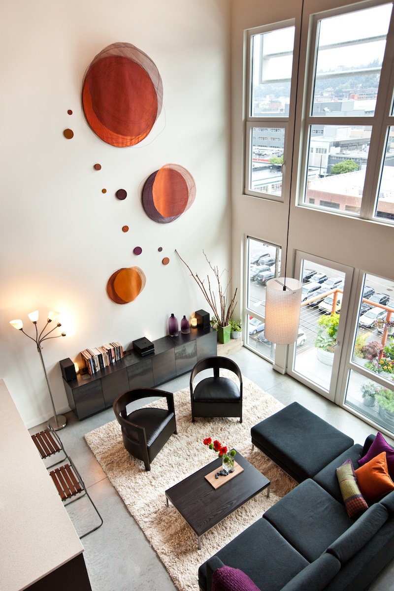
Jim: First of all, it’s a small condo – under 1000 s.f., yet feels much larger due to the layout and the generous natural light. It also shows how a contemporary design can be done on a modest budget. And locals will enjoy a bird’s eye view of Lake Union, the downtown, and all the development happening in South Lake Union.
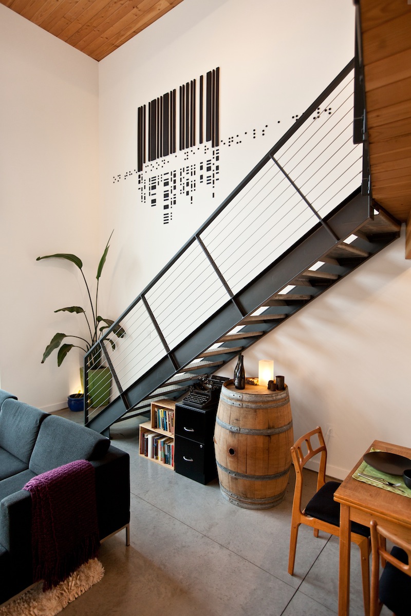
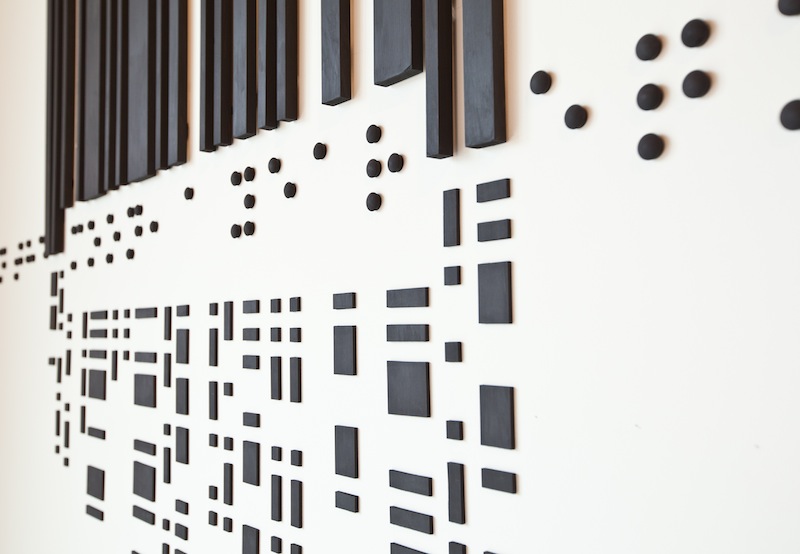
Stacy: Definitely look at the artwork. Jim created three installation pieces designed for the unit. Each one is distinct yet they create a flow and add color and warmth to the space. The private outdoor patio off of the bedroom is also a space that you’ll want to check out.
Clearly you’re a very design-savvy couple, with both of you in the professions you’re in. What sort of values and aspects of your personalities were important when you were designing your home?
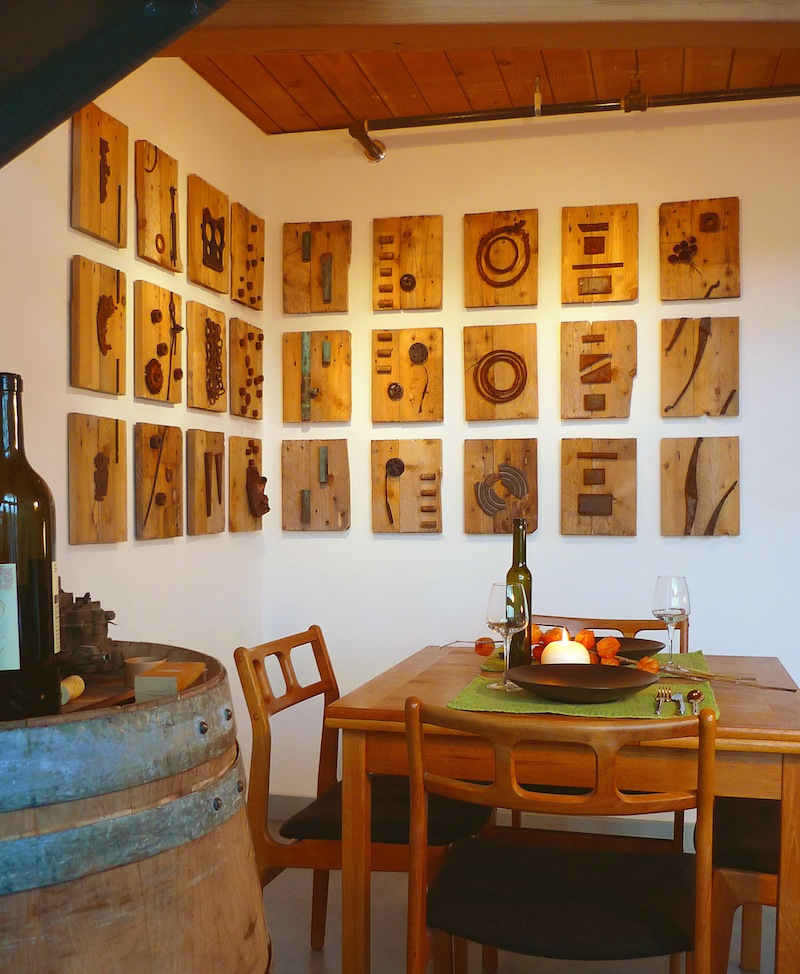
Jim: We drew on one simple event, in that we like to have a glass of wine at the end of the day to reconnect – in contrast to a big dinner or a barrage of entertainment. So, like a ceremonial tea room, our main space has a similar focus. The aesthetic of wine gave some guidance, too: bold, playful, peaceful, and minimal. The crude tools to make it – contrasted with the elegance in which it is presented – those kind of influences are there.
Stacy: I wanted to make sure there was enough color introduced into the palette of natural materials, and I think we found the right balance. We selected the fabrics together for the artwork to make sure we were both happy with it.
How would each of you describe your individual aesthetics? Are they similar to each other’s? How did you develop your aesthetic as a couple?
Jim: When we first met in Chicago, I was using crates for furniture and she had these cutesy teapot decorations! So we’ve taken a healthy step forward from that. We’ve observed a lot together – whether from travels or from the latest restaurant to open – we are always checking things out. We still don’t agree on everything, though. She keeps me from using too much black.
Stacy: Less decoration doesn’t mean less style, warmth, or personality – it’s just a different way of living. I prefer it now, and can’t imagine going back to all that clutter.
