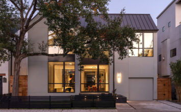
This family home in Houston focuses on quality of space and shows that high-end, modern architecture and cost-conscious design is accessible to everyone.
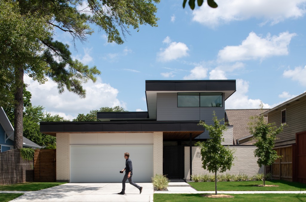
Located in Montrose, a neighborhood known for its own unique urban vibe, this studioMET architects’ home was to be featured on our 10th Anniversary Houston Modern Home Tour in the spring of 2020. Unfortunately, the idea of live in-person tours has been paused indefinitely, leaving this open-concept 3,000 sqft home unexplored by Houstonians… until now.
The restrained design approach of this modern home focuses on quality of space, simplifying life, and bringing the most value to the project while staying conscious of the budget in every decision – a studioMET signature practice to help make architecture accessible to the masses. Functionality and efficiency of the layout are key, as it has been designed for a family’s everyday living, rather than the big gatherings that happen once or twice a year. An example of these ideas combined is the use of large windows and glass doors that connect the home to the outdoor covered patio and pool area, a cost-effective and simple expansion of the space that has proven especially helpful this summer, as many parts of the U.S. find themselves confined to their living spaces.
One of studioMET’s longtime collaborators is Houston Tour sponsor BEC Engineers & Consultants who provided the structural engineering design for home. Everyone knows that architects design homes and contractors build them (in studioMET’s case, they are an architect-led design firm that also does the building). But what many not in the field may know is that it is the engineer is the bridge between the architecture and construction; engineers help bring the intended designs to life in a safe and structurally sound manner. The best homes are created when there is a true collaboration between all three pillars of home building: architect, builder, engineer.
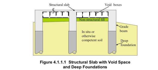
BEC’s influence was felt right from the beginning of the project, starting with the foundation. When the soils report was completed and its recommendations were given, BEC and studioMET discussed and weighed the pros and cons of different options. Ultimately, they decided on a structural slab on void boxes, supported by drilled piers. This choice ensured the best foundation design possible to accommodate the structural features of the home, while also making sure it was adequately protected from the pool that lies within close proximity of the foundation.
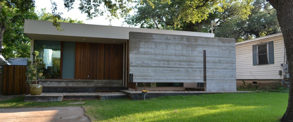
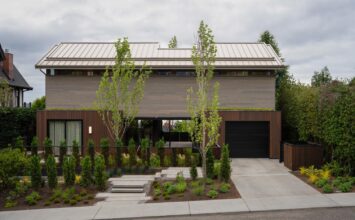
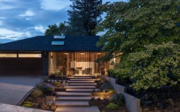
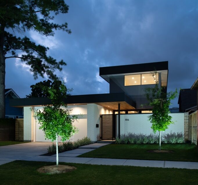
The home sits on a 60’x100’ lot and makes incredibly smart use of every foot. The street presence of this project is simple and reserved: strong horizontal lines with a simple composition of brick, wood, and cement siding. It was designed to respect the context of many single-story bungalows that are found in the area. This was accomplished by setting the 2nd floor of the home back an additional 20 feet from the front of the building, a design strategy that also allowed for an entry courtyard which leads you to the main entrance from the street. To alleviate privacy concerns that are common for urban lots, the entry courtyard is defined by a masonry wall and front gate, which allow for a transparent front door, abundant natural light, and that feeling of openness to remain.
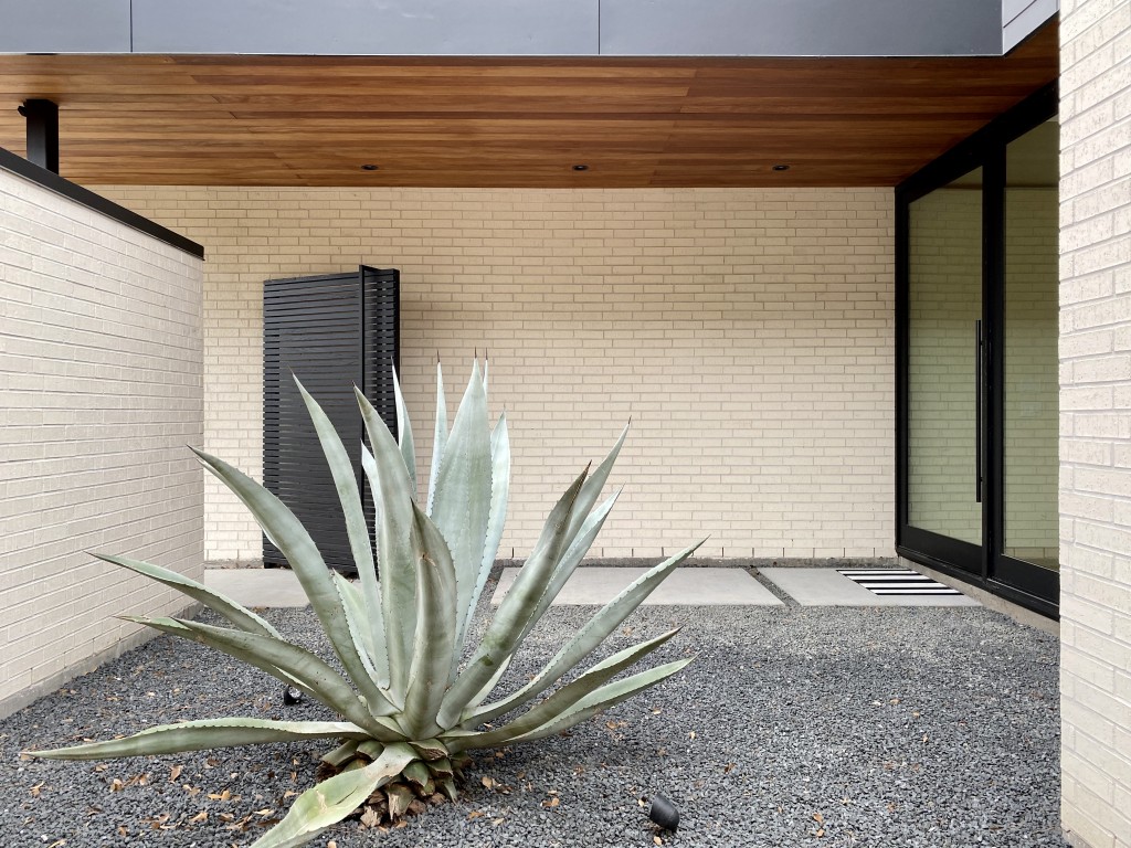
The front entry features Black Star Gravel, upper ceiling soffits of Garapa Brazilian hardwood, and a single large agave intended to be more of a sculptural piece of art rather than just landscaping. Visitors will also get a closer look at the exterior fiber cement siding above, and a very close-up look at the solid, low-maintenance bricks used for the structure’s exterior walls; these brick walls start outside and pass through the front door to the inside – making the same journey guests do as they approach and enter the home.
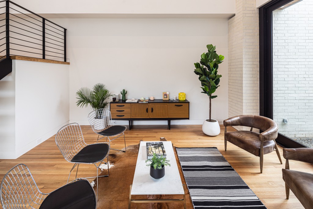
Upon entering, visitors get an immediate sense of the home’s length with a full view down the main hallway that runs from the very front to the very back of the house. The captivating two-story living room receives guests and presents a dramatic shift from the compressed entryway to a calming open space that is simple and effective in design. Natural light flows in from second-story windows high above, making this a great area to welcome guests and enjoy a quiet conversation.
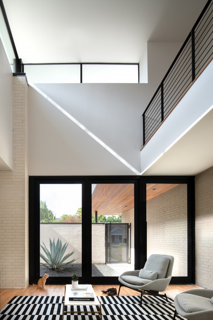
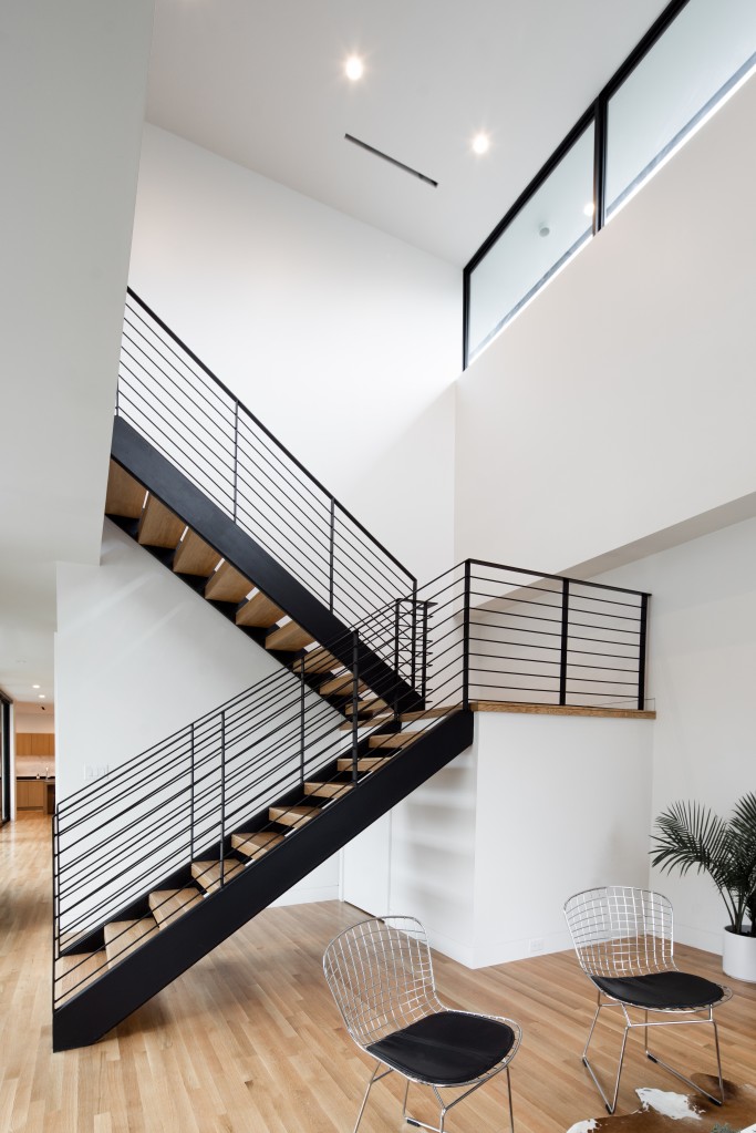
White oak flooring starts here and runs through the entire home; also starting here (actually, in the entry courtyard) and present throughout: low-voltage recessed LED lighting to keep the home illuminated after the sun goes down. Up above to the left is a catwalk reading nook and straight ahead is the open concept steel/wood switchback staircase. A vintage credenza brings a bit of old to a new setting, while Blu Dot chairs and a sofa provide ample seating in this traditional style living room with no distracting television
Visitors walk past the staircase to find a small coat closet that opens (transitional space) to a full 5’x9’ bathroom, and then it’s on to the dining room.
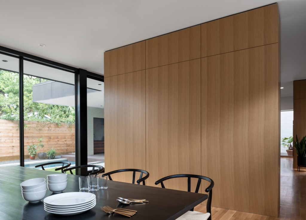
The dining room has been designed to provide the family with a space where they can sit, eat, and talk to each other. Having sit-down meals as a family, reminiscent of their childhoods, was important to the owners. Gone are the distractions of TV and media; storytelling and delicious meals take centerstage here.
The space is defined but has a feeling of openness, thanks to the dividing wall that allows passage to the next room on either side, the floor-to-ceiling windows on the left, and the window placed up high on the right to balance the natural light.
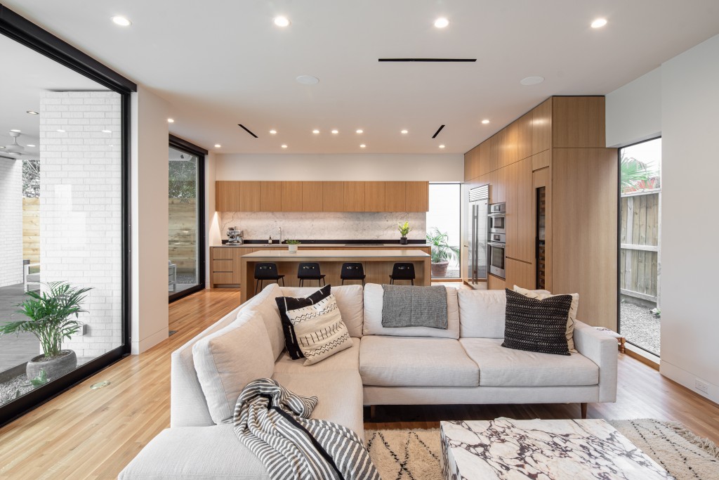
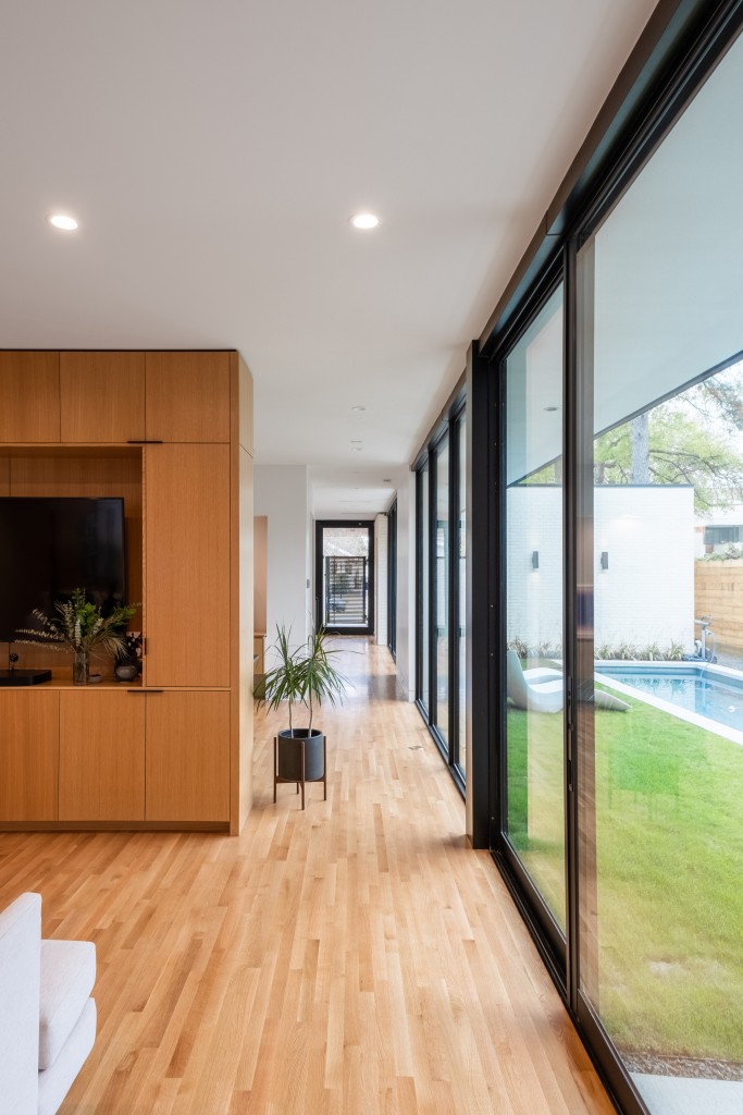
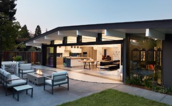
The floor-to-ceiling glass walls continue down the hall into the main living space. This open area is the central core of the home, combining the family room, kitchen, and passage to both the covered patio (via kitchen) and pool (via family room). With all doors open, the area is expanded greatly into an indoor-outdoor living space. This was a conscious design choice by studioMET, based on the cost-conscious owners who wanted plenty of air-circulation and a maximum quality of experience within the allowed area. Again, visitors find the rooms of the home to be both defined and open. This is the perfect space for everyday living.
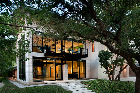
BEC’s expertise and influence is felt in this room as well. The original design had a single steel column and a lot of glass, which presented a structural challenge due to the long spans, floor to ceiling windows, and the cantilevered balcony above. The design was changed to add an extended support wall with windows on either side. After further value engineering, the final design includes the windows the clients desired, as well as the structural integrity needed to be able to use better cost-effective building materials.
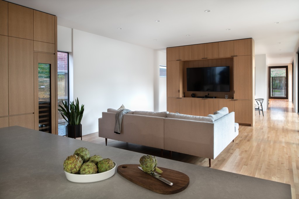
An indoor snake plant adds tranquility to the family room. The reverse side of the dining room dividing wall holds the large television and has plenty of storage behind paneling to keep things looking sleek, modern, and not cluttered. Tall glass windows on the right balance the light coming from the operable glass doors on the left side of the room that lead directly to the pool.
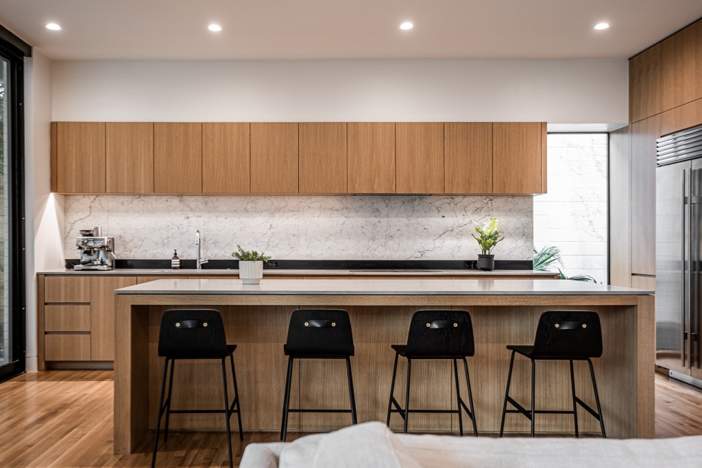
The kitchen is extremely functional and incredibly gorgeous. All cabinetry and paneling (including the living/dining room divider wall) is rift cut white oak with a clear seal finish that allows the wood’s natural tone to beautifully complement the floors. All millwork was done on site.
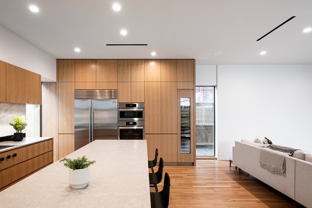
The countertops are quartz and the backsplash features a unique design – a recessed strip of black metal is used as the reveal for the beautiful honed Italian Statuarietto marble backsplash. The kitchen is equipped with top notch appliances and amenities, including a flush mount cooktop with knobs built into the millwork and a wine fridge. The large kitchen island comfortably seats four for any meal or a quick snack.
Now visitors can head outside from the kitchen to the covered patio deck. What guests will discover later in the visit is that the patio is covered by the primary suite, which consumes the entire rear portion of the home’s second floor. This is another example of the collaboration between design and engineering. BEC designed a cantilevered steel frame that would support the bedroom above and accommodate trusses for HVAC access.
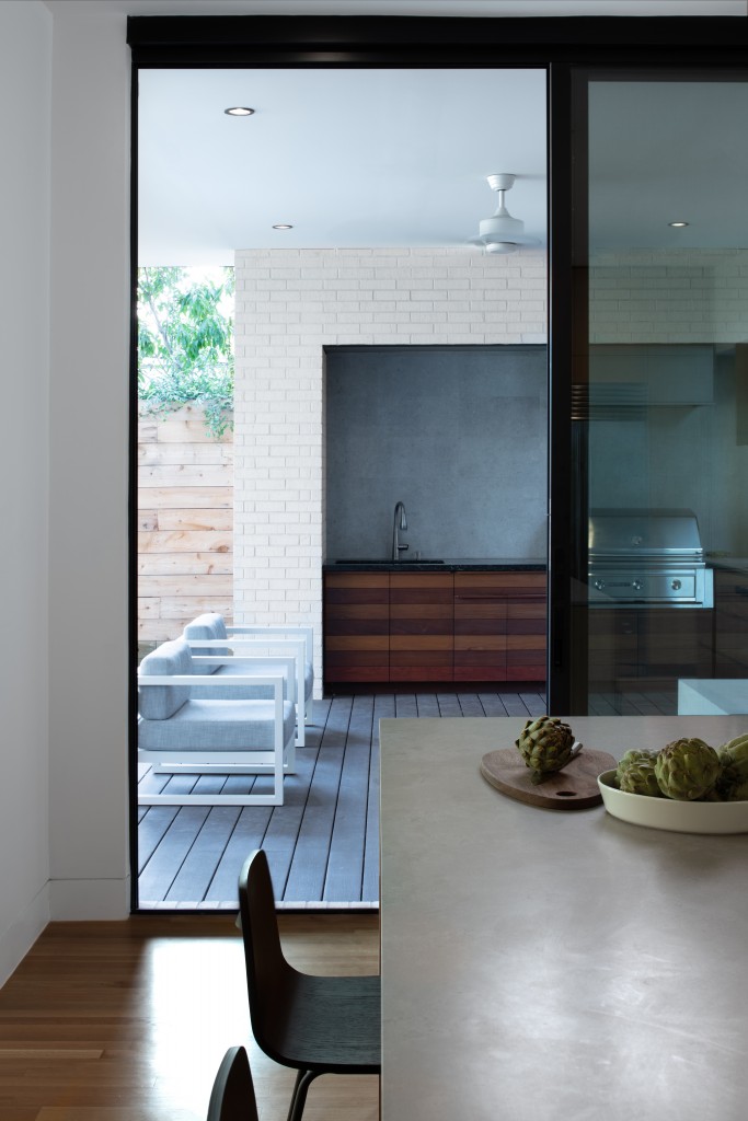
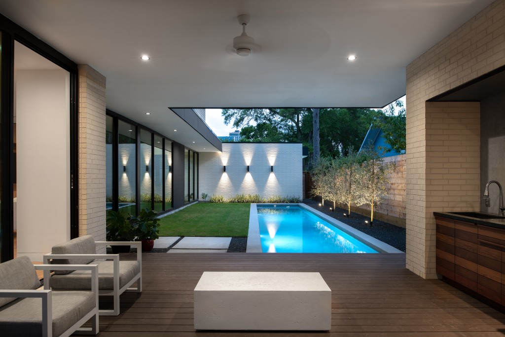
The covered patio is Azek decking, and the space and includes its own outdoor summer kitchen with built-in grill, sink, and lots of storage (with Ipe fronts). A large fan above keeps air circulating on those hot humid days.
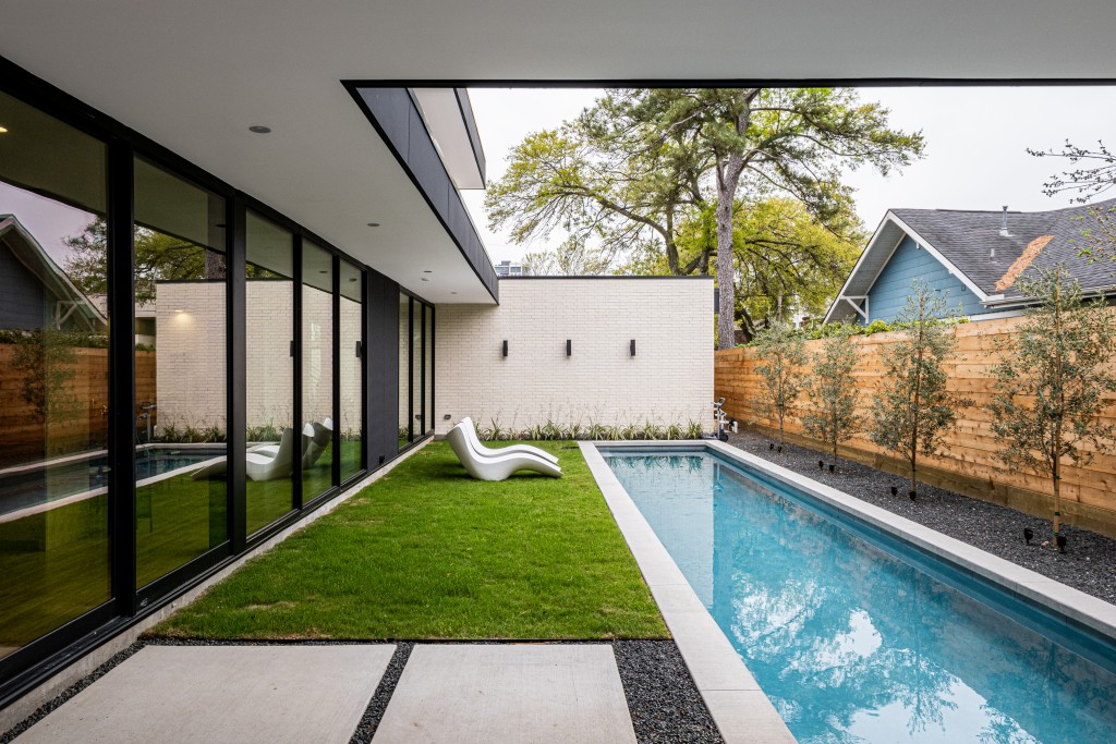
Adjacent to the covered patio, and accessible from the family room’s glass door is the centerpiece of the yard: a 10’x60’ lap pool with concrete cantilevered coping that is visible from every space on the first floor. Olive trees with landscape lighting provide a serene backdrop for the pool and enhance the look and feel of the entire yard.
Visitors can head back inside and explore the second floor via the staircase at the front of the house. The second floor is all about keeping it simple, efficient, and budget conscious. Walking up the stairs, the full openness of the entry living room is taken in; at top to the left is the catwalk reading nook.
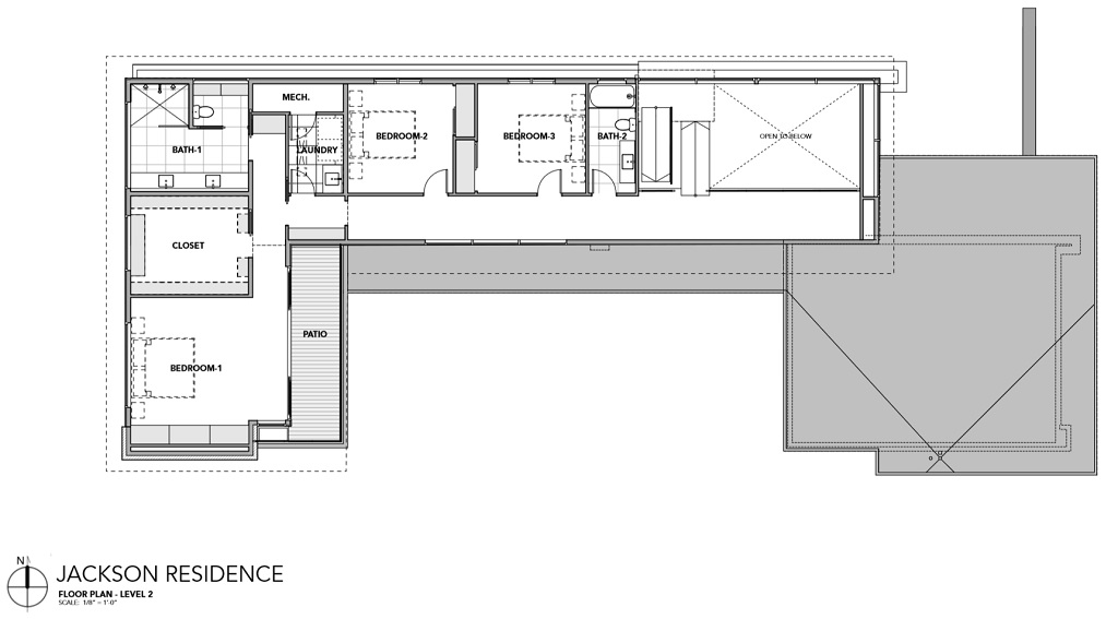
Heading down the hall to the right, guests first come across the full bathroom, shared by the children in the house. Down the hall are their bedrooms, designed to be identical in size and layout to omit any sibling squabbles over a larger room. After the second bedroom, visitors find the laundry room – one of the most ingenious modern design techniques – laundry on the same floor as the bedrooms!
Finally, at the end of the hall, guests reach the primary bedroom suite. The strategic location at the rear of the property takes advantage of the pool views and allows for separation from the public street at the front of the property. It also offers more peace and quiet for the owners who often work on different schedules.
To the right at the hall’s end is the spacious ensuite bathroom, which features a double vanity, two-person shower, and a toilet hidden behind a sliding door to allow complete privacy if someone else needs to enter. Adjacent to that, diagonally to the left of the hall’s end, is the 13’x11’ walk-in closet with generous amounts of storage for the wardrobes of both owners.
Finally, to the left past the closet is the completely secluded primary bedroom. It sits right over the outdoor kitchen/patio below and has its own outdoor deck space. From here, you can see the rest of the home, the whole yard, and all the way to the street.
StudioMET Architect’s modern home in Montrose is a wonderful study in the principles of modern, cost-conscious, effective design. Every inch of the home has purpose, and the relationship between spaces is smoothly transitional. The collaboration between studioMET and BEC Engineers & Consultants is felt throughout the design, and the end result is a home that makes every day living simple and refined.

studioMET Architects
Based in: Houston, TX
Contact: Shawn Gottschalk
BEC Engineering and Consultants
Based in: Houston, TX
Contact: Reece Scott
Project neighborhood: Montrose
Number of Bedrooms: 3
Number of Bathrooms: 3
Approximate Square Footage: 3,100
Year Built: 2019
Photographers: (1) Luis Ayala
(2) James Leasure
Millwork: KNI Enterprises
Cabinet Material Supplier: Masons Mill
Countertops: Caesarstone
Tiles: LaNova Tile Importers
Exterior Materials: Hardie Smooth Fiber Cement Siding
Meridian Brick and Masonry Supply V100 King size bricks with velour finish
Windows: RAM Windows
Western Window System (entry pivot door and sliding doors)
Living Room Chairs: Blu Dot
Dining Room chairs: Hans Wagner
Kitchen island barstools: Gus Modern
Appliances:
• 48″ Sub-Zero Built-In Refrigerator & Freezer
• Bosch Double Oven and Dishwasher
• Thermador 18″ Wine Column
• Wolf 36″ Gas Cooktop flush mount
Plumbing Fixtures: Hansgrohe, Toto, and Grohe
Pool Lining: French Grey Plaster
