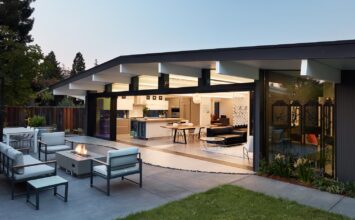
This once dated California ranch-style home has been brought from the 1980s to the 2020s with a complete transformation and award-winning interior redesign
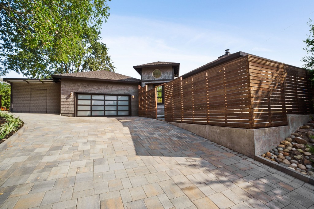
Designer Sherry Hope-Kennedy (Studio SHK) was commissioned to renovate an outdated ranch-style house and turn it into a light-filled home that would allow a growing family of three to enjoy a California contemporary lifestyle. The family was relocating to the East Bay area from San Francisco and wanted to take full advantage the interior space afforded in the suburban home. SHK worked with the owners to create a healthy interior that focuses on natural ventilation and daylight.
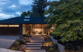
The exterior of the home has been changed just enough to give it a fresh new look. The shingles stayed put, but the color was changed from a dark brown to lighter gray. The old garage door was replaced and sconces were added for outdoor lighting. The driveway was completely repaved with stone, and a granite walkway was added to bring guests to the front door. Finally, to give the front entrance a little more privacy from the busy street, and to keep the children safe from the busy street, a cedar fence was installed.
As visitors step into the home, a foyer greets them with beautiful Italian marble tiles on the floor and a large window straight ahead (directly aligned with the door) that provides an immediate view to the expansive backyard, while pulling in the natural light. There are two directions to go from here: the main home to the right, or a short hallway to the left.
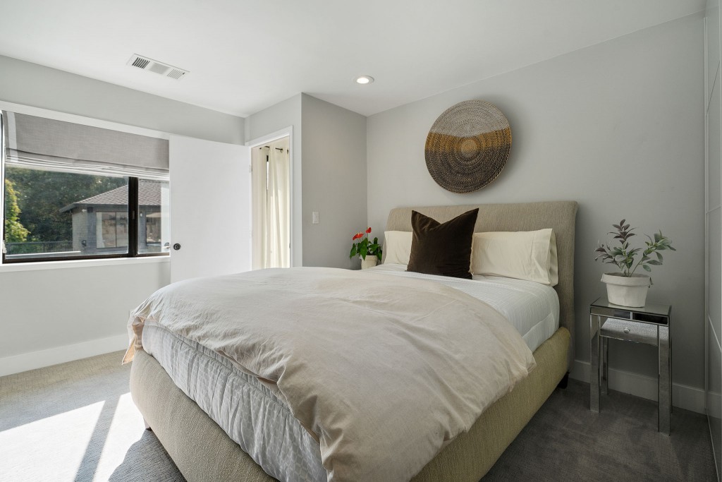
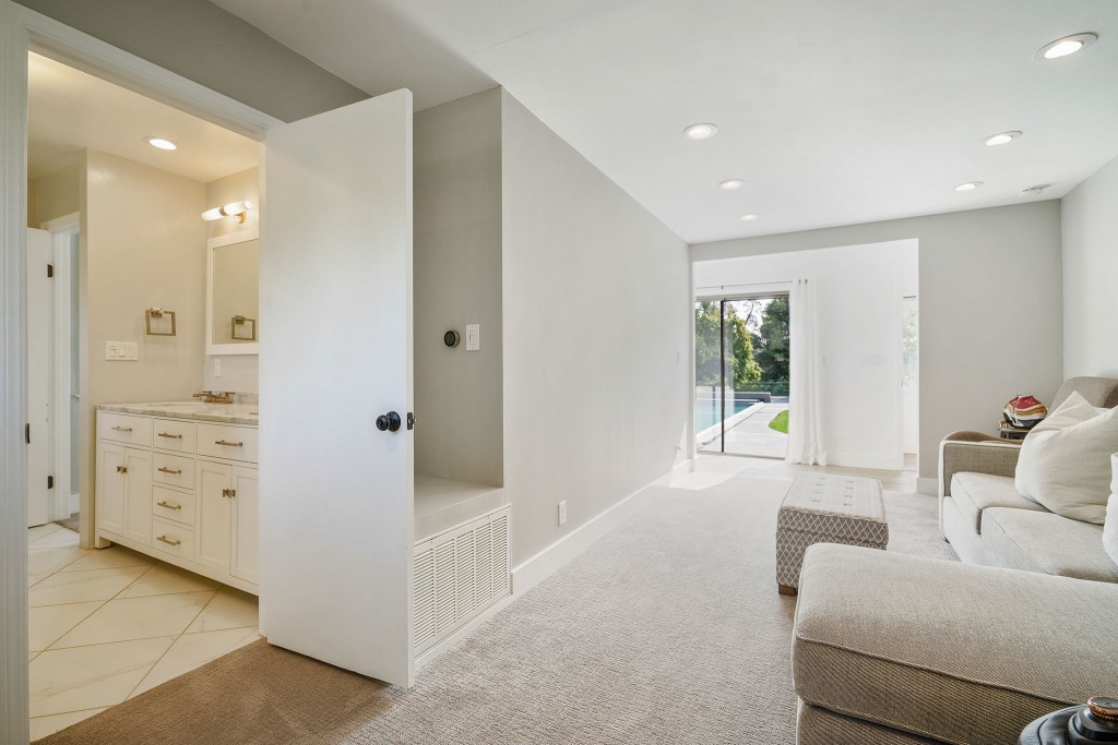
The in-law suite features separate living and sleeping areas with a connected full bathroom
The shorter, left-hand hallway leads to the garage entrance and a room behind the garage that the owners turned from a game room into an in-law/guest suite. It features a full bathroom and plenty of space to store belongings for an extended stay.
To the right, visitors can head into the main living space. The old carpet was ripped up and European white oak flooring that runs through the main living spaces was put down in a lengthwise direction that gives a sense of open space and draws guests into and through the home.
The biggest challenge of this project was figuring out a layout within the existing architecture that would allow for entertaining but still feel intimate enough for the family to relax in. The solution: enlarge the spaces by improving functionality and open the floor plan. In terms of overall design focus, furniture profiles were kept low and horizontal to emphasize the generous windows and allow the light to flow uninhibited. A tranquil color palette and durable materials, such as engineered wood flooring and porcelain countertops, keep the interiors streamlined and relevant.
In the first open space, guests find a formal living room and dining room. Luxury rugs help define the two areas. A comfortable custom sofa and armchairs surround a coffee table in front of the fireplace, which has been changed from wood burning to gas, and from a half-height brick structure to a floor-to-ceiling marble tiled splash of color that complements the oak floors and room’s palette. The tiles are a familiar sight to visitors; they are a repeat of those used on the foyer’s floor. The single window on the exterior front-facing wall was stained glass and didn’t fit the owners’ style; it has been replaced by a larger standard window to allow a better quality of natural light into the room. Finally, some very special artwork is on the walls: when Hope-Kennedy learned that the couple got engaged in Sonoma, she turned negatives of photos taken by her great-grandfather in the Sonoma area about 100 years ago into enlarged prints that were then lightly colorized by an artist. They are absolutely perfect for this room.
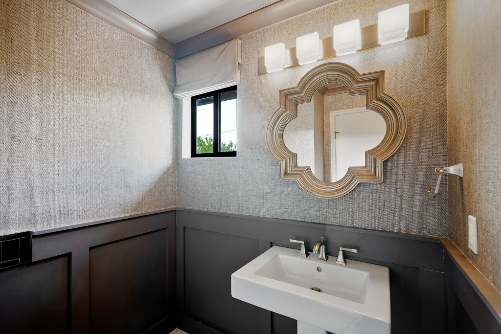
A small powder room is located off this area. The toilet used to be the first thing a guest saw when entering the room – but no more. The layout has been changed and the wall-mounted lavatory moved to behind the door; a pedestal sink now greets users. In addition, the décor has been updated in darker colors to give an elegant, modern feel.
On the other side of the fireplace wall, accessed through a pass-through on either side, is the newly designed “great room” with an expansive open kitchen and family room.
The kitchen is a focal point of the home and has been reconfigured to make cooking easier and entertaining fun. The previous island was crowded with major appliances and offered little counter space to the area. The new and improved island, which performs triple duty as a bar, eating space, and prep area, also features a beverage center and wine fridge. Above, large copper light fixtures provide lighting after sunset. Behind the island, on the backside of the fireplace wall, lies the main cook space with cooktop range, sink, and dishwasher. The countertops are porcelain with a calacatta design to give the appearance of marble without the fear of staining. The backsplash is glass tiling, and the surrounding cabinetry is maple and walnut with veneer covering.
The refrigerator/freezer, double-oven, and pantry are located on the adjacent inner wall to the side of the kitchen. The refrigerator has been laminated with veneer for durability and to blend in with the cabinetry. Another highlight of the area is a hidden appliance pantry. Rather than a space where small appliances are stored and taken out each time for use, a shelf/countertop is set up with appliances ready to use and the ability to hide them behind closed doors to keep the kitchen clutter free. Immediately to the left of this kitchen wall is an access door to the laundry room. SHK used Soss invisible hinges on the inside of the door to provide a seamless look and hidden door effect.
Opposite this wall, on the other side of the kitchen, is a cozy breakfast nook. The old bulky leather bench was replaced by a thinner floating bench covered with custom cushions, and very modern freestanding table was added to provide an intimate place for the family to eat.
Adjacent to the kitchen, sharing the same open space, is the family room. The biggest change in here was the fireplace wall. The previous configuration was another half-height brick structure with a wood burning fireplace, a random skylight above in the corner, and a wall niche that served no definitive purpose. SHK covered the skylight, evened out the walls, installed a gas fireplace, and added custom built-in walnut shelving for the music and gaming systems. Gorgeous gray tiles start at the floor and run up to the ceiling, encasing the fireplace. A television is mounted on the adjacent wall.
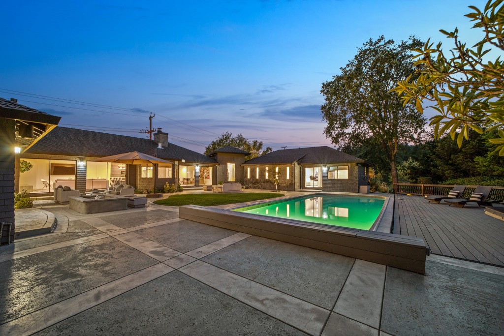
Both open living spaces have large pane sliding glass doors that give access to the backyard and allow plenty of natural light to come in throughout the day. To help the space feel larger, all molding was removed; everything along the perimeter goes floor to ceiling to give illusion of height.
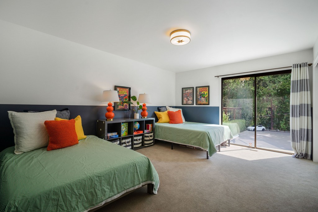
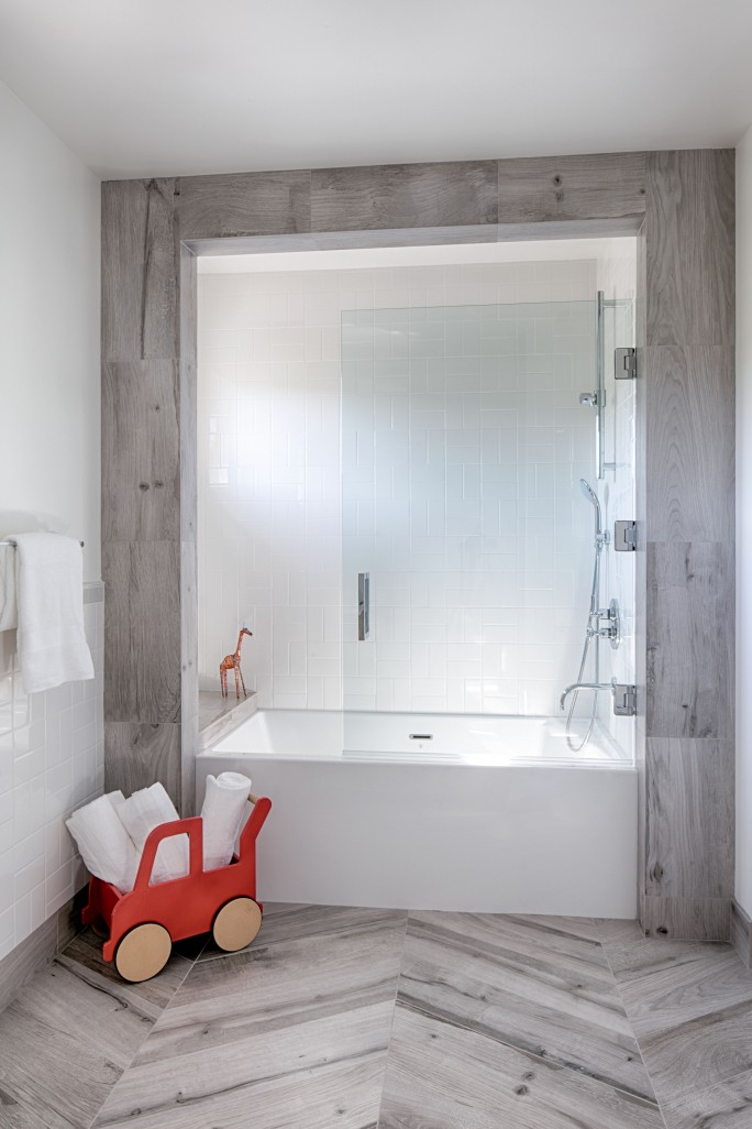
Moving on past the living areas, a short hallway brings visitors to the sleeping area of the home. To the right are the two kids’ rooms – equal in size – and at the end of the hall is the kids’ bathroom, which has also undergone a transformation. Walls were removed and the entire space was reconfigured. Again, the lavatory was moved to be hidden behind the door and the new, larger tub/shower provides a fun space for kids to wash up. Porcelain wood-look tiles are used on the floor in a chevron pattern and extend up the tub’s outer wall. A recessed enclosure opposite the plumbing wall houses all the toys and soaps. Finally, a ¾ width glass partition swings open to make bath time easy but also showers possible as they get older.
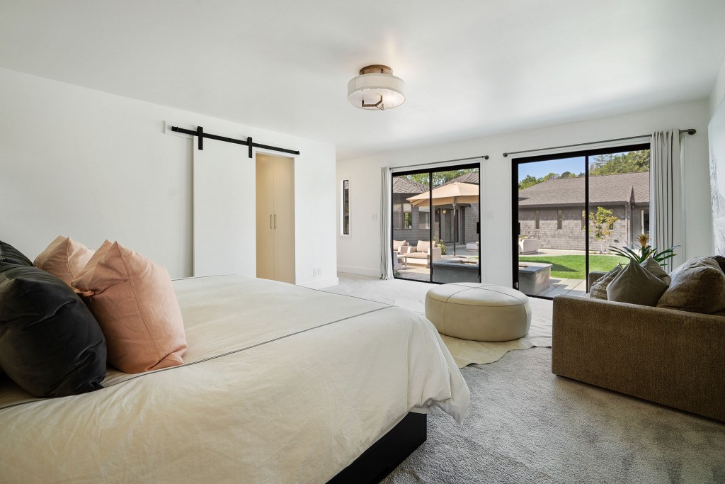
The final space to explore in this redesigned ranch is at the opposite end of the hall: the master suite. Windows were added to the hallway to let in the natural light and provide a view to the outside. The bedroom is modest in size, but it is kept incredibly clean and completely free of clutter due to the absence of dressers and bureaus. All guests see here is the bed and a lovely sitting area. Two sliding door sets provide access to the backyard. The star of this area is the award-winning* master bathroom.
*American Society of Interior Designers (ASID) Design Excellence Awards 2016-2017 – first place bathroom over 80 sq. ft.
The old layout was an awkward set up and stole perfectly usable space for an unnecessary hallway that divided a cramped bathroom and small walk-in closet. The new layout combines the entire space into a luxurious bathroom. Porcelain tiles are used on the floor. Closets and Brazilian teak shelving line the wall as visitors walk in. At the far end is the curbless shower that features gray marble tiles on the wall. The room is divided in half by back-to-back his and hers vanities. The ‘other side’ is home to the large bathtub encased in the same gray marble tiles. The standout design feature is the teak flooring that runs the length of this side of the bathroom and up the wall at the entrance to the shower to define the bathing area of the room. The wall-mounted lavatory is behind a privacy door.
Studio SHK has performed a remarkable transformation to this outdated California ranch. The new design opens the spaces, fills the home with light, provides better functionality, and updates the interior design to marry modern architecture and elegant style. And at the end of the day (or any time, really), the award-winning master bathroom provides a spa-like oasis for the owners to relax.
Studio SHK
Based in: San Francisco, CA and North Lake Tahoe, NV
Interior Design: Studio SHK
Builder: Bay Cal Contractors
Photo Credit: Tom Tomkinson
Project Neighborhood: Lafayette, CA
Number of Bedrooms: 4
Number of Bathrooms: 3 ½
Approximate Square Footage: 3450
Renovation completed: 2016
PROJECT DETAILS AND FINISHES
Foyer and fireplace tiles: Moda from Artistic Tile
Fireplace tiles (family room): Artistic Tile, Sea Gray
BATHROOM
Floor tile: Artistic Tile: porcelain tile
Shower and tub frame tiles: Afyon Grey marble from Artistic Tile
Vanity: Nuvo, by The Furniture Guild
Lavatory: Toto
Plumbing Fixtures: Gessi, Watermark, Ammara
Lighting: Ayre
Tub: Kallista
KITCHEN
Flooring: European White Oak Engineered flooring
Backsplash: Ann sacks Lucian Glass Premium in Glossy Oxygen, liner
Counters: Maxfine Porcelain in Calacatta
Cabinets: Nevamar veneers and Walnut
Light fixtures: Tom Dixon copper light fixtures
Vent hood/stove: Wolf
Double oven: Miele
Wine, Beverage, Refrigerator/Freezer: Sub-Zero
