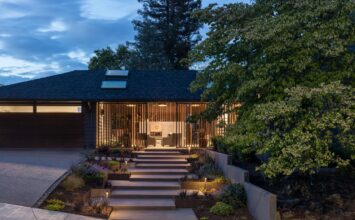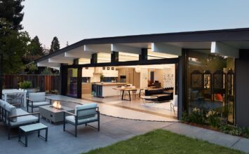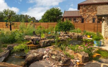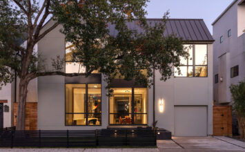
What makes a home livable for the long-term? With the Austin MA+DS Modern Home Tour this weekend, we took some time to sit down with Peter Pfeiffer of Barley | Pfeiffer Architecture, an Austin-based firm that specializes in high-performance design. It’s a term that‘s often tossed around in the architectural world, but Peter offers us a concise and helpful definition: high-performance means a home that’s healthier to live in, comfortable, less expensive to heat and cool, and easier to maintain.
And that’s exactly what sets Barley | Pfeiffer Architecture homes apart: they’re designed to be lived in, as opposed to be sold. In a market flush with homes that are built for speculative sale – 98%, by Peter calculation – Peter prizes homes that can be appreciated more the longer they’re lived in.
“We design from the perspective of how easy will it be to own this home for the next twenty, thirty, or forty years?”
Our conversation hinged on a crucial point that, as modern design enthusiasts, we should all bear in mind: “What we have to be careful with in this new interest in the Modern movement, it can appear to be a flash in the pan a few years from now if you don’t adjust the designs to work with a particular climate.”
As an example, Peter brings up the “Tuscan Look,” a popular design craze that swept through Texas several years back and sprung up houses that looked as though they were straight out of the Tuscany region in Italy.
“Now, it’s considered a really laughable style because they look so dated. We try to design a contemporary style that won’t be dated.”
Why didn’t the Tuscan style last in Texas? Simply because it wasn’t responsive to the surrounding climate. Tile roofs, as favored by the Tuscan look, are notoriously bad for water. In Italy, those tile roofs are built over homes made out of stone or brick, materials that won’t rot if water gets in. But in Texas, these roofs were put over wood-framed houses, which don’t respond well to roof leaks, much less a Texas gully-washer.
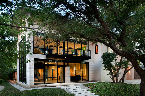
The Barley | Pfeiffer Architecture home that will be featured on this weekend’s tour, in the Barton Hills neighborhood of Austin, took as one of its major starting points this precept that good design must be responsive to climate. The home was a collaboration with builder Kelly Wunsch of Capital Construction Company, who found a neat corner lot and approached Peter about bringing the Barley | Pfeiffer Architecture approach to the spec market.
Peter was initially drawn to the lot because it lent itself to a passive solar and environmentally-sensitive design. The property was set up in such a way that he could design a home with a backyard and patio and access to the prevailing winds. The right orientation is key, Peter explains: access to the prevailing winds means fewer mosquitoes and nice cooling breezes, and south- and north-facing windows makes it easier to control sunlight.
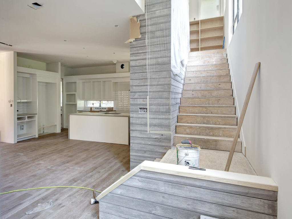
Inside, the house was laid out in such a way that it was also responding to climate demands. The stairs are purposely on the northwest corner of the house so that the windows in the stairway can bring lots of natural light into the center of the house, while also allowing for a nice drafting effect. With this natural ventilation, you can be comfortable on a May afternoon without the A/C on.
“It really allows you to enjoy the best of what the Austin, Texas environment has to offer.”
Beyond these concerns, Peter’s design was inspired by imagining the home’s future occupants. Who would live in the home, and how would they live? “We imagined a family with two or three kids running around. You’d want to be able to see them in the backyard from the kitchen sink. Or, if the daughter is doing her homework there in the kitchen, there needs to be a table there.” These sorts of sensible design considerations make the house very easy to live in – not just because of its low utility bills, but because of its floor plan.
The home also proves that the Modern style can be a good neighbor within an established setting of mid-century bungalows. To Peter, it’s important that a home doesn’t try too hard to be different. “We tried to bridge the gap between Modern and contemporary, using the vernacular of the existing neighborhood homes. We didn’t try to put a spaceship in the middle of the neighborhood.” This emphasis on both subtlety and sensibility courses throughout Peter’s work. The home has a roofline that is strong but sloped, so it sheds water easily. It’s also facing a way that would accept solar panels in the future without being seen. In this way, the home is confidently sophisticated without shouting “green.”
We love this home precisely for its sensibility and its subtlety, and we hope that you’ll be able to check it out this weekend in person. We asked Peter to list a few features of the home that tour-goers should be sure to keep an eye out for.
- How nice the natural daylighting is in the house. There’s very little direct sunlight, so there’s very little glare.
- The family friendliness of the layout, such that when you come in from parking your car, there’s a dump station in the laundry room that doubles as a craft room. That way, you don’t have to leave your backpack and purse on the kitchen counter.
- In the kitchen, there’s a nice little desk niche area, so you can check your email while getting dinner ready for the kids. How easy would it be for a family to function here?
- There’s plenty of natural ventilation, so its comfortable with the windows open and better connected with the outside.
- The detached garage makes it so that you can do projects and have smelly things out there without worrying about fumes coming into your house.
- The Master suite is upstairs but nicely situated and isolated from the kids’ bedroom, and yet windows are facing south so it gets the breezes and not on the noisy street side of the house.


