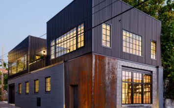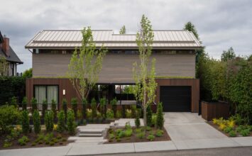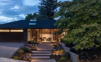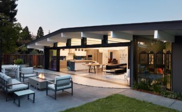
Adobe walls, stucco, vigas, brick floors, blue doors, kiva fireplaces – this is what traditionally comes to mind when you think of – well, traditional – Santa Fe style. But for all its traditional Spanish roots, there is a vibrant streak of modernism that courses through Santa Fe’s design and architecture, both paying homage to and breaking away from the traditional aesthetic.
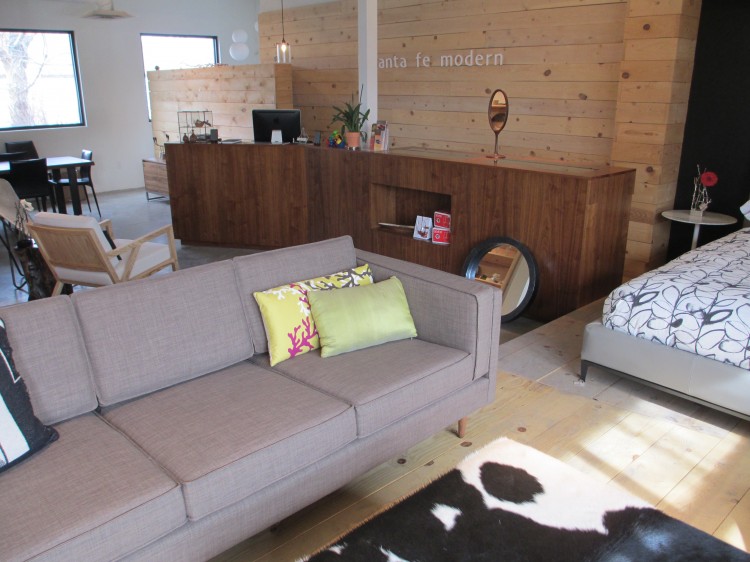
Santa Fe is home to Jeff Holbrook, contemporary design lover and owner of Santa Fe Modern, a contemporary home furnishings store that offers custom work from local artisans. Jeff is also a modern homeowner himself – his home was designed by Jeff Harnar, a celebrated local architect (for whom the annual Jeff Harnar Award for Contemporary Architecture is named) credited with introducing contemporary architectural ideas to the Santa Fe community.
We sat down with Jeff Holbrook to talk about the interplay of contemporary and traditional in Santa Fe, his Jeff Harnar-designed home, and his modern home store.
Q&A w/ Jeff Holbrook
What was your journey into the world of contemporary design?
I attended the University of Michigan in Ann Arbor in the 1970s. One of my career interests was architecture, which this university is known for. While I took advanced math courses and architectural drafting classes every year in high school, in college I soon felt intimidated by higher level mathematics and instead (and maybe influenced by this era) changed career choices and steered towards working in education, finding this a good fit for how I wanted to help “change the world.”
While architecture and design was not my chosen career path, it was always and still is a passion of mine. I think my passion started in my childhood and was influenced by my uncle. He was a furniture and interior designer in Toledo, Ohio. He designed his own house in the 1950’s, and I have very fond memories of spending extended time there with family as I was growing up. Having grown up in houses that could be described as classic, traditional, Midwestern colonials, I remember as a child being in awe of my uncle’s creation. From the exterior, he designed a ranch house with clean lines, nice materials, and an overall unpretentious look. It wasn’t until you walked inside you realized that the house had a walkout lower level, with both the main floor and the walkout having floor-to-ceiling windows from one end of the house to the other. The house also opened up to a steep ravine with unobstructed, deep forest views. The soaring ceilings, the clean lines, and the use of natural materials, like brick and slate, were a sharp contrast to what I was used to, living in a more typical four bedroom colonial!
I remember always enjoying my family visits, not only appreciating the beauty of the contemporary architecture, but also how it made me feel. The open spaces, soaring ceilings, and floor-to-ceiling windows looking onto nature made me feel expansive and introduced me to new ways of looking at the aesthetic and use of space.
It’s interesting that I find myself now in a home that has what I was impressed upon at an early age: an abundance of natural light, amazing nature views, expansive spaces, clean minimal lines, with varied quality materials. It’s even more interesting that I now own a store helping people with the same aesthetic!
How do you think Santa Fe embraces contemporary design?
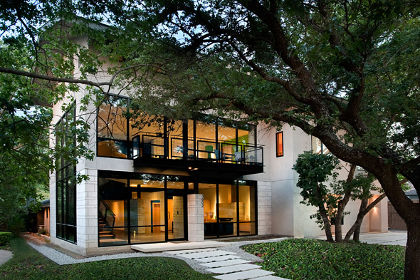
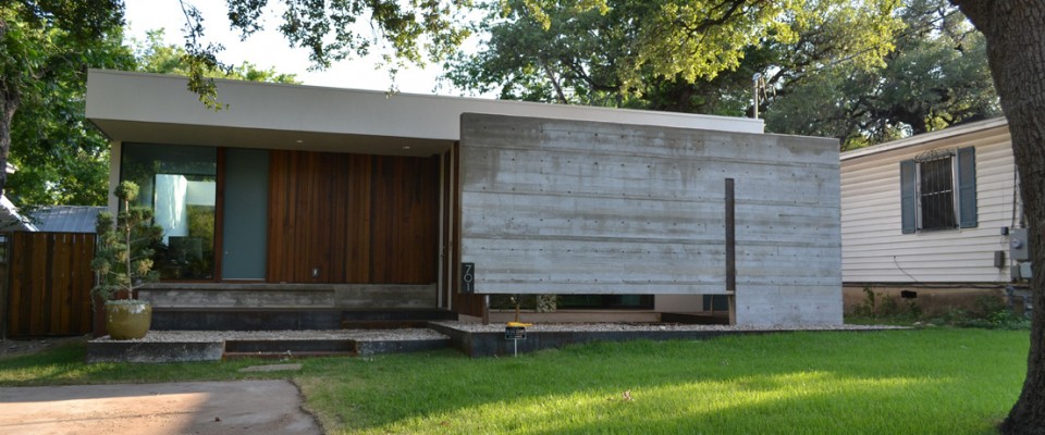
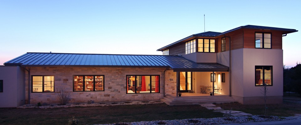
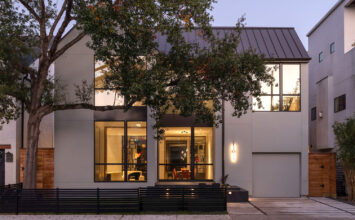
When one thinks of Santa Fe architecture, what comes to mind are adobe walls, vigas, brick floors, blue doors, kiva fireplaces, walled courtyards, etc. Often times, this is expressed in more traditional ways. Contemporary design in Santa Fe can be both different from this as well as embrace and pay homage to Santa Fe’s history, using similar natural materials (i.e. adobe/stucco, brick, wood) in different ways or use different materials (i.e. steel beams) to give a twist to how structures are traditionally constructed. I now live in a house that was designed to reflect a “New York style loft” – very different from what is seen as traditional Santa Fe style. The condo I used to live in before this house was a good example of contemporary architecture paying homage to more traditional architecture but in different ways: strong edges to the stuccoed exterior walls, black brick floors, straight-edged beams, modern corner fireplace, and tongue and groove ceilings to simulate latillas.
It is very common to see Santa Fe homes with soft-lined stucco walls surrounding the property. Contemporary design often uses this idea and makes the lines, corners, and edges of the wall more sharp-edged, thus subtly but significantly changing the look of the wall. Using a different coIor for this wall can also change the look from traditional to contemporary.
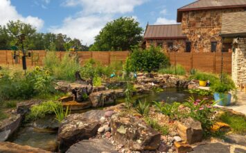
Traditional and contemporary design in Santa Fe uses similar color palettes, more natural tones, with contemporary design seeming to preferring lighter shades. Contemporary design tends to pay great attention to natural light, and cleaner, stronger, more minimal lines. Design can also influence the outdoor spaces of a home, creating inviting spaces with the same minimal lines, creative and modern landscaping and hardscaping, all the while balancing form and function—so that it’s pleasing to the eye but also comfortable to be outside in Santa Fe’s different seasons.
What I like about contemporary design is it’s inventiveness, the ability of the creator to create some sort of surprise, whether it’s through the material used, the location of a window, the homage to something in the past but used differently, or unexpected lines and shapes.

You purchased your store, Santa Fe Modern, from a friend who originally conceptualized the store eight years ago. How would you describe your vision or aesthetic for the store?
I would say my style is similar to what the store already offers—clean lines, natural color palette, and quality materials. I would also like to continue the idea that we are a store where you can buy things off the floor, buy things from catalogues from our vendors, special order pieces, and have pieces that we custom designed for and with people.
Personally, I think I have less rustic taste and possibly lean towards a more urban look. I like pops of color and even a bit of whimsy. Furniture must be comfortable and functional, as well as pleasing to the eye.
A client recently saw a coffee table (pictured below) in our store that was custom designed. He liked it and we had one built to his specifications. The base is steel and the top is solid walnut. We use the same steelsmith, woodworker, and finisher to make our custom pieces.

Here (below) is a cantilevered console that was designed recently by the previous owner of Santa Fe Modern. The client wanted a contemporary media cabinet that fit this specific niche. The cabinet is made out of steel with 3form sliding doors.

We’ve recently started working with someone that works with concrete. I’m in the process of designing a console for the front window that will have a steel base and a floating concrete top.
You purchased your home from the original owners a few years ago. What was it specifically about the home that you were drawn toward?
The site is beautiful—over 3 ½ acres of piñon and juniper dotted land, with amazing east and west views of two different mountain ranges. Inside the house, we were immediately drawn to the vast amount of floor-to-ceiling windows, letting in light and shadows, and offering great views of the Jemez and Sangre de Cristo mountains.
We were also attracted to the contemporary lines of the house, creating a virtual piece of art to live in! We liked the open layout, with the kitchen, dining, and living room all in one space. (There are also only two doors to separate all the rooms!)
We also liked the size of the house—2200 square feet in the main house. Too many times we saw contemporary houses that seemed so cavernous. This sized space is very livable for us and suits us well.


- Here is a picture of our kitchen. This exemplifies the importance of both function (ample storage, good design for cooking, ample light) and form (quality materials-stainless steel, granite, etc. and beautiful to look at and cook in!)

- Taken from the loft, this picture depicts the overall openness of the living spaces with high ceilings, huge windows, and clean lines.

- This picture shows some of the creative lines the architect used to design the indoor spaces and also is another illustration of how light and shadows play a prominent role in this house.
Stop by Santa Fe Modern to say hello to Jeff in person!
Santa Fe Modern Home
1512 Pacheco St. Suite A105
Santa Fe, NM 87505
505-992-0505
