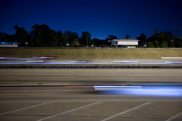
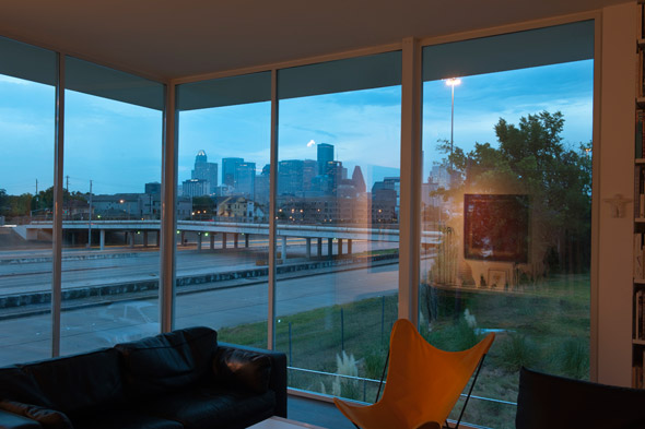
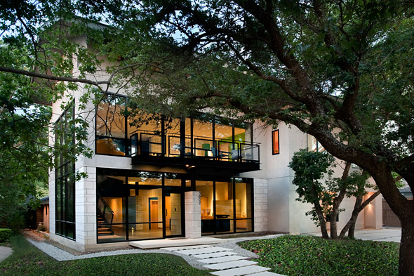
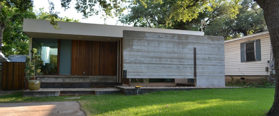
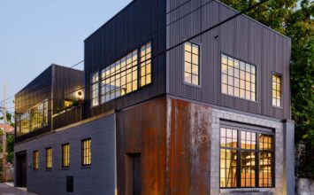
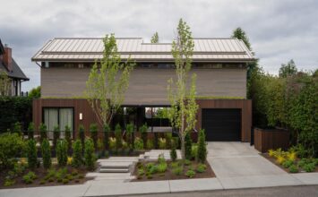
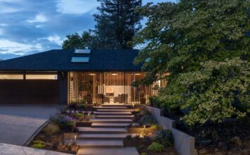
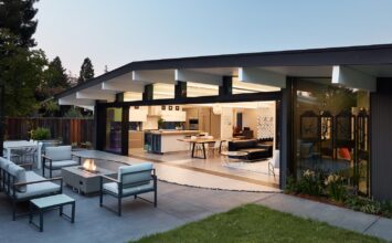
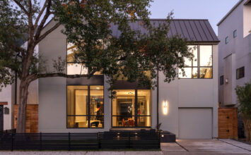
With the Houston Modern Home Tour coming up this Saturday, March 3, we wanted to give you a sneak peek at one of the more unique homes on the tour. As you can tell in the picture above, yes, this modest-sized home practically has a freeway right underneath it. The benefit of this: an absolutely breathtaking view of the downtown Houston skyline. One side of the home, settled in a neighborhood like you’d expect any home to be in, is juxtaposed by the opposite side, overlooking the concrete jungle that is the soul of Houston. Besides the location of the property, the other beauty of the home is its utilization of space. The actual home isn’t large, but it uses its spacious views and cozy nooks to provide a dynamic and “homey” living space. We were lucky enough to speak with the architect and homeowner, Ronnie Self.
1. What’s one of the main features of this home that you think people should pay attention to the most?
The house is comfortable – even homey – yet exhilarating. Without volumetric or formal extravagance, there’s a lot of spatial variety in what is a relatively small building. I think the rigor of the planning and the details gives calm to the house. The house definitely stands out. I was surprised, though, by a neighbor who said that it looked like it had always been there. In many ways it does two things at the same time. It stands out and it fits in. It’s frugal and rich at the same time.
2. With this property, what were some ways that you tried to maximize space utilization while still keeping to your signature style?
I think that in many ways and in general, the project maximizes the available space. The house was placed on the site to maximize yard space toward Saint Emanuel Street. Since the house is lifted into the air, the yard seems even bigger. Inside, living spaces are generous while bedrooms were conceived as sleeping chambers. There’s only one bathroom, but it’s designed for use by two or more people at the same time – with privacy. The downtown skyline, the freeway, the neighborhood – all become part of the space of the house. The roof deck is an enormous – almost infinite – space because it offers such distant views. Quality of space trumps size of space.
3. Obviously the location of the home is very unique being right next to a freeway. What made you want to build there?
There were several reasons for the site choice. From a practical point of view it’s mid way between my job at the University of Houston and my partner’s job at the Museum of Fine Arts. It’s in the Third Ward, a neighborhood with a strong identity and history. The site seems to synthesize the physical characteristics of Houston itself with a spectacular view of the downtown skyline, the freeway – very characteristic of the city – all within a traditional, even if somewhat degraded inner-city neighborhood. Many sites along the freeway had been left for dead since the freeway was cut through this part of the city in the 1970’s. I was new to Houston when I bought the lot. I think it may have taken somewhat of an outsider’s eye to see the interest of the site. It’s a challenging site. The freeway has its negative points, but it also has its positive points. The freeway provides a large open space. It allows for long views. In a city with very little topography, looking over the channel of the depressed freeway is a unique situation. But it’s the contrast the site offers that is really interesting – between the freeway and skyscrapers on one side and the traditional neighborhood on the other. There’s a view but also a close link to the ground, to vegetation and to the neighborhood. It’s Houston.
4. Is there a particular room in the home that you enjoyed designing the most?
Since we have been in the house for two and a half years, now I think more about what it’s like to live in the house rather than how it was to design it. The house definitely has “rooms,” but I see the entire house as one space that adapts to specific conditions and needs. Just as there is the contrast between the “city” side of the site and the “neighborhood” side, the house has spaces that take advantage of both and contrast them. The wide open view from the living room is extraordinary, and makes the more closed, introverted space of the study even more appreciable.
5. Do you think there’s a signature trademark style, unique to you, that you try to include in each of your designs? If so, what would that be?
Unfortunately, I don’t think I’ve done enough buildings to be able to develop a “style!” Actually, not having a style is a good thing. It’s more important to develop a process – a way of approaching context and site and clients’ needs and budget and structure and materials and details, etc. Process provides a framework but allows every project to become a new adventure.
6. What place do you think contemporary architecture has in a city like Houston?
Houston, perhaps more than any other large American city, is a sort of dream of architects of the 20th century. It has sun and light and green. It has cars. It has “crystal” glass buildings. It allows every generation to rebuild the city. All of these things came with problems, but they were dreams of modern architecture and urbanism, and they had positive aspects as well. Houston is a still a new city. Its birthright is to have modern / contemporary buildings. Unfortunately, that’s not the way it is. Houston should be leading the way, but it has lost interest in innovative and contemporary architecture.
To see more photos of the Saint Emanuel House, head over to Ronnie’s photo gallery here.

