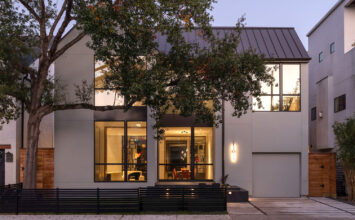
The Seattle Modern Home Tour is only days away, and the siren call of the Space Needle beckons modern architecture lovers to explore some of the coolest-designed residential spaces in the city.
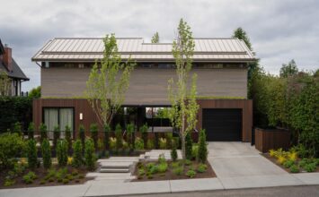
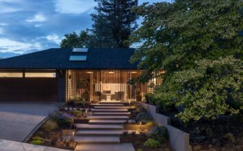
One such space – the work of SHED Architecture & Design, a Seattle-based firm that specializes in sustainable, green, modern and contemporary spaces – is a re-imagining of an outdated midcentury home in Seattle’s Central District. This economically-driven renovation features an open layout, a dedicated outdoor workspace, a direct connection from the garden to the new farm-style kitchen, and a new roof deck with 360 degree territorial views.
We spent some time getting to know Thomas Schaer, co-founder and principal of SHED. He shared with us his vision for the home, and some details that tour-goers should be sure to keep an eye out for.
Project Description | by Thomas Schaer, SHED Architecture & Design
Architect: SHED Architecture & Design
Contractor: IHS Contractors
Structural Engineer: Todd Perbix
SF: 2,100 SF + Roof Deck
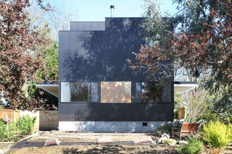
This house began as a nondescript, single story,1,000 s.f. postwar box. Our clients had occupied it for some time and, while they loved the yard and hilltop location, they didn’t much care for the house. We noted with interest the large vegetable garden, roaming chickens, secluded back patio, shed full of bikes and tools, chairs on the roof for taking in the view, and the piano and drum kit crammed into the study. The atmosphere was both industrious and laid-back. The budget was tight so we resolved to incorporate what we could of the existing house into a new, simple building constructed of hard working and cost effective materials. Todd, our structural engineer, confirmed that the existing foundation and ground floor walls could support an additional story. The reuse of these elements made the project financially feasible and saved the site from the ravages of the excavator.

The existing roof was removed, the interior gutted, and the perimeter walls modified with enlarged openings tuned to the site and surroundings. A new layer of deep LVL (laminated veneer lumber) joists spans from wall to wall and supports the new second floor. These exposed joists, stacked on the original 8-foot walls, raise the effective ceiling height and imbue the house with a warm and informal atmosphere. The joists cantilever from inside to outside to support roofs for the front porch and a generous work porch, a covered outdoor space on the path from garden plot to table with vegetable-washing zone, a utility closet, and room for tools and muddy boots.
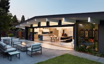
The new farm-style kitchen opens onto the secluded back patio and is designed to accommodate a 10-foot long dining table, eliminating the need for a dining room and creating space for the homeowners’ piano, drum set, and wood stove in the living room.

The second floor layout is dedicated to a master suite, two bedrooms, guest bath and laundry. A stair tower, illuminated by large sliding doors, connects the floors to a roof top deck with sweeping views and serves as a passive ventilation chimney in the warm summer months.
Fiberglass sliding windows and doors, selected for their low cost and high thermal performance, open the house to the yard and views beyond and light weight corrugated metal siding completes the low maintenance exterior.
Q&A w/ Thomas Schaer | SHED Architecture & Design
This project was a remodel of an outdated midcentury home. Why did the clients come to you, and what was your mandate as you set out to re-imagine the space?
After living in their midcentury home for over a decade, the homeowners, both working professionals and avid gardeners, approached us in 2014 to help re-imagine a home that better aligned with their lifestyle and create a better relationship to the site.

What were the biggest challenges, and what were the most drastic changes that were made?
The biggest challenge was the budget constraints and finding a way to utilize as much of the existing structure as possible.
What materials were you drawn toward using for this home?
We used standard rotary cut fir plywood throughout the home – its cost effective way to add warmth and texture.

How does this home embody your vision — or your client’s vision — of modern?
Our strategic approach to materials (i.e. exposed LVL framing on the main floor, corrugated metal exterior) and spatial layout (created a connection between the interior and exterior spaces) enabled us to achieve character, warmth and materiality on a tight budget.
What are a few details of the home tour-goers should be sure to keep an eye out for?
– House is very symmetrical – chimney first floor goes up btw two bedrooms to the roof
– The LVL framing extends outside like wings to create the protective overhangs
– The stair to the upper floor and roof features large sliding windows facing north and south, which bring light into the center of the house and create passive ventilation to move air throughout the home.
– Inserting a table in the center of the new farm-style kitchen, reduced the need for a dining room, leaving space for the homeowners’ piano, drum set and wood burning fireplace in the large, open living space.
– Territorial views from roof in all directions
– The kitchen also connects directly to the front yard vegetable garden via a side door and through a new covered outdoor workstation, featuring a vegetable-washing zone, tool hooks and a large utility closet. These features made for seamless transitions from outside to inside.

Ready to see this home in person? Get your tickets for the Seattle Modern Home Tour here!
