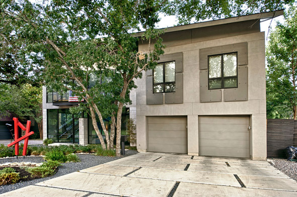
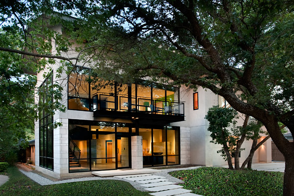
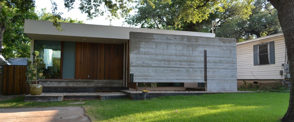
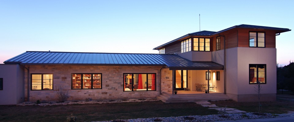
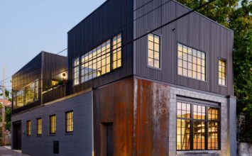
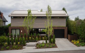
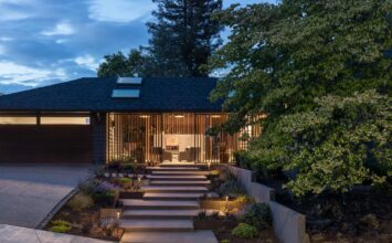
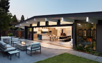
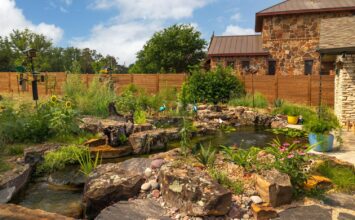
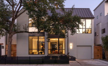
This week’s featured property comes from Dallas, TX. Designed by Raymond Design, this project took an anonymous ranch house with tight spaces and no street presence and dramatically expanded it to suit an active family. We were given the chance to talk with Robert Raymond, founder and owner of Raymond Design, and ask a few questions about this property as well as his design style in general.
You can tour this home and 11 others during the Dallas Modern Home Tour on January 28, 2012.
1. What were the homeowners’ desires for the home?
The existing, old, one-story house was getting cramped and it was low and uninteresting architecturally. It needed major changes. Mainly it needed more space for family…two young girls getting older and outgrowing tiny rooms. It also needed playroom/TV space and more room for entertaining, artwork, vehicles and tools. The client wanted to move the front entry to the street façade. The existing side entry was hidden on the side making it dark and uninviting. Finally, they were looking for a dramatic architectural statement from the street/curb.
2. How did you meet those desires?
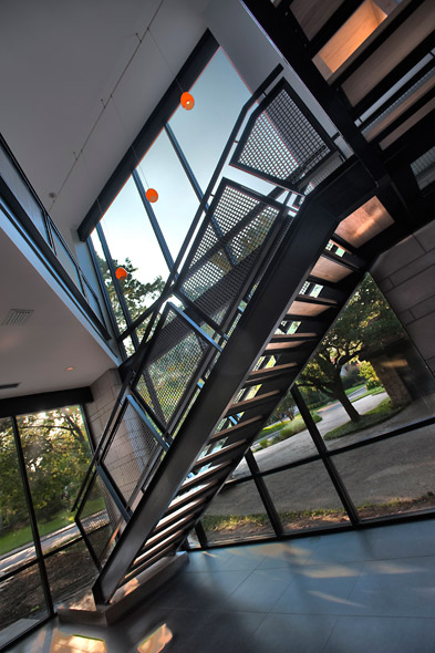
We removed the existing garage which was the only element visible from the street, re-oriented the driveway, and built a three-story structure on the front as the strong street statement desired. The public spaces of the existing house were then renovated. (The master suite and kitchen had been renovated previously).
Besides the homeowner requirements/desires…I suggested creating a stronger connection from front to rear…visually and functionally. The existing house was already quite deep, and adding the new addition was going to create even more distance from front to back so it was critical to develop the connection. You can literally see from the front door to the back yard. And a good portion of that connection is a linear gallery space connecting front living spaces to rear living spaces.
An interesting feature that evolved during design: when the owner realized that the attic space was actually quite generous, we developed it into usable space that could help the appraisal and loan calculation. And we did it with very little impact on the budget…so it leveraged the value of the project quite positively.
And as the addition grew from two occupied stories to three, it became even more critical to finesse the stairs. So we opted for a dramatic stair from L1 to L2, and a minimized/semi-hidden stair from L2 to L3.
3. What was your favorite part of designing this project?
I love collaboration. Better ideas are always generated when brainstorming with clients. The client for this project was very involved and they had plenty of ideas. Most of my clients have done their homework and come to the project with some ideas and elements they like. They have a lot of “pieces” or “features” that they like. My job is to synthesize their functional needs with their stylistic desires and create a unified and inspiring composition. And it’s always much harder than it looks.
Within a contemporary design vocabulary, I am somewhat conservative. This was the first project where the client was really pushing at every step: “more glass, more drama, more color.” That was unique and I believe the final result owes much to the client’s input.
4. Do you have a favorite room to design?
That’s easy…my favorite room is the room that the family will spend the most time in. That might be the Kitchen, maybe the Living spaces or a combination of the two. Many of my clients work at home, so the Office/Studio space becomes the center of their universe. One client, a husband and wife, both worked at home. She is a graphic designer and he is a financial planner and we designed a wonderful loft space for both of them above a garage. We used a combination of glass and millwork partitions to separate them acoustically, but the glass allowed light and views to be shared both ways, and the millwork was strategically placed for partial privacy and art storage requirements.
5. Is there a signature style that you try to incorporate into your homes?
Style is a tough word to define, so let me offer some signature “characteristics” of my work. The most consistent distinguishing feature of my work shows up in the plans. I spent 18 years in commercial architecture before moving into residential, and the rigors of budget and structure/mechanical integration were ever-present and influenced my tendency to stick with very basic shapes with very few frivolous or gratuitous gestures in the plan. Most of my house plans are in rectangular and square shapes which squeeze the most programmed space into the least amount of footprint. Another distinguishing feature would be the roof forms I employ. I never do flat roofs…which is normally a signature of contemporary design. Flat roofs are very difficult for managing water and snow. In Texas, it can rain several inches in one hour and you have got to have a sloped roof with generous overhangs to get that water off and away from the walls of the house as quickly and efficiently as possible. And over the last few years, I have continued to expand my knowledge of building science and environmental impacts…specifically designing residential projects that use less energy, use natural resources more efficiently, and are non- toxic for the occupants. While this approach could be considered a style or characteristic…it is almost invisible because you can incorporate these concepts into a wide variety of architectural expressions.
Quick note on sustainability: my most recently-completed home (6151 BelmontAvenue, Dallas, 75214) was awarded LEED Platinum…and we built it for $100/sf.
6. What place do you think contemporary architecture has in Dallas?
Dallas is known as a “pro-business”, “can-do”, “forward-thinking” city…and it has continued to grow by attracting businesses and people. But in terms of residential architecture, I find it ironic that there is still a strong predilection for “backward-looking” traditional styles at all income levels. Dallas has a strong history in contemporary architecture in the residential realm, but it is still a very narrow slice of the pie. I would argue that Houston and Austin have a wider and deeper appreciation for contemporary styles. I am encouraged and hopeful that that could change in Dallas. There seems to be an increasing number of young college grads who are opting for urban densities, loft-type apartments, and a more vibrant, eclectic environment for living and working. They are also much more aware of environmental issues and the huge impact that architecture and transportation have on all facets of those issues. This bodes well for contemporary design in the near future…even in Dallas.
Raymond spent 18 years working for big architectural firms doing very large-scale, complex projects. In the late 90’s, he quit to build his own home for his family and used that to launch his solo residential career. He uses his experience and knowledge gained from working in the large firms and applies that to the residential world. To see more of Raymond’s work, check out his portfolio on the Raymond Design website by clicking here.
