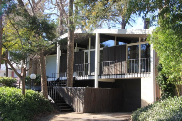
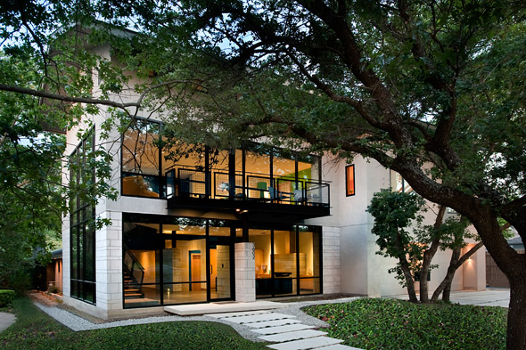
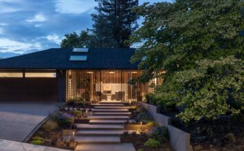
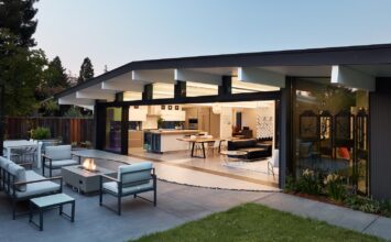
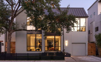
We’re getting very excited for our Dallas Modern Home Tour this Saturday, March 2nd. 10849 Clearbrook Lane is one of the beautiful homes we’ll be seeing. Originally a mid-century modern home designed by Lewis Thomas with a floor to ceiling window wall, the home was recently remodeled and given an updated look on the interior. We talked to the interior designer, Vennesa Villarreal, to learn more about the remodelling process and the wonderful features of the home.
How did you go about beginning your renovations?
I’ve been an interior designer or 8 years now and have a passion for mid-century architecture and glass. With that said, our home was only on the market for 1 hour before we made an offer. I didn’t even have to step inside and I just knew. The exterior facade was so different from the other Dallas architecture we had seen and it wasn’t new. We didn’t want anything new because we wanted to restore something original. I immediately knew what walls were coming down and exactly what finishes we would be using. I had the design in my mind within the first 10 minutes of walking through the house the very first time.
What can you tell us about the materials you used, especially those for the floor and countertops?
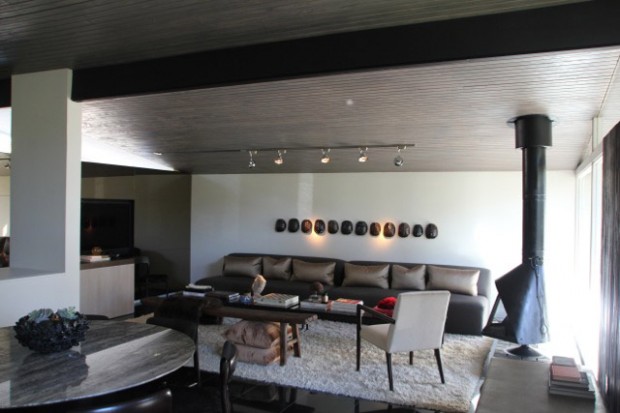
We love clean lines, classic materials and a neutral palette. I cook everyday and I’ve always dreamed of owning a Bulthaup kitchen. Bulthaup is a German kitchen manufacturer, and in my opinion, the best kitchen manufacturer in the world. Their attention to details such as self close doors, reveals around the doors for finger pulls, paneled hidden appliances, and birch wood drawer interiors are just a few key features in their kitchens. Our kitchen is clean, simple, and oddly enough, the most relaxing room in our home. Floors are 12 x 12 absolute black granite stone, bathroom countertops and shower walls are calacatta gold honed marble, and the guest bath is wrapped in Innovations grass cloth. The oversized shag rug in the living room adds warmth and drama against the contrasting black granite floor. This in addition to the bronze mirror paneled wall, gives the living area a mid-century modern look that resembles a set from ‘Mad Men’.
What posed the biggest challenge in renovating the house?
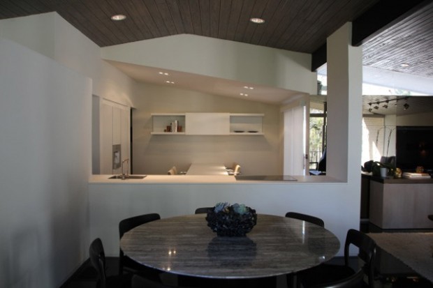
The wood ceiling and lighting! It took five different stain colors and seven processes to get the color we wanted. We used the Menil Collection Museum in Houston as our color inspiration. The previous owner had 3 ceiling fans as his main light source in the house. We installed low voltage track lighting for its versatility and seamless look.
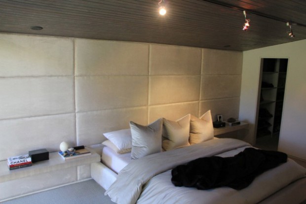
How did the design of the home or even your own renovations influence the designs of the custom furniture?
The architecture/interior design company I work with, TenPlusThree, inspired me more than anything. We design about 70% of our furniture for our clients and have the local resources to help us achieve the final product. With this said, our vendors and resources helped me tremendously achieve the final product in my home.
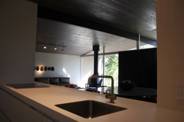
What features of the house – both original and renovated – should tour-goers be sure to keep an eye out for?
Original- the wood sloped ceiling in the main areas. We absolutely find it incredible the way the ceiling runs thru the glass exterior walls and makes the outdoor porch/ indoor space feel like one. Lewis Thomas, the home’s original architect, built this home around a tree that sits right in the center of the home in a small atrium. We decided to leave that detail exactly like he intended it to be.
Renovated- the kitchen. It is very open and plays a key role visually, as soon as you enter the home it draws the viewer in with its lines running parallel to the architecture in the ceiling and beams. We were also consistent with architects original design of using pocket doors throughout the entire house.
If you haven’t already, head over here to get your tickets to the Dallas Modern Home Tour!

