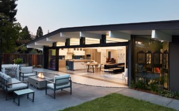
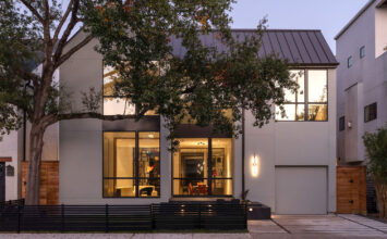
On February 16, Modern Home Tours heads to Venice, California featuring six of the most beautifully designed homes in the area from some of their most talented architects. To hold you over until you can see the homes in person, we’ve got a preview of one of the stops, 677 California Ave. We spoke to the architect, Michael Matteucci, to learn how this renovated 1600 sq. ft. home took shape and what to look out for on the tour.
Your objective was to change the shell of this 1922 shotgun duplex into that of a single-family dwelling that has a greater spatial relationship with the site. How did you perceive that relationship and how did you respond to it in your renovation?
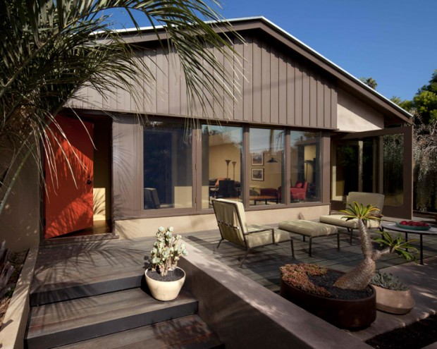
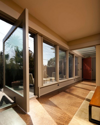
The original structure had two front porches with living room, dining room, kitchen, bedroom and bath behind one another – each unit the mirror image of the other. Because the front of the lot is at a diagonal to the house, the original two front porches had unequal relationships to the sidewalk. In the remodel, we chose to put the front door nearest the deeper portion of the lot to make the arrival sequence longer and make the project seem larger. Because the lot is narrow and side yards are correspondingly so, we opened up the ends of the structure with glass to increase the perceived size of the living space by bringing the outdoor yards in as well as capitalizing on the borrowed view of the neighborhood beyond. The idea is to increase the spatial depth as experienced from inside the space. Because the lot has streets on each side, this was more easily capitalized upon. In the back area, the parking space is designed as part of the yard so when the car is removed it can be utilized as entertainment space and outdoor living area.
What materials were you drawn toward using in the renovation?
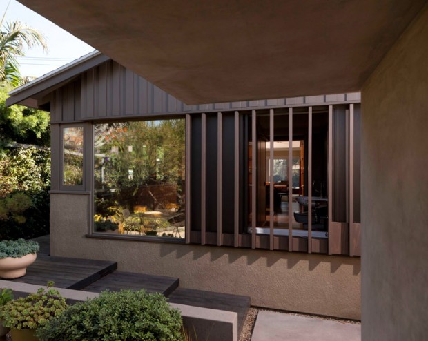
Because we’re in Venice, we tried to use vernacular materials that are interpreted in a modern way that is consistent and congruent with the fabric and scale of the neighborhood. Acid-washed concrete was the typical paving finish used throughout the ‘20-’50s. We paired the concrete with wood decking in a playful sectional composition. The vertical board and batten siding above the windows on the gable ends and heavy dashed stucco compositionally paired with smooth stucco below in an asymmetric composition reinterpret the traditional materials’ use. The goal is to have materials that bridge across the 20th century that through their detailing and composition continue to be fresh and innovative today.
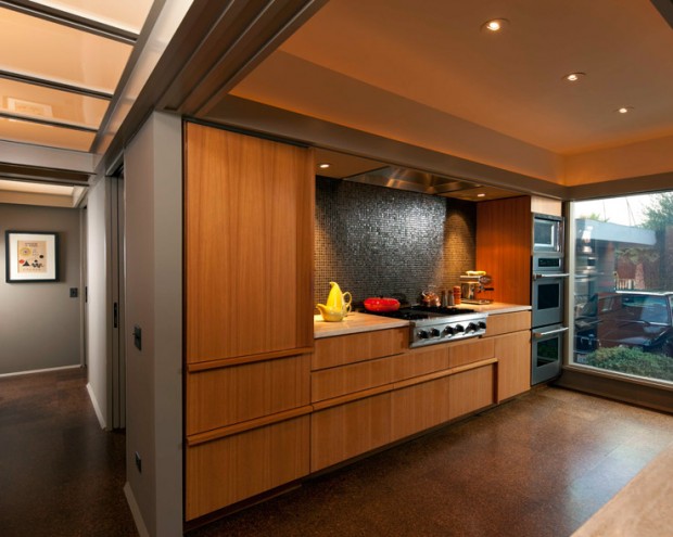
On the interior, we employed a system of valances that trap materials and color in simple planes. The valances are used to distribute color and in so doing, provide a sense of scale to the occupant. Darker color paint on the lower registers of the walls are paired with a lighter color above to give a sense of loft and height in a relatively low 8’3″ ceiling.
As with the exterior, the interior materials like the glass mosaic tiles and the teak wood are a bridge material that were employed throughout the 20th century and project a classic and timeless look.
The color palette was developed by drawing colors compositionally compatible with a painting in the rear corner bedroom that my mother painted in art school in 1963. House and furnishings colors were tuned to proportions of color extant in the painting and are reinforced by the landscape design and plant selections made at the exterior.
What posed the biggest challenge in renovating the house?
The biggest challenge was sticking to a clear unified concept. Because we lived in different parts of the house while we did the addition and as the budget permitted, we had to do the project in pieces. We didn’t want each phase to be a different experiment so at the onset, we developed a plan informed from living in the structure as it was for four to five years to determine our and previous patterns of use. It was difficult to stay disciplined and true to our original intent as the process continued and the project developed.
The next biggest challenge was keeping the center interior load bearing wall that originally divided the two original units. For budgetary purposes, it would have been tough to remove the wall so we worked at opening views through the house along its original grain, lengthwise.
Your renovations made the interior both more open and more convertible. How were these changes appropriate or necessary given the original structure?
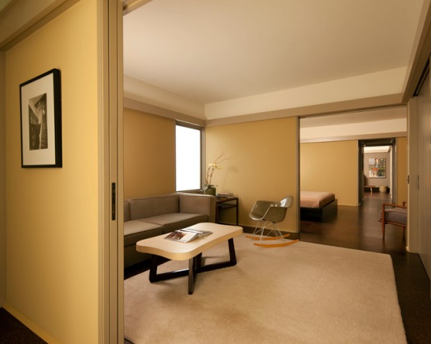
We took cues from original layout of rooms in single file configuration and added sliding pocket doors in the new layout to reduce unusable circulation space and the need for a long hallway space servicing the bedrooms. In so doing, this strategy allows the small front room off the entry to be imagined as a den with access to the hall foyer or closed from the hall and opened to the master middle bedroom as a sitting room. Alternatively, both doors could be utilized so the room could function as a guest bedroom.
The sliding pocket doors in enfilade also allow the view to be extended through the “bedroom” wing of the house in a gallery type configuration that reinterpret the classic modern principles of traditional Japanese design rooted in both craftsman and modern movements
What features of the house should tour-goers be sure to keep an eye out for?
I would say that it would be of interest for guests to look at the ceiling plane and notice how the detailing defines each space in relationship to the relatively open floor plan below. For instance, glass ceilings are typically in areas of circulation or transition. Valances with the plaster coffers above them define rooms that function as bedroom bathroom or kitchen. Lack of valance throughout in the living/dining room define this space as the most important hierarchically allowing for larger pieces of art and furniture.
Be sure to grab your tour tickets here!

