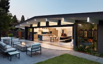
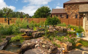
On February 2, Modern Home Tours returns to Austin to explore more than 15 stunning examples of modern architecture from some of the area’s most renowned modern architects. To get you as excited as we are, we took a sneak peek at 1844 Logans Hollow Dr., one of the stops along the Austin tour. We then spoke with architect and builder Erik Gonzalez of Sago International about his 4200 sq. ft. home that sits on an incredible 1.9 acre property.
In addition to having designed this house, your family lives in it! You’ve said that the house was designed around the idea of creating a space where you’d be surrounded and stimulated by nature. How did you accomplish this design goal?
The site is very private, and its natural setting was the basis for the design. Ever since I purchased the lot, I had a vision of my kids running around throughout the property, climbing on trees, exploring nature, and being completely integrated to the outside. I am very satisfied that this vision has become a reality.
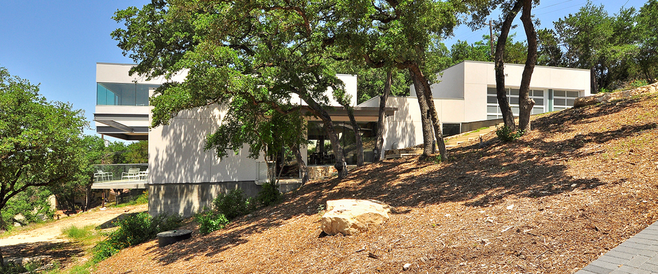
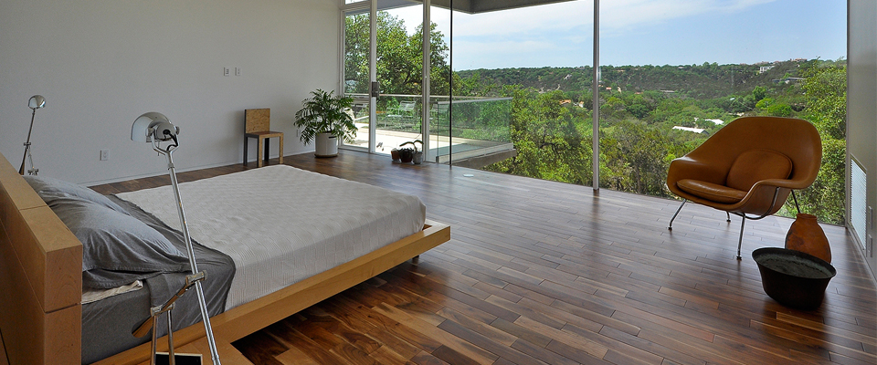
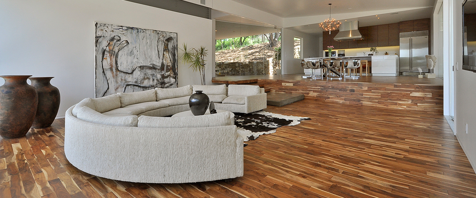
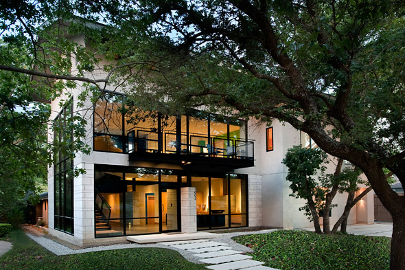
The house is surrounded by beautiful trees, giving it a sense of permanence, as well as a sense of protection. The trees actually gave the house its shape. The boxy volumes are composed like a Lego around the existing trees, with its branches dictating void spaces in the spatial context. Additionally, the placement of the house at the highest point of the hilltop property results in expansive views of the surrounding hills, of incredible sunsets, and of the huge Texas sky. The use of expansive glass walls throughout the house exposes one to experience nature without filters. Seeing storms come in is awesome. Watching deer and foxes stop and look at us inside the house stimulates dialogue of nature in our lives.
What words would you use to describe the feel of the home?
Open, honest, simple, Zen, unpretentious
The house sits on a 1.9 acre lot, and it has a beautiful main entrance. Can you describe the main entrance and the feel you try to evoke for people when they enter the home?
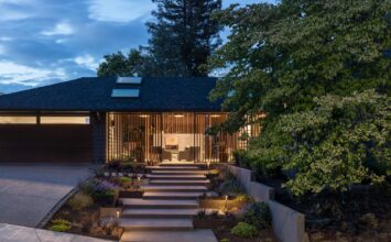
There is a cluster of oaks at the top of the property that I knew needed to be an important part of the experience of accessing the house. So from the car plaza at the end of the driveway, there are stairs that take one around the oak cluster, to the front door. This trajectory has as its backdrop a breathtaking view of the valley.
The pivot hinged front door is a completely transparent 6’ wide by 10’+ tall glass panel. It does not fulfill the roll of the typical home’s front door in the sense that it does not provide privacy. This was done on purpose. Whoever reaches it is someone who is welcome to our home. Needless to say, it does provide protection (unless you throw a brick through it). The reaction the front door has evoked in guests has been “Wow.”
You’ve said that “light” is the main protagonist of the project. Can you explain that further?
In architecture, natural light is the most important element. I strived to capture this valuable light inside every space. By using expansive glass surfaces that extend the whole width of rooms, this light transmission is maximized. But I was conscious of the sun’s orientation during the various seasons. For this reason, I utilized various shading techniques, including eaves, cantilevers, and even existing trees. The results are spaces that rarely need artificial lighting. In the morning, the light filters through tree branches and leaves into the spaces. Their shadows dance as wind moves them, stimulating one’s beginning of the day. In the evenings, the sunsets wash the white walls with their vibrant colors. It is like an exclamation point to the end of our day. Even in the middle of the night, under the light of the moon, the spaces are illuminated.
You call the home “Quinta Azul”? How did you come up with that name for the property?
In Spanish, my native language, ‘quinta’ means house surrounded by gardens. My youngest daughter is named Azul. She was the inspiration for my wife Ivana and I for our house and the meaning of the whole thing in the context of our family. So we named our home “Quinta Azul.”
What features of the home should our tour-goers be sure to keep an eye out for?
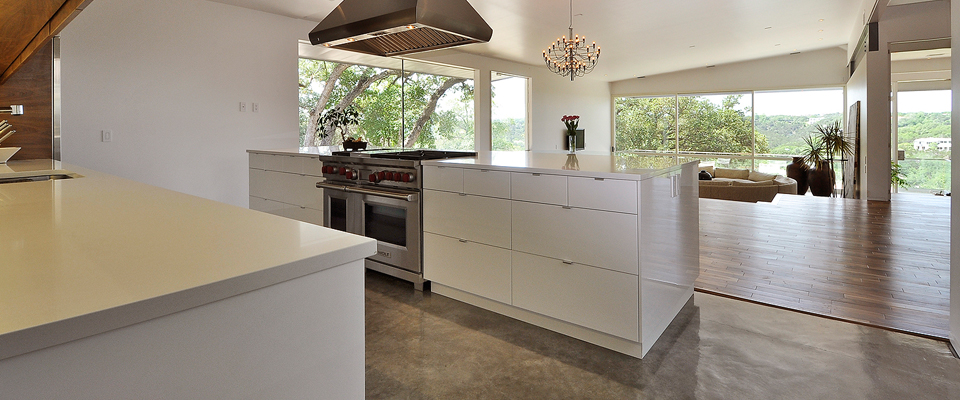
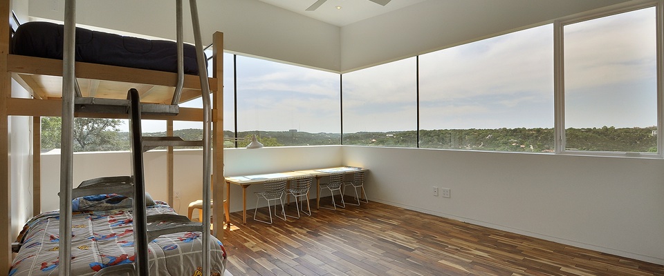
The 15 foot cantilevered volume off of the 2nd floor, housing the kids’ bedroom. Make note of the hints of the exposed structural steel throughout the house. See the rough stone hardscaping, and how it contrasts with the clean lines of the building. See my own designed custom window system. See the bathrooms. See the 14’+ kitchen island. Enjoy the views. Oh, and make sure to see the front door.
Grab your tickets to the Austin Modern Home here, and then check out some other designs by Sago International!
