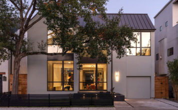
We’re about a week out from the Nashville Modern Home Tour on Saturday, November 3rd, and we’re ready to head back south after having spent the last several tours on the West Coast. This week, we sat down with David Baird and Marcelle Guilbeau of Building Ideas, LLC, a collaboration in which each brings their unique set of skills to bear in spaces that integrate architecture and interior design. We had some questions for the duo about 5007 Wyoming Ave. – their personal home, and a stop on next week’s Nashville tour!
Why do you think your architectural and interior design styles mesh so well?
Marcelle: David and I are “modernists” in a more general, easy-going way that you find more on the West Coast, where we both spent our youth. Instead of “form follows function”, you might say we think “proportion follows purpose.” “Proportion” being the outlay of time, money and space. And “purpose” being “what are your values, and what are you spending your time doing – what do you want/need to be doing?” So each project gets a fresh approach to the question of purpose. Therefore, we are “modernist” more in spirit (keeping to the purpose or value of something) rather than in conformity to a certain style. So both of us like to play with “traditional” – especially vernacular – forms, in our “modernist” work, especially as a sense of community and roots is so vital to the Nashville culture (we both grew up in the South). We also like to incorporate things we just think are healthy and good in this “modern” world, in all of our work – like natural daylight, connection to the outdoors/elements of nature, living spaces that allow for multiple functions – such as dining, relaxing, entertaining, etc.
Your company, Building Ideas, LLC, prides itself in sustainability, and you are among the first LEED-AP architects and interior designers in Tennessee. So cool! Can you tell us about some of the green/sustainable elements, both seen and unseen, that are part of this property, or any of your other projects?
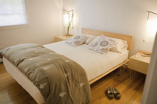
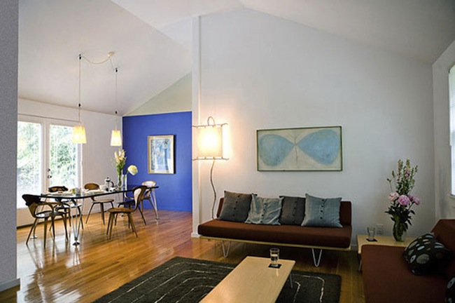
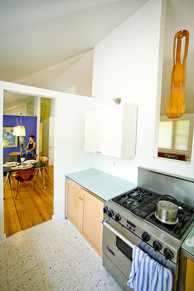
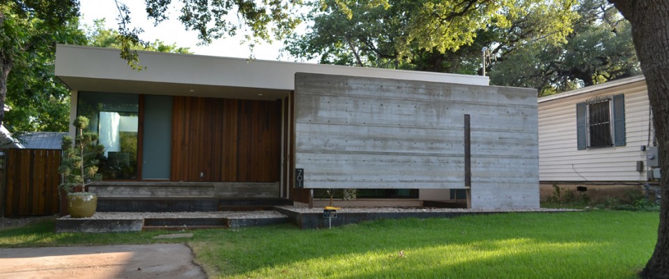
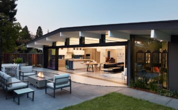
Marcelle: Well, on this “project” – our house! – you can see the most “low tech” and inexpensive forms of sustainability around: our house has a very small footprint, with very efficient use of space, being open plan and multi-function. The living, dining and kitchen spaces are open to each other, so whatever room you are in, you “feel” like you are a room the size of 2 or 3 of the rooms combined. The ceiling has been opened up, which also makes the house feel much larger. The bedrooms in the back have glass partitions at the tops of the walls, allowing one’s view to go all the way through the house, giving you a much “bigger” sense of space. So all this translates in a very small electric bill! Our house electric bill, for instance is the same size as that of our clients’ 9,000 s.f. LEED Platinum house – but for very different reasons! We have a small house with a very high efficiency (Energystar) conventional a/c unit; they have Geothermal heating and cooling and solar energy!
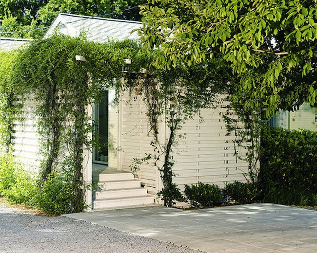
Our house does have one “sustainable” feature in common with our clients’ LEED house, though: recycling. In our case, the whole house has been “recycled” in that it was a ’56 Ranchburger which has been gutted and given a whole new life (except for the tub, which was also recycled). Our private studio in the back was also “recycled”: we kept our original garage footings and reused the original garage block to build its walls. On our clients’ LEED house, built on the site of their old house, we also recycled all of the brick cladding for its exterior, and we incorporated other recycled materials elsewhere, such as reclaimed wood flooring.
You’ve said that 5007 is like a “beach house without the beach.” What are some of the features that give it that breezy, relaxed beach house vibe?
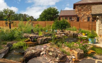
Marcelle: It’s really the relaxed, easy-going, nature-friendly flavor of this house. It is very simple and open – wide open to a very long and spacious back yard. It feels more like something you’d see in Venice Beach than in Nashville. They have perfected the art of the repurposed ranchburger out there, and we have a real affection for that “art form”, if you will. We also have a “zen” stone and pebble back patio, bordered by a bamboo hedge and a water pool; we also have a little enclosed front deck. We often have the doors open to the back patio and front deck, so I think this “breeziness” kind of feels a little beachy.
The house was built in 1956. Have you ever renovated it, or do you have any plans to? What would a renovation entail?
Marcelle: Although I have already accidentally answered that question, I would add: We do have plans for an “addition,” which would be a “box” added on to the back of this little ranchburger. Of course, the box would be a glassy and soaring little modernist jewel (that is our vision), but it would also preserve and respect the little “mod pod” ranchburger in its entirety. For some reason, we are really attached to it the way it is!
What are one or two features of that house that tour goers should be sure to keep their eye out for?
Marcelle: I think I accidentally answered that too! Notice how the glass partitions, partial walls, and tall ceilings create a sense of space that is as relaxing and zen as it is illusive. And also how the open views and doors to the back patio/front deck give that “breezy” feel.

