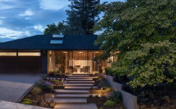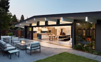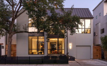
What do a modern residence in a historic neighborhood and a piece of fruit have in common? Quite a bit, if we’re considering the David Coleman-designed McGilvra Residence in Seattle, a stunning remodel that inspires delicious imagery to explore the relationship between interior and exterior. The home will be featured on this month’s Seattle Modern Home Tour, inviting tour-goers to literally step inside this metaphor and take a visual bite.
Located in Madison Park, one of Seattle’s oldest, most established neighborhoods, the home was originally built in 1907, its gambrel-roofed, Colonial-style exterior in keeping with the look and feel of the historic neighborhood. But the homeowner also desired a living space that reflected thoroughly modern tastes, prioritizing light, openness, and a connection with the outdoors. David Coleman’s solution was to restore the exterior to its former glory while designing a brand new interior within the existing shell.
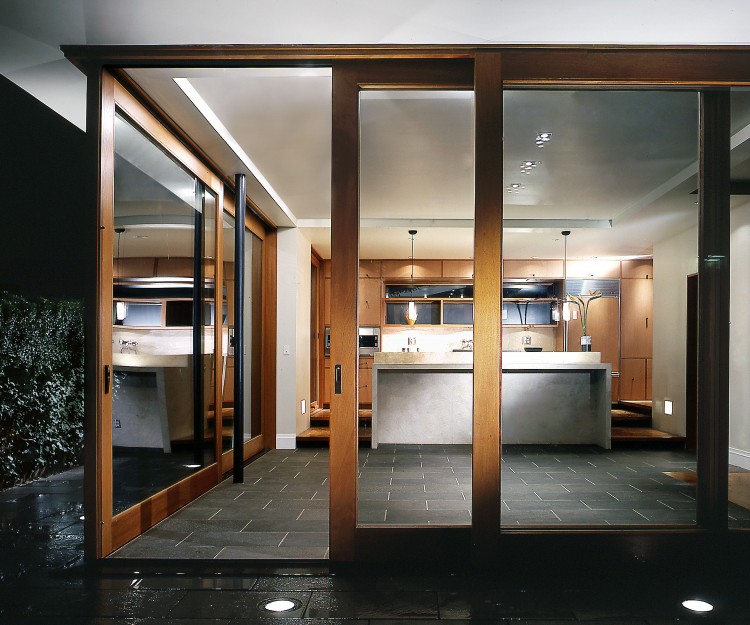
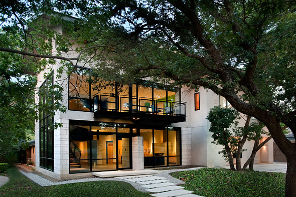
Emphasizing simplicity, material, texture, and details, the new interior both harmonizes with the existing exterior and offers a decidedly modern counterpoint. What results is a study in the relationship between “container” and “contained,” an interplay the architect likens to a piece of fruit. As David Coleman states, “Modern interior design elements are allowed to penetrate the exterior skin in several key locations, expressing the change that has occurred within and inviting a closer look.”
David Coleman took some time to chat with us about the McGilvra Residence. Don’t miss your chance to explore this home in person at the Seattle Modern Home Tour on Saturday, April 30!
Q&A w/ David Coleman
Your firm, David Coleman / Architecture, lets three primary themes guide your work: light, place, and time. How do those three tropes play out in this home?
Light – We carved an abundance of new windows into the restored shell of the old house to bring in light, open up views, and allow the interior rooms to expand out into the landscape. By doing this we transformed a “dark” house into a “light” house.
Place – New interventions vastly improved the original building, strengthening its sense of place and connection to the landscape.
Time – By opening up the old floor plan, with its maze of small rooms, this house “lives” modern. This, along with our decision to allow the new elements to stand in contrast to the old, create a building that clearly stakes a claim in the present while still honoring the past.

To describe the contrast between the home’s Colonial interior and modern exterior, the relationship between container and contained, you’ve come up with a very cool metaphor about a piece of fruit. Can you elaborate upon that?
In the US, most home openers believe that the existing “style” of their homes constrains them when considering remodels and additions. In the case of the McGilvra residence, we consciously decided to treat the exterior as its own unique statement, separate from the interior, which was to be decidedly “modern”. In this way, the fruit metaphor is apt – a kiwi or a pineapple looks very different on the inside than the outside, yet they clearly belong together. That is what we tried to do here.

How does this home embody your vision – or your client’s vision – of modern?
Visually and spatially, rooms are open to one another; light fills the interior spaces; views and physical connections out into the landscape are suggested; decorative and busy details are minimized in favor of clean, simple lines; the material palate is kept to a minimum.

What materials were you drawn toward using for this project?
Fossilized French limestone, plantation mahogany, blackened steel, glass.

Don’t forget to purchase your tickets to the Seattle Modern Home Tour on Saturday, April 30!
