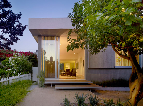
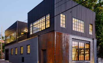
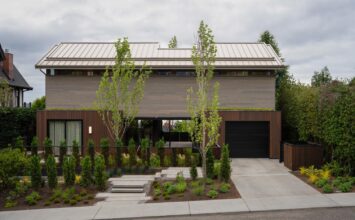
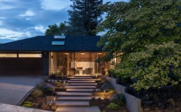
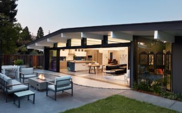
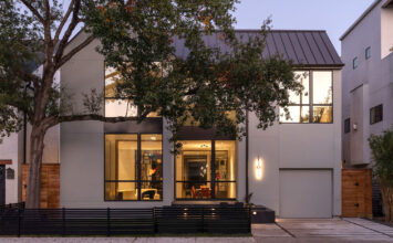
The Venice Modern Home Tour is only 2 days away! Here’s your last chance to get a sneak peek of one of the properties on the tour. This remodel, designed by Carson Architects, manages to maintain the original 1950 footprint of the house while still adding a fresh burst of life to the home. The theme of openness is rather prevalent in this home with almost every room dedicating at least one wall to be opened up to the exterior. This makes this 1,900 S.F. space feel much larger. We were able to chat with the home’s architect, Thomas Carson, AIA, to get a little inside perspective on the home.
1. What were some of the homeowners’ desires when planning to build this house? What were they looking for or envisioning for their home?
The homeowner loved the location of the existing house on one of Venice’s iconic walk streets but did not want to overpower the narrow walk street by building too much house.
2. How did you go about your designing to meet what they wanted?
I saved the minimum amount of walls required by the City of Los Angeles in order to qualify the project as a remodel and to keep the original one-car parking from the 1950’s house. To maximize the amount of outdoor space on the small lot, I designed every interior space to the outside thereby connecting the house with the walk street. The palate of materials was minimized to meet our budget so I used two different stucco textures for the exterior to create differing effects. Smooth white stucco was used for the tallest part of the building and the large overhangs. Grey combed stucco was used on other parts of the building which created a corduroy effect.
3. What was your favorite part about designing this particular home? What about a favorite feature of the finished home?
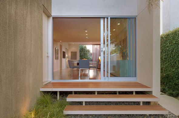
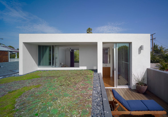
One of my favorite things about this house is its scale. This house feels much larger than 1,900 S.F. because of the way I connected each space to one another and the outdoor rooms. I also like the Master Bedroom which I designed as a sleeping porch. Two opposing walls open to the outside to allow breezes to float through the room and a green roof on one side creates a little meadow in the sky.
4. In general, do you have a personal favorite kind of room to design?
I like to design Bathrooms and Kitchens equally. Bathrooms are typically cold, closed-off spaces and I design them to feel more like living spaces full of daylight. Kitchens are the most important rooms in a home. Our days begin and end in the Kitchen so it is important that they are tailored to the client. I design Kitchens to be visually linked with the main living areas of the home, and I also work with my clients to determine how every square inch will be used in the Kitchen.
5. Is there a subtle, signature style that you try to include in each one of your homes that you design? If so, what would that style be like?
I am always working to simplify my buildings. I don’t want there to be anything there that isn’t necessary so I guess you could call it minimal.
6. What place do you think contemporary architecture has in a city like Venice?
Venice is a contemporary place and therefore very comfortable with modern architecture. Venice has always been a place for artists and experimentation, so the people that live here embrace “different” unlike most other places in the US.
To see more work by Thomas Carson and Carson Architects, check out their website here.

