A stunning transformation from dark and gloomy to bright and glorious is the theme of this Lost Creek renovation
For the second week in a row, we are bringing visitors through an exceptional remodel. This one features a living space completely transformed and redesigned by long-time, huge supporters of the Austin Modern Home Tour: Barley|Pfeiffer Architecture.
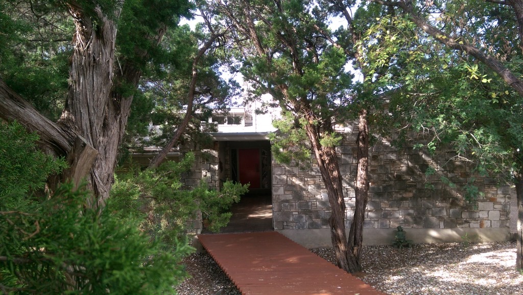
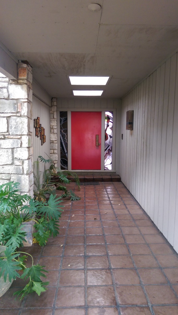
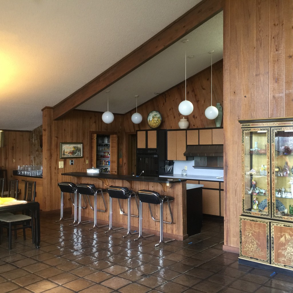
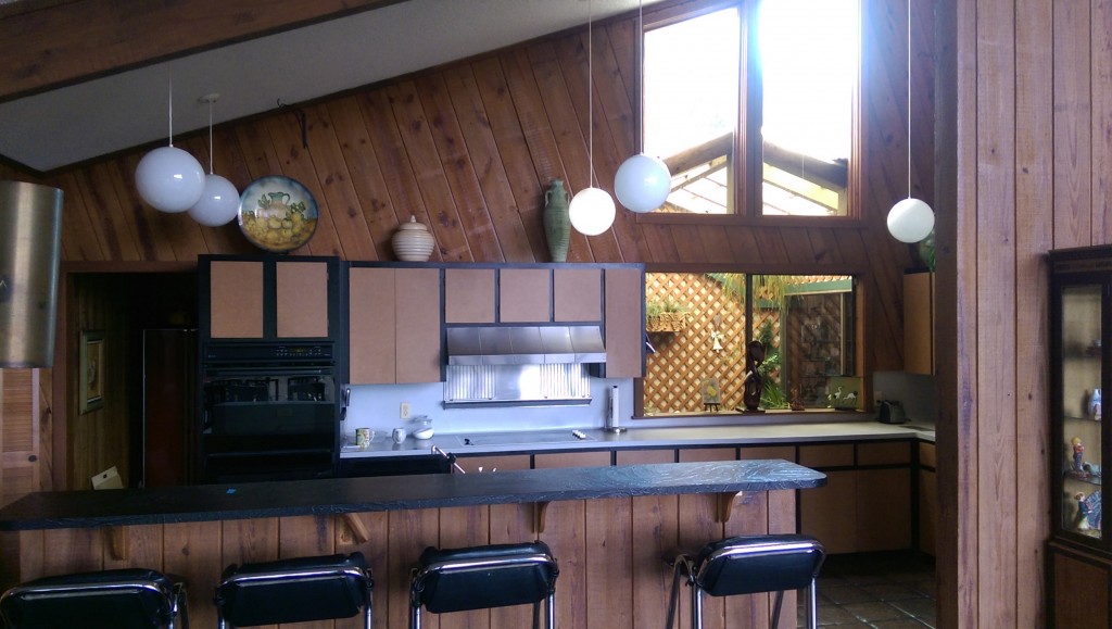
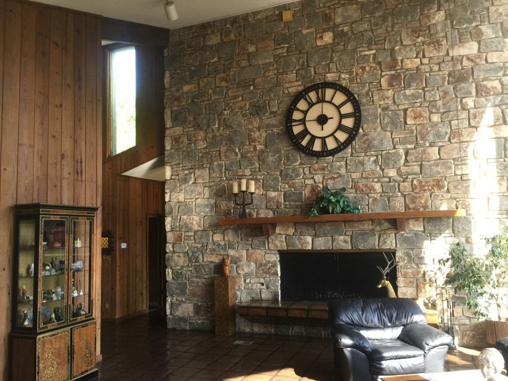
Built in 1978, the home was modern at the time, but had become outdated and felt dark inside. The house did have a standout feature: the home’s rear wall, comprised of floor to ceiling windows. Despite the natural light that was able to flow in, the general layout was a series of poorly lit spaces with no real connection to the outside. In addition, the windows and doors leaked both air and water, and the exterior walls had signs of deterioration.
Sharon Radovich, principal of Panache Interiors, had been hired to work on the home and brighten it up. She was asked to replace the windows and cure the home of the dark and gloomy atmosphere. After talking with the clients, Radovich recommended they work with an architect to properly update the residence. Barley|Pfeiffer Architecture and Oliver Custom Homes were bought on and tasked with transforming the home into a high performance, comfortable environment by changing the layout and maximizing its efficiency.
Barley|Pfeiffer went to work and quickly saw the potential. They set to take advantage of the building and remake the house, from the way it was perceived from street through the inside spaces. The plans turned the home into a more unified idea. But once the builder tore into the house, they found a lot of problems, e.g. the fireplace was not properly supported and there was significant mold damage due to water leaks. Because the home was outside of Austin when it was originally constructed, the builders were able to cut a few corners (a well-known practice of the time – it was even advertised as a benefit to developing in the area). Thus, the project quickly turned into a prime example of what architects call a “while we’re at it, let’s fix ___” job. If that was the motto of the project during construction, the finished home’s slogan could be: dark home sees the light.
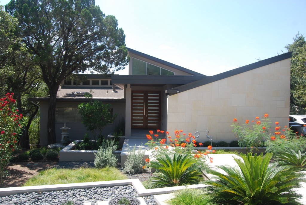
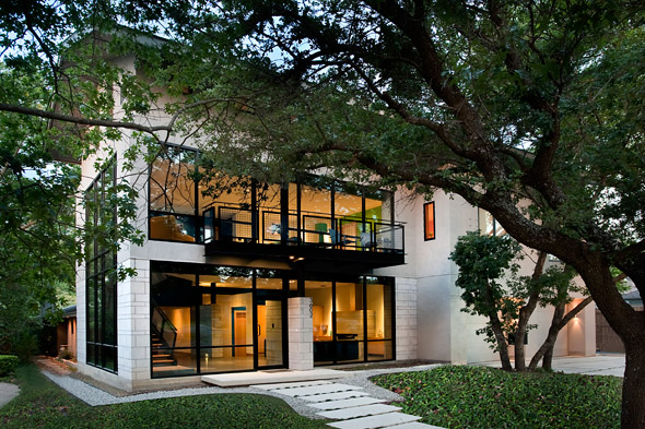
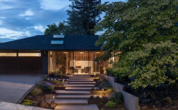
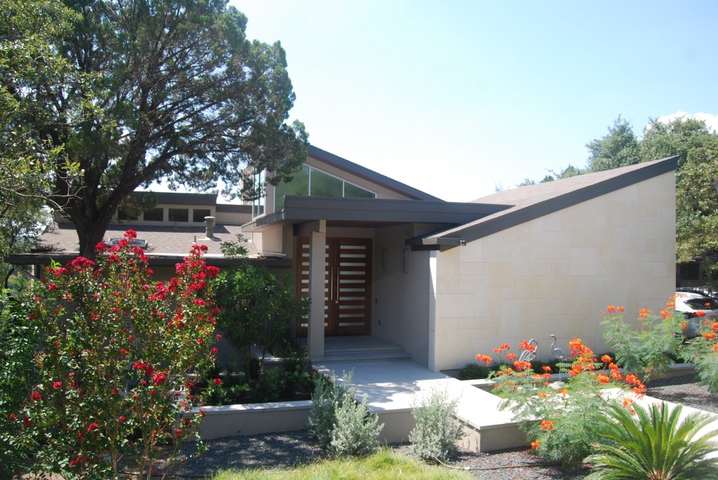
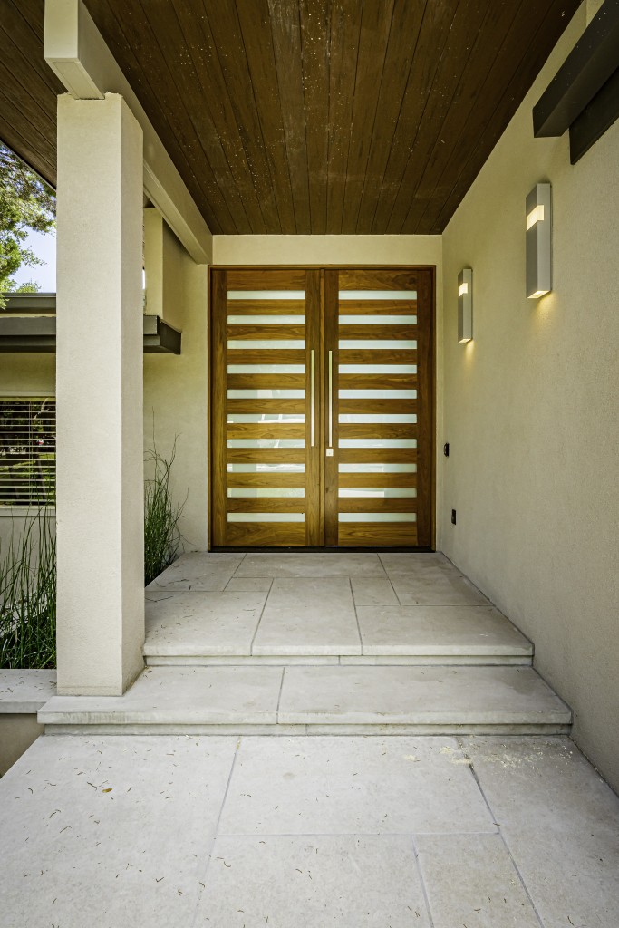
Upon arrival, visitors see a totally new, welcoming façade. The landscaping was reconfigured entirely: trees were trimmed back; weathered limestone veneer was replaced; planters were added. The front porch was updated, and the front door was brought forward to get rid of the dark tunnel-like entry. The new approach is open, illuminated, and positioned much better for the home’s street presence.
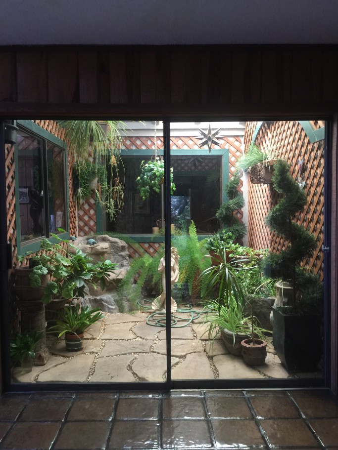
Before the update, after walking down the long, dark covered entryway, guests would step into a small foyer. An open atrium was to the right, and guests could walk into the open concept living area ahead. However, one really couldn’t see the space before walking into it because of the claustrophobia-inducing walls that were in place. On the other side of the seemingly-randomly-placed atrium was the family’s entrance from the garage.
With the front door moved forward, the volume of the entryway has been increased, not just in terms of floorspace, but also ceiling height. The ceiling slopes up to a peak of 20’. Windows have been added in the extended space above the front door to keep the new entrance well lit. The atrium has been incorporated and what was trio of compartmentalized areas is now one connected open space with custom case work and storage for dropping items and hanging coats upon entry – whether it be from the front door or the garage.
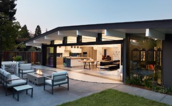
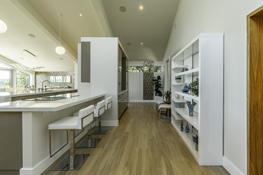
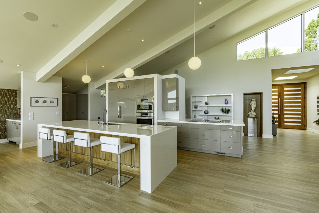
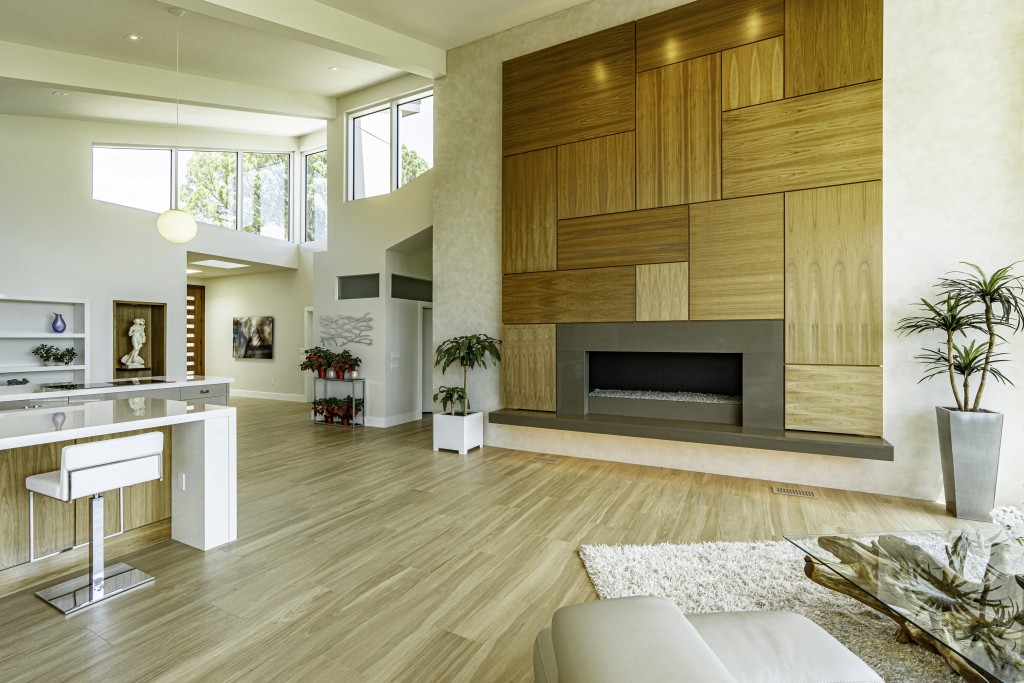
The kitchen walls were removed and now, from the new foyer, visitors can see the full scope of the home’s living space as soon as they walk in the front door. A few steps forward and guests move seamlessly into the updated great room that combines the kitchen, living room, and dining area. This redesign is absolutely stunning and there is a lot to take in.
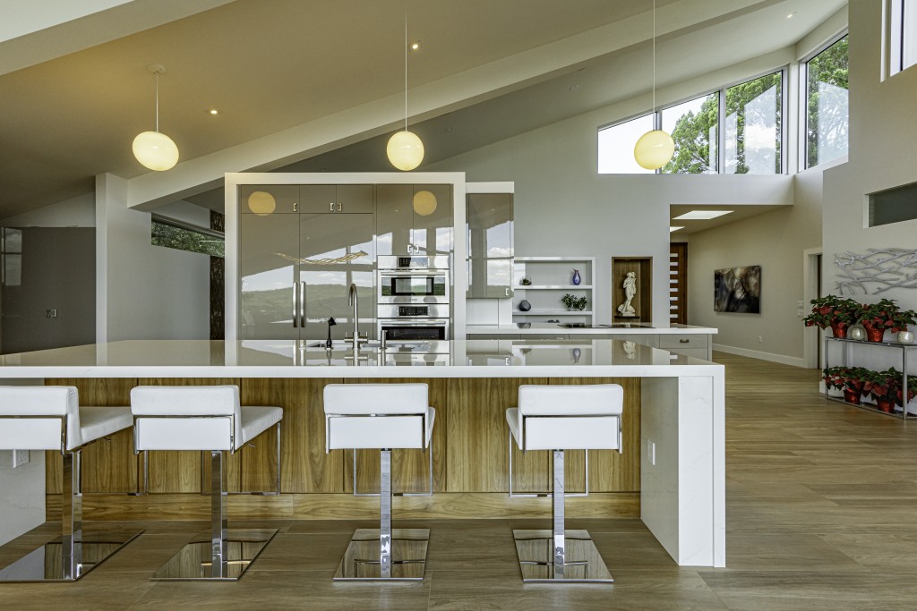
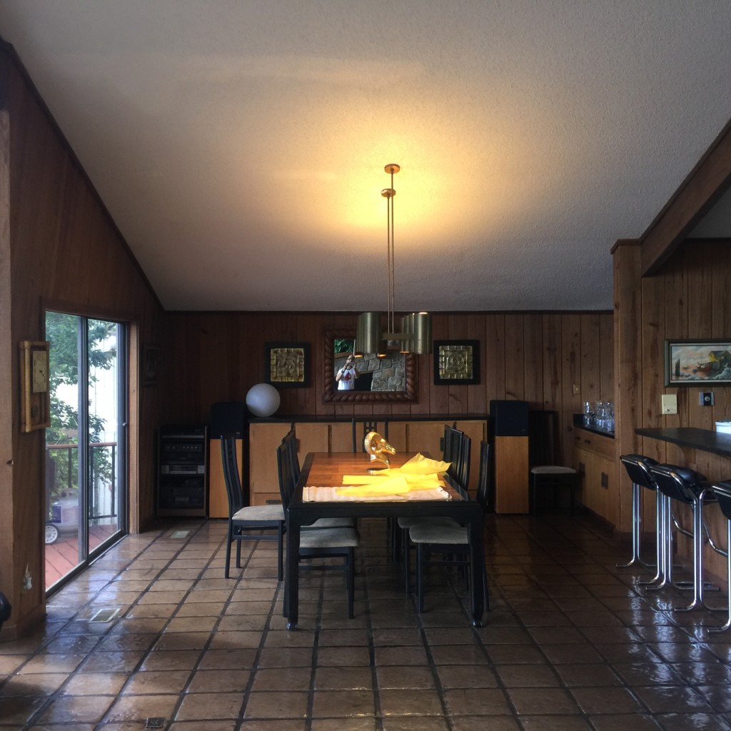
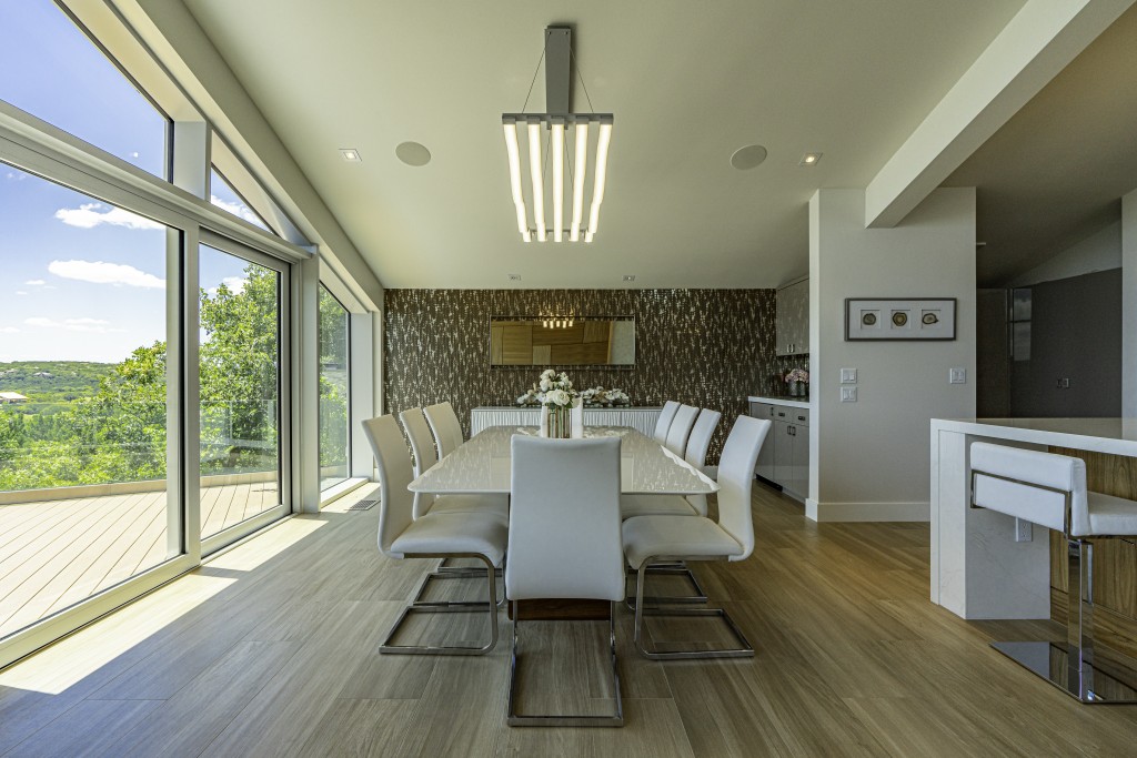
The roofline over the kitchen has not changed, but it has been extended. One of the interior walls that was taken down was structural, so new, longer beams were installed to provide the proper support. On the floor, the dark, Saltillo tiles are gone, and new, lighter wood-look ceramic tiles have been laid throughout the space. Since the kitchen walls were removed, the dark wood paneling went with it – for the remaining wall, everything has been painted in a white heron. Between those three elements (roof, walls, floor), the entire space is tremendously lighter and brighter – that is without considering the volumes of natural light that flow in.
The kitchen has been simplified and made more functional. The kitchen island has been enlarged and serves double duty, housing the sink and dishwasher, while also providing a place for the family to eat informal meals together. The single kitchen wall that remained holds the rest of the major appliances, and a walk-in pantry to the side keeps all clutter completely out of view. The countertops are quartz, cabinets are covered in a high-gloss UV paint, and in addition to the recessed LEDs found throughout the open room, the old glass bulb hanging lights have been cleaned and reinstalled to provide plenty of illumination with a touch of the previous design.
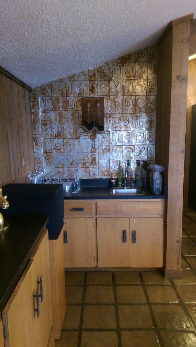
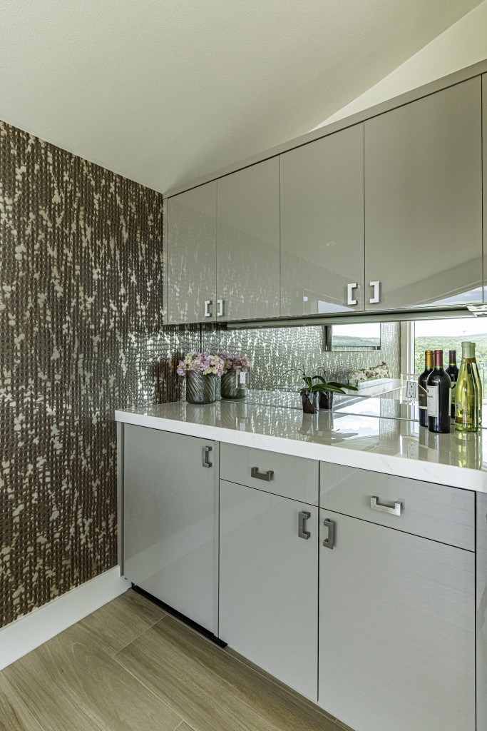
Adjacent to the kitchen, on the other side of the pantry wall, is the bar. While location did not change, the look, style, and general feel of the area certainly did. The sink has been removed in favor of more counterspace, and the cabinets have been updated and the storage space doubled. A mirrored backsplash helps make the space feel even larger. The abutting wall has been covered with a handmade wallpaper, a Laguna Bronze color/pattern, that beautifully complements the light brown floors and gray cabinetry.
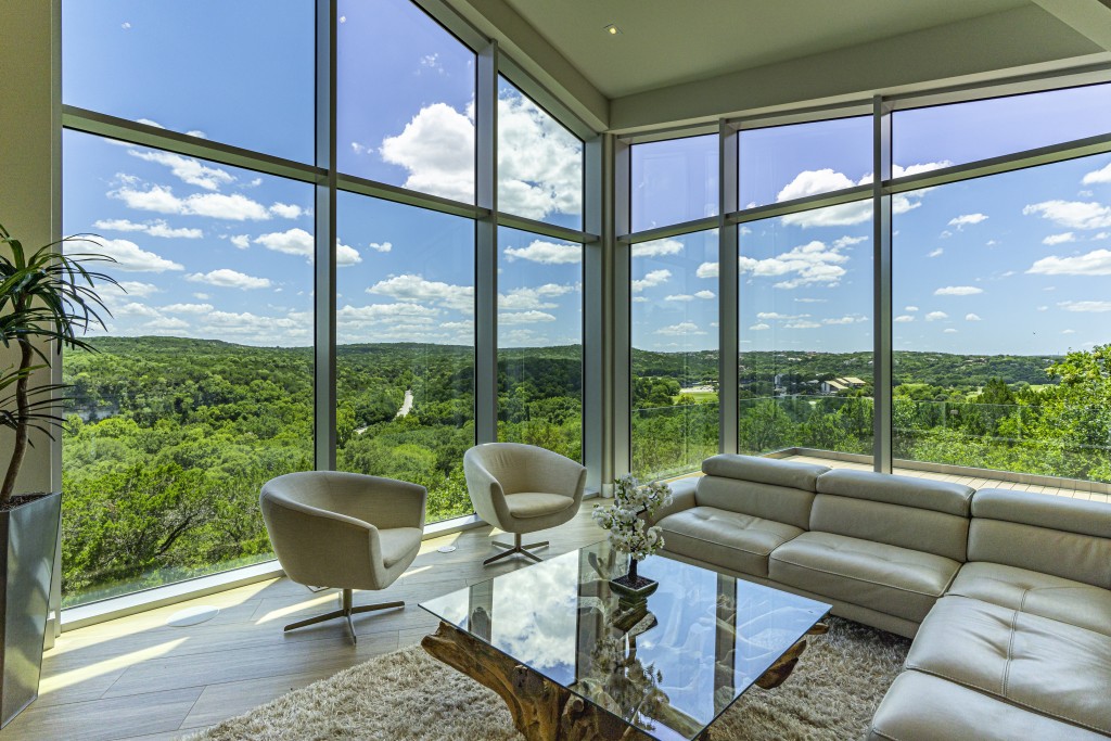
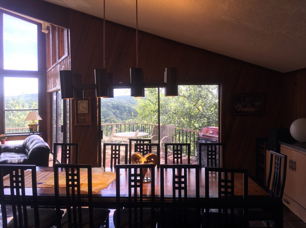
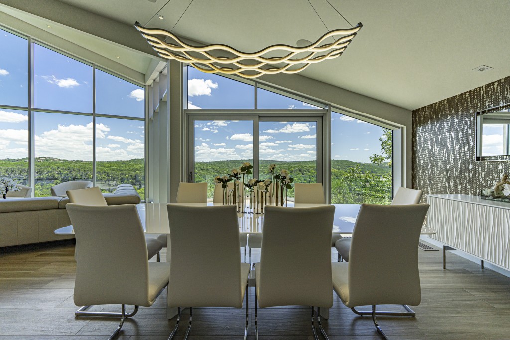
The bar technically sits at the end of the dining space, and thus, nearby is the new, very modern dining table that seats ten. Above, a modern custom designed light fixture bathes the area in soft light after the sun sets. The adjoined living room is open and luxurious, equipped with a sofa and armchairs that echo the modern style of the dining table and chairs. An area rug and coffee table round out the amenities.
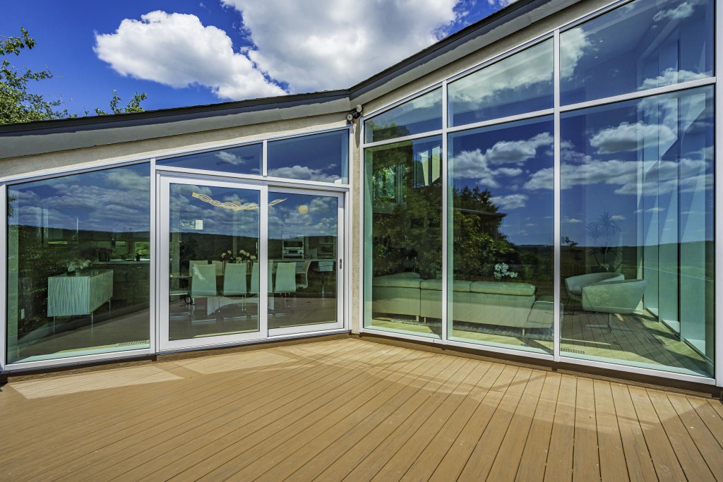
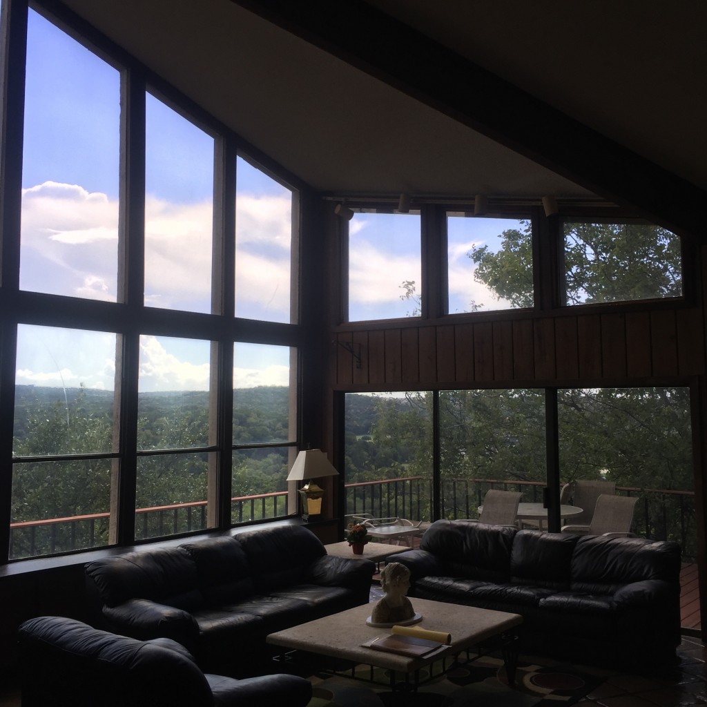
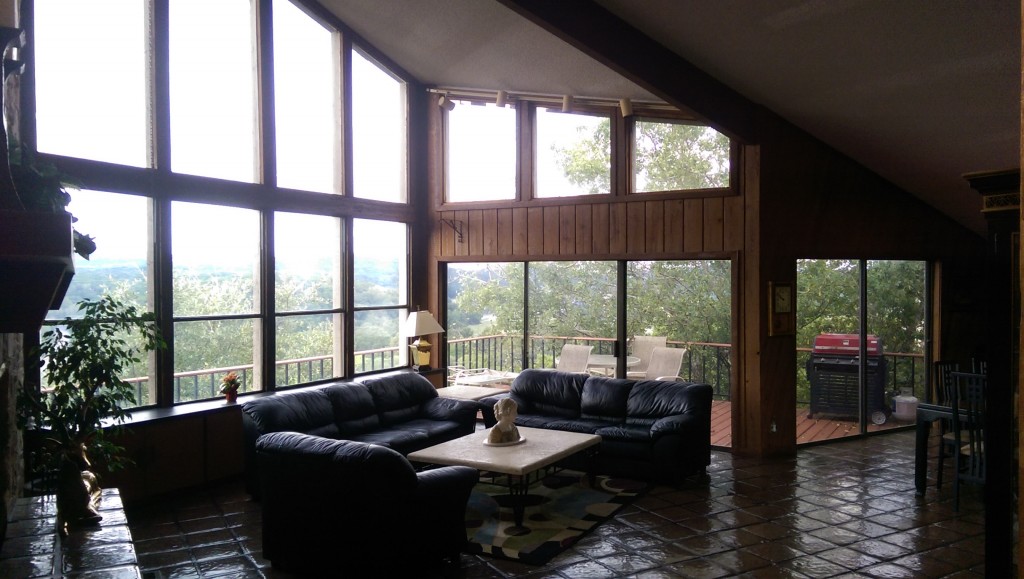
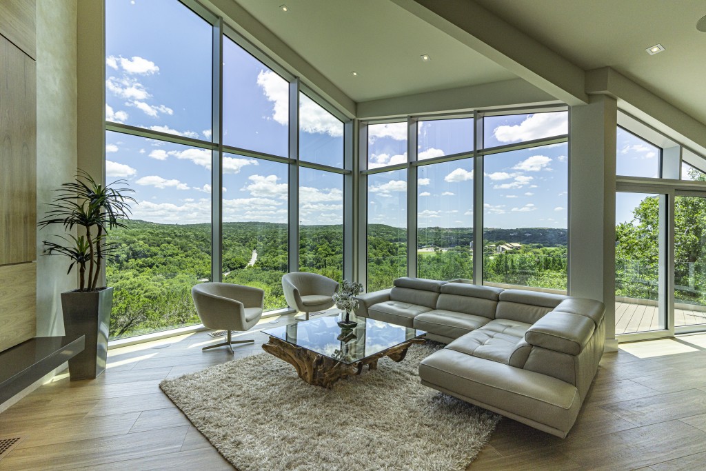
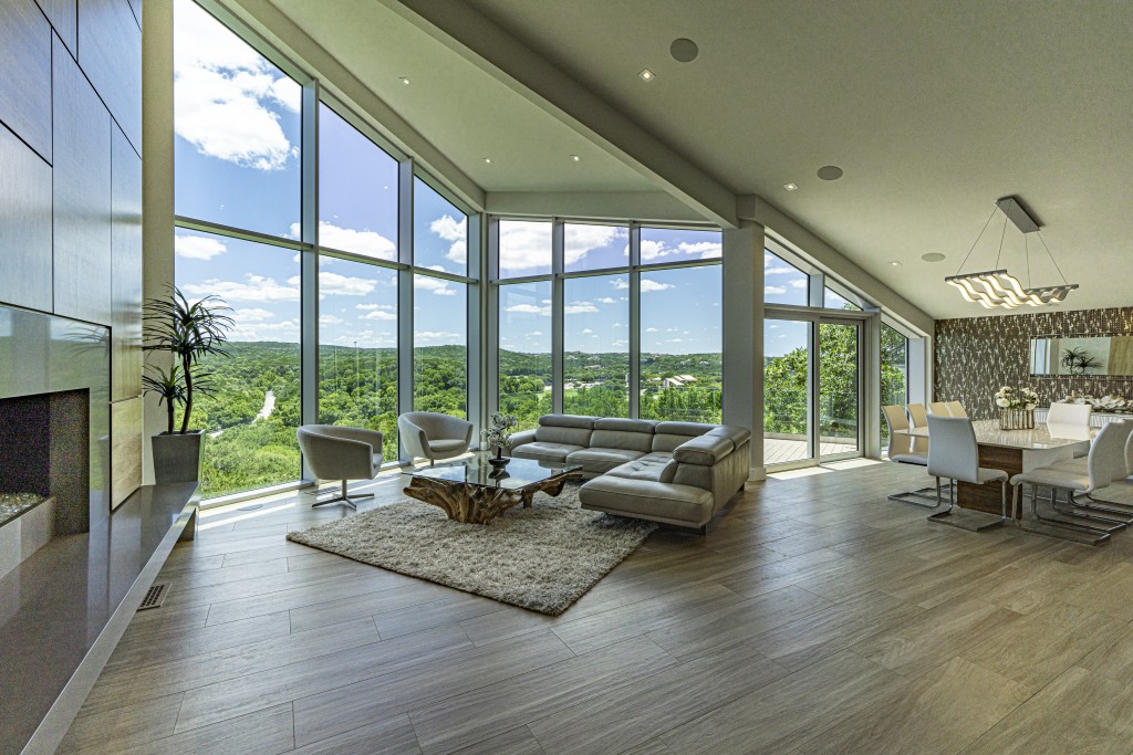
While the furniture is exquisite, they are hardly the centerpiece of this remodel: the giant window wall and fireplace really steal visitors’ gaze.
The home’s rear wall faces south-southwest and is exposed at the top of a cliff. As a result, the old wall (which was not built very well) was completely rotting and leaking. Barley|Pfeiffer installed a thermally broken aluminum curtain wall system. True curtain wall systems are usually more expensive than the typical storefront or generic window wall systems, but in turn, they offer a more robust solution for draining water. Given the large exposure to wind-driven rains, and the apparent history of water leaks, the investment was recommended and has proven to be worth-while. The home’s rear wall now holds up better against the elements and is much more energy efficient than the previous structure. And thanks to the expanded glass portion of the wall, natural light and spectacular views have been maximized. The aforementioned windows over the front door play an architectural role in balancing the light that comes in from both sides of the home.
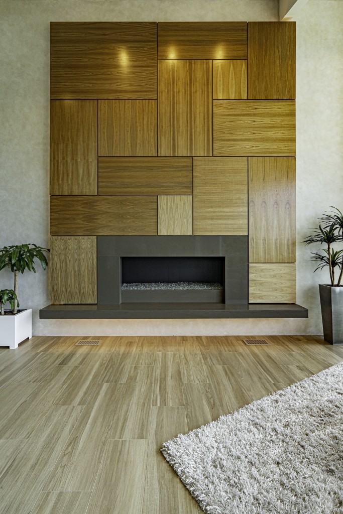
The fireplace wall was also completely redesigned and rebuilt; a mandatory task, considering it was not supported properly from the start. The wood burning fireplaced was replaced with a more efficient (and better for the environment) linear gas fireplace. The stone veneer wall was taken down and a new wall was constructed, featuring a hand troweled, highly burnished, venetian plaster with beeswax sealer. The fireplace is encased in a metal, which is also used as the hearth. This is surrounded by gorgeous walnut paneling. Indirect lighting (LEDs) under the hearth and behind the paneling create the effect of a floating fireplace wall. Quite stunning.
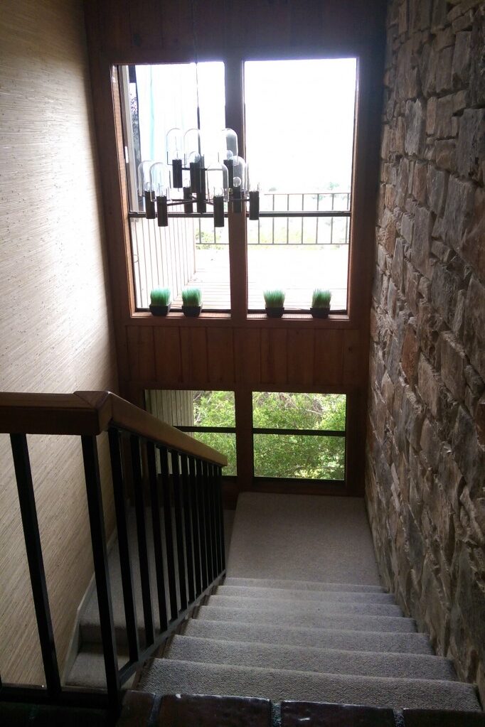
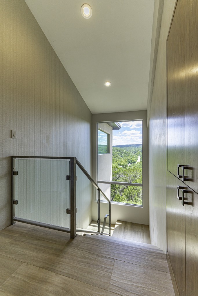
The new stairwell is lighter in color and brighter thanks to the larger window with unobstructed view.
The final area that received a remodel was not in the original scope of the project, but since they were fixing things… The home’s main stairwell, located on the other side of the fireplace wall, was redesigned and brightened like the rest of the home The stairs were rebuilt and covered with the same porcelain tiles to match the rest of the remodel. The old railing was replaced with a modern glass one, and the walls have received wallpaper treatment to brighten the space and add style consistent with the rest of the remodel. Finally, an elevated deck outside the stairwell’s window wall has been removed. This allowed Barley|Pfeiffer to open the wall, install a larger window, and maximize the natural light and that amazing view.
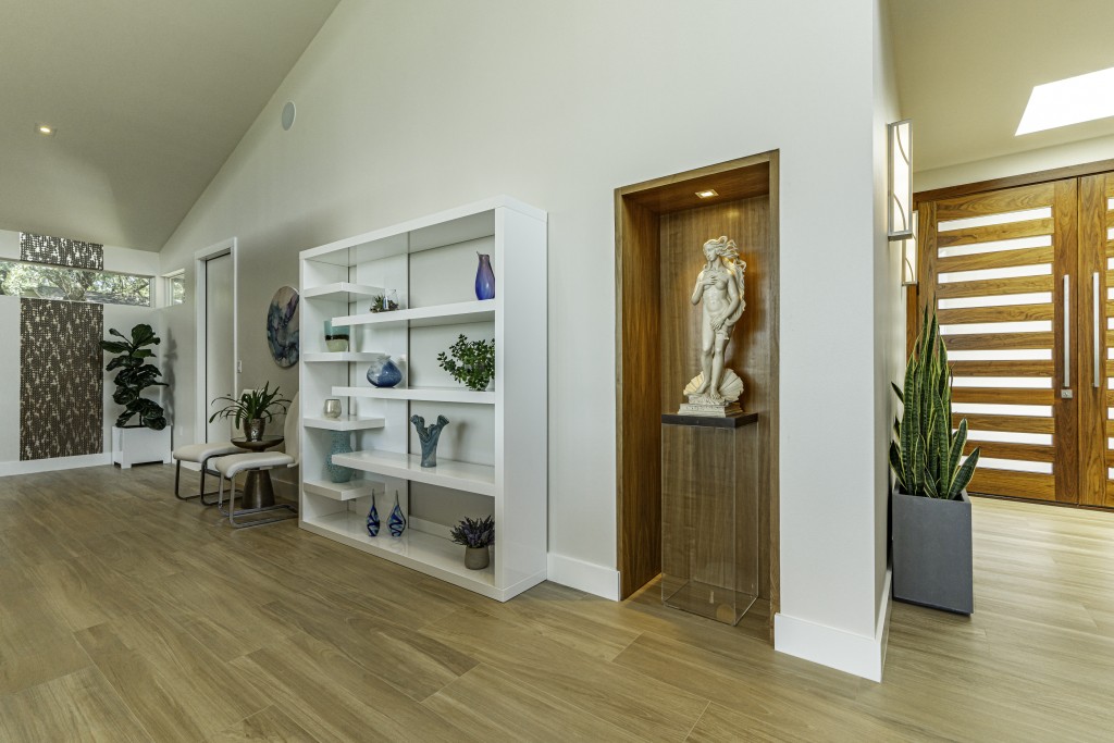
One last special touch to note, courtesy of Barley|Pfeiffer. The owners had acquired a statue of The Birth of Venus in their travels over the years and placed in the atrium, where it sat unappreciated. The statue has been given a special, new home: a carved-out niche in the new entryway. It now sits on a glass pedestal illuminated by a soft light. A gorgeous complement to the space.
Barley|Pfeiffer Architecture has consistently impressed us with their work. As frequent participants in the Austin Modern Home Tour, we have seen their remodels in person, and they are all exceptional. While the pandemic has put our in-person events on hold, we could not be happier to showcase this amazing transformation through before-and-after photos. Alan Barley, AIA and Peter Pfeiffer, FAIA are true masters of their craft (with quite a few awards to prove it), and this remodel is a testament to their expertise and skill. This cramped, dark, and gloomy home has not just seen the light, but is truly bathed in it.
Barley|Pfeiffer Architecture
Based in: Austin, Texas
Project Manager: Joel Effland
Interior Designer: Sharon Radovich, Panache Interiors
Contractor: Oliver Custom Homes
Photo Credit: Mark Adams Media
Project neighborhood: Lost Creek
Approximate Square Footage of Renovation: 1,200
Original Construction: 1978
Renovation completion: 2019
– Details and Finishes –
Wood (fireplace and cabinets): Pecan
Wallpaper (Dining): MDC Laguna Bronze
Wallpaper (Stairwell): MDC Rock Steady Uptown Cut
Dining Table: Modloft – Camden
Barstools: Calagaris – Even Plus
Paint: Sherwin Williams
Dining Room light: Modern Forms – Dream LED