A Passion for MCM – A Tour of Mid-Century Modern Homes Saturday, April 3rd
Tour the Homes in Live 3D!
Meet the Architects & Designers as They Guide You Through Our Livestream and Answer Questions -- LIVE!
Learn about mid-century modern architecture and design - direct from the pros keeping it alive today!
Sample 3D model from the 2020 Austin Modern Home Tour
A Passion for Mid Century Modern
- the Homes
Palo Alto Eichler
Klopf Architecture
Architecture: Klopf Architecture
Builder: Coast to Coast Construction
Landscape Architect/Design: Disceli
Photography: Mariko Reed
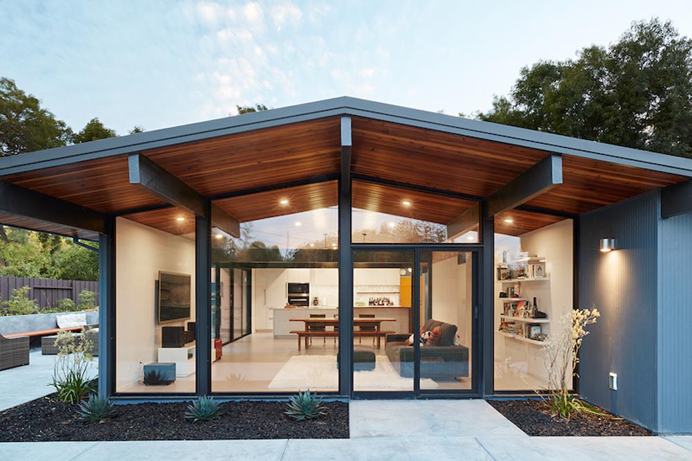
Klopf Architecture completely remodeled this once dark Eichler house in Palo Alto creating a more open, bright and functional family home. The reconfigured great room with new full height windows and sliding glass doors blends the indoors with the newly landscaped patio and seating areas outside. The former galley kitchen was relocated and was opened up to have clear sight lines through the great room and out to the patios and yard, including a large island and a beautiful walnut bar countertop with seating. An integrated small front addition was added allowing for a more spacious master bath and hall bath layouts. With the removal of the old brick fireplace, larger sliding glass doors and multiple skylights now flood the home with natural light.
The goals were to work within the Eichler style while creating a more open, indoor-outdoor flow and functional spaces, as well as a more efficient building envelope including a well-insulated roof, providing solutions that many Eichler homeowners appreciate. The original entryway lacked unique details; the clients desired a more gracious front approach. The historic Eichler color palette was used to create a modern updated front facade.
Durable grey porcelain floor tiles unify the entire home, creating a continuous flow. They, along with white walls, provide a backdrop for the unique elements and materials to stand on their own, such as the brightly colored mosaic tiles, the walnut bar and furniture, and stained ceiling boards. A secondary living space was extended out to the patio with the addition of a bench and additional seating.
This Single family Eichler 4-bedroom 2–bath remodel is located in the heart of the Silicon Valley.
Forest City Eichler
Klopf Architecture
Contractor/Builder: Keycon Construction
Landscape Architect/Design: Eleizer Napoles
Structural Engineer: Sezen & Moon Structural Engineering, Inc.
Photography: Sabrina Huang
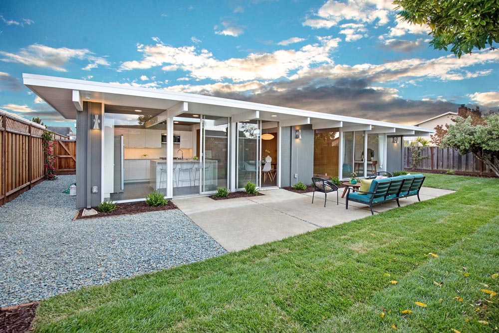
Joseph Eichler developed his moderately priced houses for the mass-market starting in 1949. His homes were designed using affordable materials and simple construction techniques. Nearly 70 years later these homes are in need of updating and remodeling an Eichler home today can become an imposing and costly project if you’re not careful. For this project the clients, who had undergone several previous house renovations, were determined to stick with an established budget from the beginning. Klopf Architecture helped them modernize their Eichler with a premium appearance on a reasonable budget.
The clients challenged the Klopf team to create a design that had a high-end feel and nicely done while adhering to their budget. That meant not all the initial project scope could be built. Like many other Eichler homes, the original floor plan did not meet the family’s needs leaving them feeling disconnected from one room to another. While an early goal was to expand the house into a carport and create a larger garage, it did not survive the contractor pricing phase of the project.
The goals that did survive through to the end of the project included blurring some of the boundaries and opening up some of the spaces, making them more functional and creating a smoother flow in the house. The Klopf team joined the former separate kitchen and formal living room into one large space and shift the dining room where it is now connected to the kitchen. Klopf swapped the family room to the front alongside the living room, so the spaces feel more cohesive and are now better suited for family activities. The functional layout of the master bathroom was changed to include a large, curbless shower.
Installing a complete IKEA kitchen including cabinets, countertops, appliances, light fixtures, and furnishings was key to staying within budget. Bath fixtures in this house are also exclusively IKEA. Klopf Architecture has designed many homes using IKEA products, which are quite compatible offering an affordable, contemporary take on Eichler homes. The clients saved additional money from the simplicity and availability of IKEA products and by orchestrating the orders and purchases themselves. Following each construction meeting, the clients would make a run to IKEA and purchase items, pick up needed spare parts, and bring them back right away to stay ahead of the contractor’s schedule and minimize the chance of delays and bottlenecks.
Klopf balanced material selections by retaining some of the original woodwork and simply refinishing the mahogany paneling. They were able to retain the original windows and sliding doors which were still in good shape, avoiding some of the costliest replacement expenses. Additionally, interior doors were simply refinished, and the exterior siding cleaned up and repainted. Formerly dark interiors are now illuminated with new slimmer semi-recessed lighting eliminating the need for costly roof work.
Attention to design details allowed the Klopf team to ensure the house ended up with a high-quality feel. Key visual elements were strictly aligned and Klopf worked with the clients to select a unified materials palette throughout the spaces, so the house flows seamlessly together. Aligning the tile layout with the trusses and keeping it level with the concrete slab outside allowed them to achieve a level of quality that may otherwise be missed.
The clients were able to keep their budget on track by determining clear goals and making critical decisions upfront, choosing materials and furnishings wisely, working with the right design and construction teams in place and to a large part, their willingness to participate throughout the process. In the end the clients were much happier with their reconfigured Eichler home and Klopf Architecture managed to keep their remodeling costs to about $325/sf – a good amount below the average Bay Area Eichler remodel.
9 Wilder Lane
LJStudio 209
Developer: New Century Modern
Architect: Studio Gunn
Contractor/Builder: Novak Construction
Specialty Firm 1: Precision Media
Lighting: Colorado Concept Lighting
Wilder Lane is brainchild of Curt Stedron of New Century Modern homebuilders. This innovative development in the suburbs of Denver, CO, features 24 individually unique homes that bring back the tradition of true mid-century modern style with 21st century design and construction. The development has its roots in the first modern communities dating back over half a century to the 50’s, when home builders acted on an “impulse to build in harmony with the progressive social, technical, and aesthetic promise of Modernism” (David Fixler, Hipsters in the Woods).
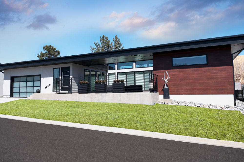
Two Wilder Lane homes will be featured in this virtual home tour. The first is a perfect Mid-Century Modern home with an open floor plan and an abundance of ceiling volume and natural light. The interior space showcases an outdoor courtyard which features soft seating and fire pit table. The home features 2210 square feet on the main level with a large basement with two bedrooms and a large work-out area benefiting from the 12-foot ceilings. The home also features an art studio used by the owner, Lance Jackson. Jackson has collected mid-century furniture for our 40 years and 9 Wilder Lane offers the perfect stage for his passion for design. A designer, business strategist, and abstract painter for more than four decades, Jackson’s own highly sought original artwork also features prominently throughout the home.
For Lance Jackson, dramatic, original art, classically designed furniture and an abundance of natural light are all essential. He selected all of the home’s finishes, lighting, and colors to visually integrate the home and create the perfect environment for his art and furniture collection. He designed the outdoor area to augment and compliment the gallery-like interior of the home. Featuring bronze sculpture by Kevin Robb, the courtyard reinforces the inherent partnership between contemporary architecture and contemporary sculpture.
9 Wilder Lane lives like a gallery and feels very much like home.
19 Wilder Lane
The Roybal Corporation Architects
Architect: Roybal Corporation Architects
Developer: New Century Modern
Kitchen and Bath: Mountain High Appliances
Millwork: JK Concepts
Lighting: MH Lighting
Windows: Weather Shield
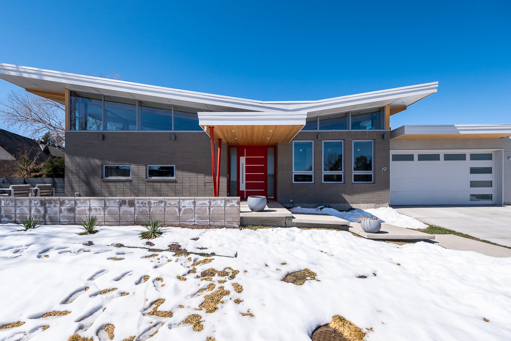
LET THERE BE DAYLIGHT! The beauty behind the Mid-Century Modern (MCM) architectural vernacular is comprised of several unique characteristics, but none more essential than the introduction of daylight and the connection to the outdoors. The Roybal Residence bravely captured this concept by utilizing a classic Butterfly Roof that introduced clearstories and daylighting into every living space throughout the entire house. Consequently, the interior of the house is bathed with daylight and established a direct connection with the expansive sky that reflects the myriad of time of day and seasons of the brilliant Colorado skies.
While you are in the house, the deep connection with the outdoors provides for an ever-changing interior landscape. In the winter season, the overhang was calculated to allow for the warmth and penetrating sunlight to heat the interior and provide for a feeling of warmth and comfort. In the summer, the deep southern overhang protects the harsh direct sunlight from penetrating into the living space, thereby creating a cool and temperate living space.
The home was ideally situated on the site to allow for all the living spaces and kitchen to be oriented to the southeast and southwest. An expansive covered patio is ideally positioned to create an indoor/outdoor experience in any weather. Large glass doors provide a direct connection to the exterior. The interior spaces are all positioned on the site and solar orientation to maximize privacy and daylight into each space.
The Butterfly Roof created a sweeping dynamic roof line. The clean and simple lines of the house amplify the simplicity of the façade and interior floor plan. The interior of the house continues to reflect the clean modern lines of a Mid Century Modern Home. The Great Room reflects an expansive open plan with clean lines reflected in the butterfly roof structure consisting of exposed glu-lam beams spanning the entire 40 feet of the space. The interior spaces reflect a commitment to simplicity and clean architectural lines to define each space. The integration of modern furniture compliments the simplicity and cleanliness of the Mid-Century Modern era.
We invite you to explore and experience a truly unique home that reflects to beauty and simplicity of the Mid-Century Modern era.
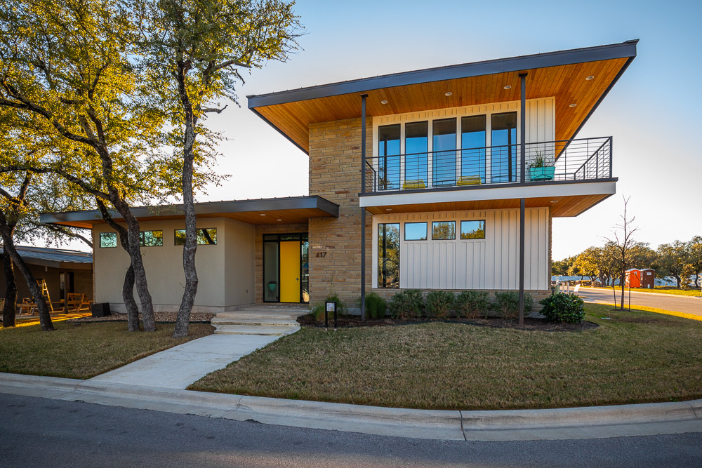
Starlight Village I
Contractor/Builder: Starlight Village
Just a few miles northwest of Austin, TX, nestled in the hills, is Starlight Village. This gorgeous development fuses all the excitement and flair of Mid-Century Modern architecture with 21st century floor plans and amenities. It’s the place “where Mid-Century cool meets 21st century living.
Starlight Village II
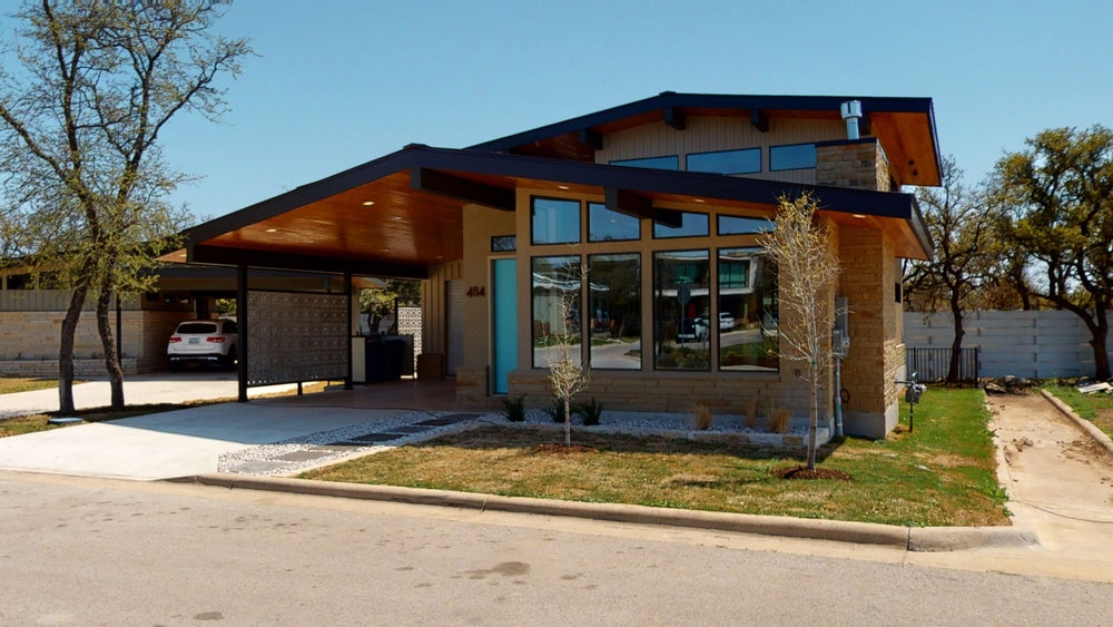
Contractor/Builder: Starlight Village
Just a few miles northwest of Austin, TX, nestled in the hills, is Starlight Village. This gorgeous development fuses all the excitement and flair of Mid-Century Modern architecture with 21st century floor plans and amenities. It’s the place “where Mid-Century cool meets 21st century living.
The Best Experience Ever? Here's How It Works.
We’re here to let you know we’ll be conducting our 2021 Modern Home Tour Series with a combination of in-person 360 virtual walkthroughs – see example at top – combined with realtime LIVE interactions with you, the tourgoer, the architects and designers that created these beautiful spaces, and the homeowners that live in them (if available).
What does this mean for you? Well, a few things, actually…
- The ability to “visit” those extra-special homes that the owners might not want open to hundreds of people…
- Shorter hours and less stress on Tour day…
- The chance to revisit your favorite projects long after Tour day to refresh your memory, look at a favorite detail again, or check out that inspiration piece when you upgrade your own space.
- Talk to the architects live on Tour day, and get answers to your specific questions as we all look at the property together.
- And more!
We like the idea so much that once things are back to normal, we expect to continue using the lessons we’ve learned to make our live Tours even better with bonus content and additional virtual homes… but let’s not get ahead of ourselves…
Ready to Tour? You know what to do