The Bay Area Modern Home Tour
A LIVE Virtual Event on June 26th, 2021
Tour the Homes in Live 3D!
Meet the Architects & Designers as They Guide You Through Our Livestream and Answer Questions -- LIVE!
Sample 3D model from the 2020 Austin Modern Home Tour
The Homes of the Bay Area Modern Home Tour
Feldman Architecture
Architecture: Feldman Architecture
Photography: Adam Rouse
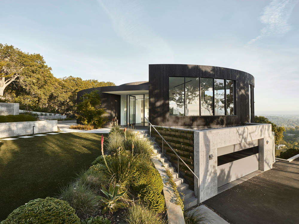
Tucked away in the Los Altos hills, the aptly named Round House is a geometrically unique structure; one of a few similarly shaped homes built in California in the 60s. The clients fell in love with this quirky circular house and initially had the desire to remodel. Soon after moving in, the pair recognized the inefficiencies of their new home. The low window eaves curiously obstructed the otherwise spectacular views, spurring their desire to revamp and modernize the property. Owner and architect saw the opportunity to further its true design potential and the original remodel evolved into a beautiful enhancement of its sui generis form.
Perched atop a precipitous site, the building has 180-degree views with a deck that runs around its perimeter. The original central courtyard, once open-to-sky, becomes the kitchen – an appropriate gesture for an aspiring baker and a family that sees the kitchen as the heart of the house. A large circular skylight streams daylight into the kitchen with its custom curved casework.
From the main entrance, visitors can effortlessly progress through the living room, kitchen, and spacious deck, before circumnavigating the house via wrap-around walkway. A concentric hallway drapes around the kitchen leading to discrete pie-shaped rooms – carefully arranged, demarcating the private from the public. A cuneate outdoor deck is strategically carved out at the intersection of the Great Room and kitchen – framing unparalleled views of the Bay. Tall pocket doors from both spaces vanish into the walls, asserting a strong indoor-outdoor connection. The more modest perimeter deck allows outdoor access from all the bedrooms, while curved landscape walls radiate outward merging into softscape.
A Japanese style of charred wood siding, called Shou Sugi Ban, and seamless concrete floors in combination with hardwood floors add warmth and richness to an otherwise minimalist interior. Due to the challenges of its circular form, the project team had to look for creative solutions in each aspect of the venture. Most conventional solutions favor straight geometry, which made for a refreshing intervention that is an honest response to the constraints of this unique project.
Gustave Carlson Design
Architecture: Gustave Carlson Design
Photography: Laure Joliet
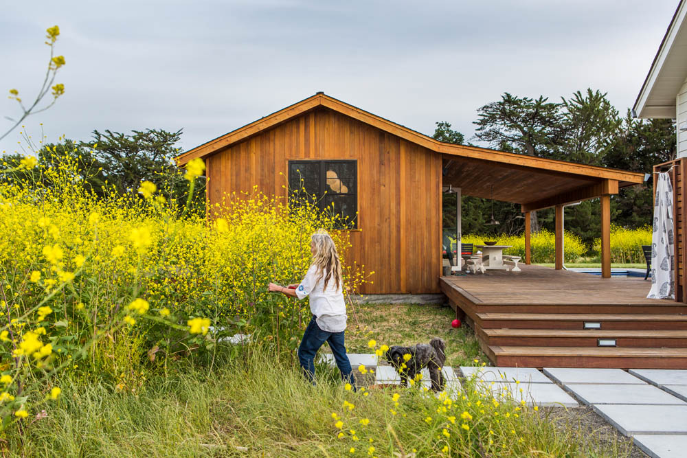
The Mocabee house and studio barn sit humbly on the vineyard view landscape. The exterior of the house is western red cedar siding, and the studio barn is white clapboard. The home has a long front façade where all the rooms circulate to the outside so each occupant could leave their room and walk outside across a large deck and enter back into the shared communal living and kitchen space. The house is used primarily as a second home in the summer. The deck allows for the house to feel like it floats above the wine country landscape.
The house is modern in feeling, with a warmth of linen white painted wood walls and 16-foot ceilings. The experience of living in the house is almost like camp or a bunkhouse. I wanted to highlight this element of California living, this organic way of living between the inside and outside within your daily experience. The ipe wood deck gives a sense of expanded square footage with this interior and exterior flow and borrowed views of vineyards and mountains.
The house has a particular restful feeling, placed in the center of a 4-acre property. The relaxed open plan is conducive to entertaining several people or only a few, reading a book quietly on the landscape and borrowed vista of the Mayacamas Mountain range. The barn studio which is accessible by the deck is used for my wife Caroline Seckinger for artwork which is featured in the house.
Historically the agrarian building typology is built over different time periods. The house, the barn, the guest house, the garden shed may appear in their own time creating a unique flow of human traffic and land usage. Buildings will emerge as they are needed. During COVID, we have placed a new, small studio shed art gallery on the property for painting.
DNM Architecture Inc.
Architecture: DNM Architecture Inc.
Photography: Joseph Schell
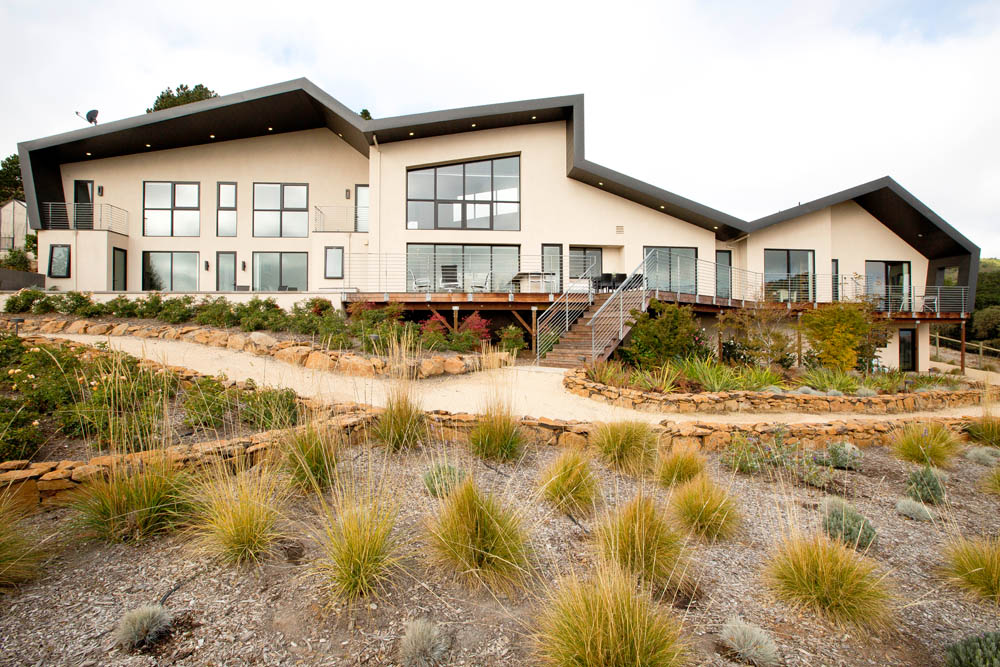
Set into an east-facing hillside overlooking Sonoma, this custom house focuses on view, ventilation and controlled solar access. Its orientation respects contours and neighboring views while optimizing ventilation. It has been awarded an exceptionally high 180 points in the Green Point Certified House program and employs structural insulated panels (SIPS), insulated concrete forms (ICFs) and other passive and active strategies that minimize air conditioning to about 8 days for the entire year. Through its first ten months of occupancy, average total daily energy used – including all heating, cooling, lighting, and hot water – was 57KwH, of which 33KwH was supplied by solar energy. The net purchased energy was an extremely low 25KwH!
Each design decision affects function, aesthetics, and livability. The folded metal roof recalls Sonoma County’s rolling hills while maximizing south facing surfaces for solar collectors and rainwater harvesting. The shallow depth maximizes views and cross-ventilation from afternoon ocean air. The architects simulated airflow through the house during the design and made adjustments to ensure no dead-air spaces would be built. Polished concrete floors provide a zero-maintenance finish and thermal mass to modulate temperature swings.
Age-in-place strategies for the retired clients start with organizing almost the entire house on a single level. Two 5-foot square stacking closets are prepped for a future elevator, doors have lever handles and are sized at major spaces to accommodate a future wheelchair. An attached dwelling unit can be converted into a future care giver’s apartment.
Foundations are constructed using ICFs to temper the crawlspace and minimize heat transfer from above. The building shell is constructed of SIPS, which provide a tightly sealed and insulated shell as well as save time and labor during framing. The exterior doors and windows are thermally-broken aluminum with tinted argon-filled dual glazing. Landscape irrigation is primarily fed by four 5000-gallon rainwater harvesting tanks that store rainfall collected from the large metal roof, radically reducing water consumption.
Klopf Architecture
Project Team: John Klopf, Geoff Campen, Angela Todorova, and Yegvenia Torres-Zavala
Photography: Mariko Reed
Klopf Architecture designed and Van Gelder Construction built a new warm, modern residence to replace an existing ranch home. The owners, who previously lived in a Streng home (similar to an Eichler), liked clean lines, simple details, and openness to the outdoors. The site is a large plot in a semi-rural area surrounded by an open field, large oak trees, and a seasonal creek. It is a calm environment that invites a close connection with the house. The house is a 3-bedroom, 2.5 bath, and 2,633 square foot that is intended to be the home this couple will live in for a long time.
The goals of the project were direct and indirect connections to the surrounding environment and the interior. The house sits in a calm and natural environment. The clients’ primary goal was connecting their indoor living spaces to nature in all parts of the house. The Klopf Architecture team responded by designing a wide plan for the house that allows the main living space, bathrooms, and master bedroom to open up to natural views at the rear. Then Klopf put large sliding doors along the rear of the master bedroom and the main living area to provide direct and expansive access to the outdoors.
It was important for the house to sit lightly and keep a relatively low profile out of respect for neighboring houses and the natural feel of the area. Clearly this meant designing a single-story home. Additionally, the Klopf Architecture team sloped the roof to be at its lowest in the front and open up to the rear. This was intended to create a humbler appearance from the front of the house while still engaging the rear of the side as much as possible.
This area gets quite hot in the summer. In response, Klopf designed the house to feel comfortable and still be energy efficient year-round and throughout the hot summer days. In the beginning of the day when the sun is low and direct in the front of the house, the couple can open their rear sliding glass doors or live outside on the rear decks. In the middle of the day when the sun is more overhead from the south, the extra deep overhangs and shading devices in the rear patio allow these spaces to be used comfortably. At the end of the day, when the sun is blasting the rear of the house, there is a patio area in the front of the home that is in shade, but still bright because of openings in the roof. Despite the harsher sun and climate in the area, the outside environment can always be experienced comfortably.
The design team employed a number of energy efficient strategies to make the interior environment comfortable and efficient. In addition to in-wall insulation, a continuous layer of rigid insulation was applied to the exterior walls of the house (and sealing house wrap and tape) to lower the heat gain. High performance and low solar heat gain glass at the main exposures of the house also reduce the potential heat. A “cool roof” metal roof was used to reflect much of the direct sun and heat before it can heat up the house. The windows are all thermally broken aluminum (Fleetwood and Milgard), which are much more energy efficient than older aluminum windows. In addition to these defensive strategies, to save even more energy the Klopf Architecture team specified high efficiency heating and cooling units and almost all LED lighting.
While natural wood siding looks great, it wouldn’t last long under the harsh sun conditions in Orangevale. In response, the Klopf team specified high recycled content composite siding (Tru-Grain) that maintains its look without maintenance much longer than wood possibly could, along with some smooth white stucco to visually separate the main living area. On the interior, the main living space has an exposed concrete floor with composite counters, and white oak cabinets. The bedroom wing uses reclaimed white oak flooring from Blackwood Farm. The owners wanted a different feel between the main living area and the bedroom wing (the bedroom wing is more for rest while the living area is a lot more active), so Klopf varied the materials to some extent. That said, in order to preserve the feeling of flow, Klopf kept many material connections between the two areas.
People often ask about challenges during demolition and construction. The house project started as an option between tearing down and replacing the existing home and renovating it. The owners originally decided on a renovation, but during construction Sean van Gelder, the builder, discovered that the slab and foundation were too damaged to keep. At that point everyone shifted gears and turned the project into a new house design. The climate (heat) that was certainly a challenge as well. The Klopf Architecture team had to be extra cognizant of the sun angles and also had to carefully design the house for minimal heat gain in the envelope given the high level of openness desired.
The owners are a husband and wife with grown kids. They were looking to create a space for their family to relax outside of their jobs and ultimately retire. They are both very creative in their respective fields (he is a TV producer, and she is a chef with her own restaurant). They brought their collaborative creativity to the design process for the house.
The Sacramento new residence is a 3-bedroom, 2.5 bath, and 2,633 square foot that is intended to be the home this couple will live in for a long time.
Timeline Design+Build
Photography: Dean J Birinyi
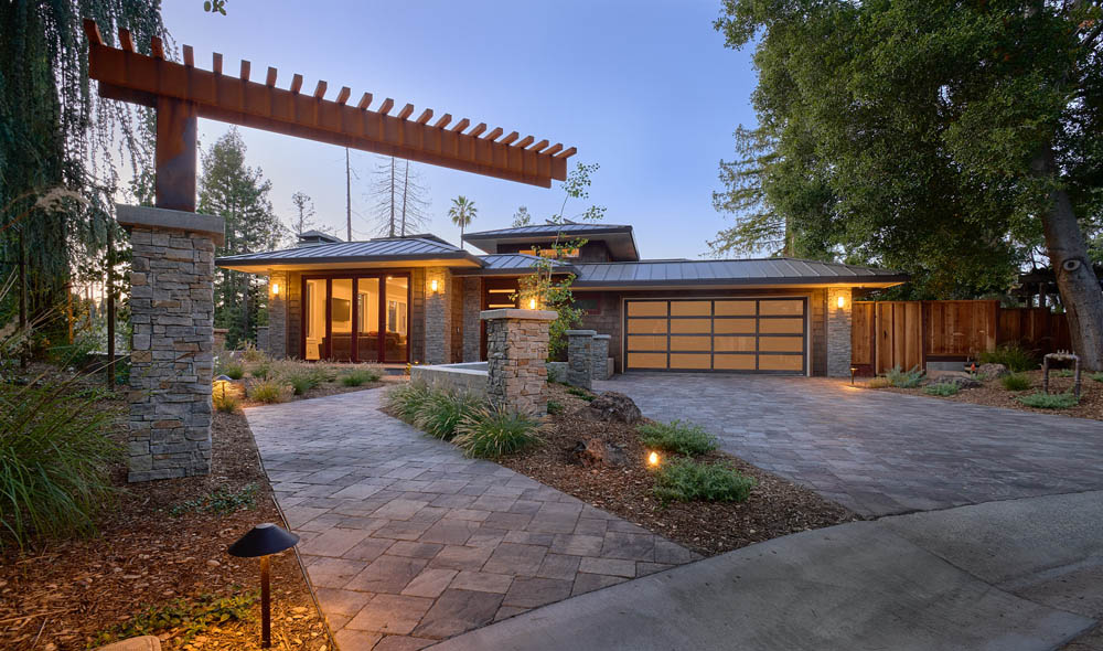
This astonishing prairie style home was inspired by Frank Lloyd Wright’s Robie House in Chicago. The home also draws inspiration from the client’s passion for nature photography, which leads to a design laced with beautiful wood elements inspired by the National Forests they’ve visited.
The use of elements such as recycled glass in the shower area, and Cambria natural countertops, help weave in the home’s more rustic, natural feel. Features such as broad windows, ample lighting fixtures, and illuminated bathroom mirrors add brightness to the home.
Andrew Morrall, Architect
Architects: Bernard Tong and Andrew Morrall
Photography: Jean Bia, Konstruct Photography
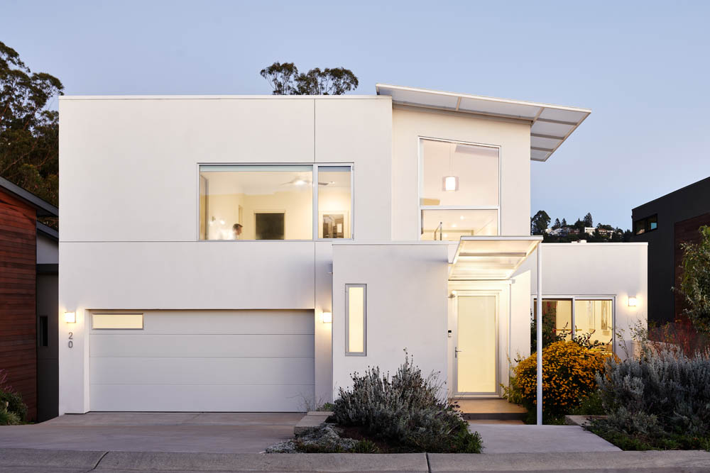
This is a much smaller custom–designed home in the Oakland Hills with the integration of a large workspace and Design Studio.
The house was designed and built by 2 Bay Area Architects in the Oakland Hills. Efficiency of design and budget were the focus for creating the Architect’s own relatively small, affordable home and work studio. Comprised of 1,246 square feet of living space on 3 levels, and a 274 square foot work studio on the lowest level, the emphasis was to create an expansive design, despite the relatively small size of the house. Open floor plans on all 3 levels and balconied spaces overlooking and flowing into each level create a home that feels much larger than it is.
A main design feature is a center galleried space displaying artwork by one of the Architects. It acts as a fulcrum of the design that can be viewed from any room in the house. The central galleried space has 3 large, tiered skylights with high U value polycarbonate panels extending to the exterior eaves that shade the house.
Environmental Features include expansive Solar Panels, Less Heating and Cooling due to the small Roof and Footprint allowed by the Stacked Design, high density eco-friendly insulation, Low E glazing, LED lighting throughout, and Drought Resistant Landscaping. Zero commute by keeping the workspace and Design Studio within the home.
The Best Virtual Experience Ever? Here's How It Works.
We’re here to let you know we’ll be conducting our 2021 Modern Home Tour Series with a combination of in-person 360 virtual walkthroughs – see example at top – combined with realtime LIVE interactions with you, the tourgoer, the architects and designers that created these beautiful spaces, and the homeowners that live in them (if available).
What does this mean for you? Well, a few things, actually…
- The ability to “visit” those extra-special homes that the owners might not want open to hundreds of people…
- Shorter hours and less stress on Tour day…
- The chance to revisit your favorite projects long after Tour day to refresh your memory, look at a favorite detail again, or check out that inspiration piece when you upgrade your own space.
- Talk to the architects live on Tour day, and get answers to your specific questions as we all look at the property together.
- And more!
We like the idea so much that once things are back to normal, we expect to continue using the lessons we’ve learned to make our live Tours even better with bonus content and additional virtual homes… but let’s not get ahead of ourselves…
Ready to Tour? You know what to do