The Vancouver Modern Home Tour
A LIVE Virtual Event on September 25th, 2021
Tour the Homes in Live 3D!
Meet the Architects & Designers as They Guide You Through Our Livestream and Answer Questions -- LIVE!
Sample 3D model from the 2021 Austin Modern Home Tour
The Homes of the Vancouver Modern Home Tour
Madeleine Design Group
Contractor: Rain City Homes
Exterior Design Drawings and Landscape Design: KASA Design
Photographer Credit: Janis Nicolay
This gorgeous older home was completely updated throughout with an ultra-modern design and aesthetic.
The client wanted an extremely modern design brought into their older home that was full of family history. They did not want a minimalist design, per se, but needed clean, contemporary lines, a bright and open atmosphere, and lots of windows to showcase the view. The challenge for Madeleine and her team was helping the client visualize the desired ultra-modern aesthetic incorporated into the older, existing home. Once the client was able to envision the modern design, a connection was made and pieces started to fall into place, helping the client “see” a final result during the build phase.
A new, gorgeous living space greets all who enter the front door. The living room, dining area and kitchen all share the open floorplan, connected but well defined in their own spaces. Beautiful oak floors run throughout the home and a raised second floor gives the ceiling new height and makes this space feel enormous. A combination of floor-to-ceiling and oversized windows bring in immense amounts of light from all sides.
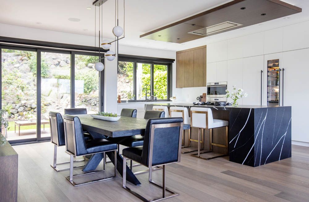
In the kitchen, Madeleine reworked the entire floorplan, making it more functional for the adjoining living room. The centerpiece is a kitchen island with a black (Eternal Marquina) marble waterfall countertop and integrated cooktop. The refrigerator, freezer, and dishwasher are all paneled in white to match the surrounding cabinetry and back-wall countertops, providing that ultra-modern look.
Rift sawn oak is found in three places to bring splashes of color and tie the kitchen together: a set of cabinets near the windows, the ceiling drop over the island (which also houses the cooktop vent), and behind the kitchen island at the legs of the three informal dining chairs.
Giant windows above the sink bring in tons of light while cooking and all appliances are Midland. Sliding glass doors open to a back patio, perfect for quiet evening meals or a cup of coffee in the morning.
In the living room area, a new gas fireplace has been installed, encased in a beautiful marble slab. Sliding glass doors open to a front porch, which – when left open on a nice day – help extend the living space to the outdoors.
The entire home underwent transformation in every room. The main floor powder room has been turned into an elegant, modern washroom with a gorgeous stone tile accent wall and large circular mirror. A new home office has built-in storage (stained oak) and a desktop made of the Eternal Marquina marble. And downstairs in the basement, the clients now enjoy a comfortable home theater with reclining theater seats.
The home’s main staircase has also been rebuilt. The treads are a lighter-stained, white oak and a glass/metal railing system helps the tall windows bring tons of light into the stairway.
Upstairs, the master bedroom’s ceiling has been vaulted and stained oak soffits run through the floor-to-ceiling windowed wall to the outside. The view is absolutely spectacular with the opened design.
The mater en suite has been completely moved and is now an oasis for relaxing, equipped with a double vanity, towel warmers, large soaking tub, and shower lined with walls of Eternal Marquina marble.
The final touch to the new, modern home is the relaxing roof deck. The client was adamant about this feature and for good reason – it offers an absolutely stunning view of the bay and a personal space for often-needed peace and quiet.
The “Locarno” project is a fantastic example of Madeleine Design Group’s expertise put to work. Their ability to take an old house with lots of family history and transform it into a warm, stunning, modern home, while simultaneously helping a client envision an end result during the build. Each room is different, but there is a story that goes through the entire project, giving the client a new chapter in their family home.

Synthesis Design Inc.
Architecture and Interior Design: Synthesis Design
Contractor/Builder: Antrim Builders
Kitchen and Bath: International Cabinets
Photographer Credit: Tina Kulic
Villa Vertigo was built on a small steep sloped waterfront site deemed un-buildable with no allowable building footprint. Synthesis Design was ready to take on the challenge of designing a modern summer residence on this difficult site.
“Villa Vertigo” was born! Villa Vertigo is home to Lynda and Curtis Krahn, principals of Synthesis Design, and located at Madeira Park on the Sunshine Coast.
This seaside home is inspired by simple geometry and a shifting of planes in plan. The form began with two 20 x 20-foot squares and an 8 x 20-foot offset rectangle dividing them. These planes also shift vertically as they stagger and are carved into the steep slope.
The street elevation is understated; the entry butterfly roof is the only indication of what is beyond.
Upon opening the oversized fir door, one is greeted by an uninterrupted view of the ocean beyond. The offset spine shapes the entry and features an open riser, three storey staircase that projects out over the floor below and is completely enclosed in glass, framing the view. This feature staircase is a recurring reminder of the dramatic site as one traverses the three levels.
Villa Vertigo is a reverse plan with the entry, kids cave and playroom on the top floor, the main floor is divided between the living room and kitchen, and the bedrooms are below – directly accessing the water via a cantilevered concrete deck.
The sundecks are designed for outdoor living and are an extension of the kitchen and living rooms which can be accessed through respective overhead glass garage doors. When the garage doors are open, and they often are, there is a blurring between inside and out that literally doubles the living spaces. The exterior hammock spans the living room deck and is attached to both of the fir columns making it one of the most sought-after places to relax. The hammock has the added bonus of straddling the line of inside and out, making conversations on either side natural. The decks are connected via an aluminum grated bridge that wrap around the glass stair cube.
The lowest level bedrooms open up to a covered, cantilevered concrete deck, with direct access to the hot tub and ocean below.
The sloped exterior stained hemlock soffits utilized in the six-foot overhangs is continued inside creating a visual connection from outside in. Painted pine on the flat ceilings adds a touch of warmth and coziness.
The interior walls are finished to exacting standards with a ¼” aluminum reveal between all individual wall panels and designed to align with window and door openings. These panels also allowed the use of a negative ¼” aluminum reveal instead of rather than baseboards or casings, which required the framing to be within a 1/16” tolerance.
The mid-level is an open space, linked with an open single metal stringer stair which creates dynamic shadow patterns throughout the afternoon and evening. The kitchen is centered around a 200-year-old fir slab seating eight, and also forms the meal prep area. Home to many casual meals, the kitchen also doubles as a battleground for some pretty rousing matches of UNO!
The fir “cut out” slab that allowed for the sink in the kitchen also houses the puzzle table that often sees 3,000-piece puzzles in various forms of completion.
The interior design creates an open, casual elegance and promotes a sense of togetherness.
A color palette of grays and white enhances the casualness, while creating a backdrop for the colourful vibrant blue and orange accessories.
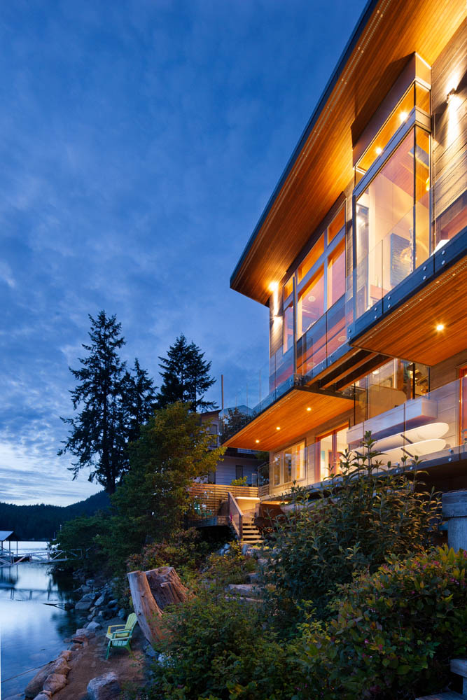
While understated from the street, Villa Vertigo exposes itself from the waterfront. The roof opens up to the view in the opposite direction to the slope of the land creating an even more imposing façade than its 3 three levels. Glass makes up most of the seaside elevation with uninterrupted views from every level.
Originally Lynda and Curt sought out a small, musty cabin retreat but ended up with Villa Vertigo. Plans change and designers change their minds; but there are no regrets! As a “happy place” for Curt and Lynda and their son Cole, it is also a welcoming place for family and friends who often create their own adventures.
Sustainability Features:
- The maple stairs, fir beams, columns, doors, casings and trims, and cedar that are featured, were cut and milled on the Sunshine Coast.
- Insulated concrete forms were also used to increase the insulation within the structure.
- Pressurized sewage treatment plant creating clean water as a by product
- HRV heat recovery ventilation unit to heat the cool fresh air and cool the exhaust air for maximum efficiency
- Heat pump to reduce heating and cooling energy
- Operable skylights in the stair core allow for natural ventilation throughout the 3 levels
- 2 double overhead interior rated garage doors that maximize the light and ventilation through the spaces.
- Built in mechanical shades that reduce heat and sun transmission while maintaining air flow and a walking path around.
- Adjustable sail shades to reduce heat transmission form the western exposure
- Cementitious exterior cladding for reducing spread of fire

Frits de Vries Architect Ltd. + Marrimor Interiors
Architecture: Frits de Vries Architect Ltd.
Interior Design: Marrimor Interiors
Contractor/Builder: MKL Homes
Landscape Architect/Design: Grandin and McIntyre
Structural Engineer: Ennova Structural Engineers Inc.
Photographer Credit: Ema Peter Photography
Situated on the tidal flats of Centennial Beach, the Boundary Bay Residence was originally conceived and realized by locally renowned Architect Daniel Evan White in 1990. A master of balance and the interplay between shape and form, the unassuming modernist architect, who began his career under the mentorship of Arthur Erickson, was responsible for hundreds of residences up and down the West Coast of Canada.
Boundary Bay Residence was bought by our clients in 2015 with a view to sensitively remodel the home. Frits de Vries Architects + Associates (FdVA), in close collaboration with interior design firm, Marrimor Interiors (Marrimor), sought to resolve the Clients primary objectives of enhancing the street presence and clarifying entry sequence; developing exterior living areas to refine relationships to the site; and building envelope remediation. Respecting Dan White’s original geometry and architectural language, a new approach to detailing and planning resolution was brought to the project. The house, now thoughtfully refreshed by FdVA and Marrimor, provides a bright, joyful space reflective of its new owners.
The design teams’ work sought to build upon Dan White’s commitment to geometrical consistency which drives the architectural language of the home. Indoor and outdoor spaces were held in equal regard, to the extent that those delineations are constantly blurred.
Along with its unassuming massing, the home unapologetically closed itself off to the public, turning its back to the street. Guests were presented with an ambiguous entry which, if navigated successfully, brought them through the six-car garage to the front door located within. Occasionally new guests would confuse the side yard gates for entry doors and wander mistakenly around the home.
Paring back the extensive screening unveils the layered massing of the home and opens a conversation with the street. Movement into the house is now carefully choreographed. The new entrance sequence transitions guests from the street to the heart of the home. Behind the custom designed front door, now visible from the street, a spectacular new 30ft x 9ft skylight floats over the length of the new entry passage. The slow transition of the re-imagined entry reinforces a gentle decompression and calm assimilation to the interior. As part of the entertainment deck above, the walk on skylight often gives an early glimpse of life within the home.
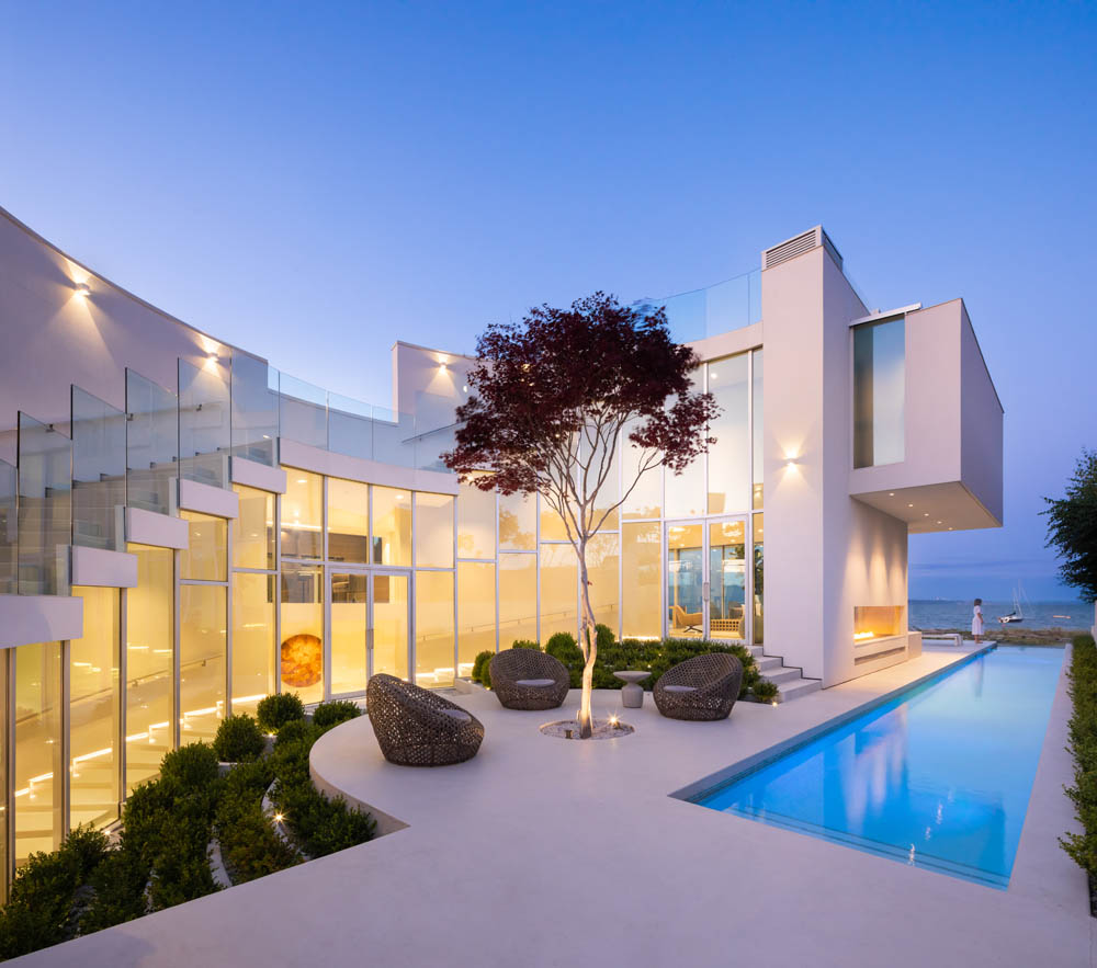
With its strict adherence to plan symmetry, the original front door location did not passively direct guests to the living areas upstairs. The new entrance arrangement moves the point of arrival to the base of the curved feature stair drawing guests up to the main living space and panoramic ocean views. The stair also frames the central core of the home, a geometrically landscaped courtyard. Early examination of the original plans revealed the home’s geometry radiates from a central node within this courtyard. This focal point was celebrated with the introduction of a new large Japanese Maple tree, visible throughout the home.
The exterior works also formed a significant scope of work and were developed to reinforce their connection to spaces within the home. The shape of the original 65ft pool was simplified and extended with an infinity reflecting pool, drawing the ocean deep into the property. The refinished beachfront patio further blurs the distinction between the garden and tidal flats from its elevated position as well as from the interior. The hot tub was relocated from its exposed position in the centre of the courtyard to a more private, less prominent location on the rear deck looking down the length of the pool towards the ocean.
A large new 3-panel slider opens the kitchen and family room to the rear entertainment deck and outdoor kitchen, sheltered from beachfront winds. Playfulness is introduced to both the deck and entry below by brave guests walking across the “void” on the clear skylight bridge.
Stunning views are to be had from the refinished upper roof deck. The complexity and beauty of the original exterior curved stair and glass guard was respected while rebuilt to meet Code requirements and address issues of significant water ingress.
Over 25 years the wet West Coast climate and sea air had taken its toll on the building and framing within. Careful deconstruction of the envelope back to its wood and steel frame identified areas damaged by extensive water ingress, requiring full restoration. Throughout the 3-year remodeling a comprehensive building envelope review was undertaken. Underperforming assembly details were identified and carefully redesigned to balance modern Code requirements against the original design aesthetic.
New thermally-efficient, thin frame aluminum windows and sliders retain the character of the home while improving energy performance throughout. All new air handling and ventilation systems were carefully mapped to be concealed throughout the complex structure of the home.
Interiors were intentionally restrained to let the modern architecture speak for itself. Not wanting the principal living space to compete with the stunning views of the beach, Marrimor opted to take a relaxed approach to furnishings in this area. Curated pieces casually sit within the expansive gallery plan creating a series of connected, yet intimately scaled, spaces. The 10-foot, two-way fireplace from Dan White’s original 1990 design was retained but simplified in keeping with the new softened aesthetic. Located one level above the Living Room, the private oceanfront Master Suite presented a more compressed ceiling height throughout. These proportions were balanced with the considered selection of low form furniture pieces. Extensive custom millwork was designed and integrated throughout the home, providing everyday functionality while maintaining the homes minimal clean aesthetic.
The muted exterior palette of concrete, stucco, and glass continue throughout the home, softened with the addition of warm wood tones, lush mohair, and velvet upholstery. The original dull pink tone of the concrete floor and decks was corrected with a hand-applied polished epoxy concrete topping. The end result is a seamless surface from inside to out, reflecting light deep into the home.
Interior and exterior lighting throughout were completely redesigned, with careful attention paid to night reflections and views.
From the outset of the project, the collective goal of the design team was to let Dan White’s original design shine while creating a functional home for our clients that is understated, yet aesthetically driven. The three-year+ journey took creativity in both architectural and interior design, technical detailing, and respect for Dan White’s original vision, in order to transform this stunning home for its new Owners. We are proud to have built upon the home’s fluidity of interior and exterior delineation and strengthened its relationship to its site.

Shelter Residential Design + Naikoon Contracting
Architecture: Shelter Residential Design
Builder: Naikoon Contracting
Interior Design: Erin Stevenson
Photography: Sama Jim Canzian
When Mark Simone at Shelter Residential Design first met the clients, they wanted him to do a feasibility analysis on the property to determine whether they could re-develop the lot in a way that they would want to. The original house was severely degrading, had been through many haphazard renovations, was structurally unsound, and slowly slipping into the adjacent ravine. Current environmental regulations in the District of North Vancouver would force a new house to be pushed at least 10m back from the ravine, and on this oddly shaped lot, the owners weren’t sure if that would leave enough area for a new house that would be large enough to suit their family.
It was determined that there was no way to salvage the original house, so that option was ruled out. There are many positive aspects of the site; the relationship to the densely treed ravine, the quiet neighbourhood, and most of all, despite the forested setting, it was not considered to be in a wildfire hazard zone, which meant no restrictions on the use of cladding materials. Mark drafted some preliminary designs to show the clients different ways the square footage within the buildable area could be utilized, and the project began.
The moderately sloping site, wedge shaped lot, and top of slope setback were the primary design challenges. The original home had a walkout basement to the ravine; for the new home, the clients wanted to access the back yard from the main level. To achieve this, the main level would have to very closely follow the natural slope of the site, both to allow for the indoor – outdoor connection, and to comply with the restrictive building height limit. Naturally, this creates an engaging dynamic experience with a series of expanding spaces as you approach and move through the home.
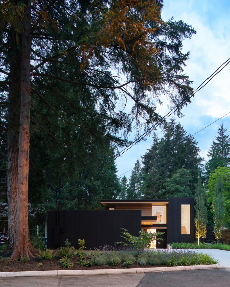
A side entry detached garage is the dominant element in the front yard. The double garage door is clad in clear cedar and when closed disappears completely. The horizontal shiplap cedar wraps up onto the soffit and subtly draws you towards the entry. Descending three steps, you move through a compression of space as you enter the home, which then opens to a double height space filled with natural light from skylights above. As you move towards the main living area and the back yard, you again pass through a compression of space, which opens up with two more steps down and a series of ceilings that step up. The dining room, kitchen, and living room are all oriented towards and connected to the south-west facing back yard.
For the exterior cladding palette, the client wanted something that would feel harmonious with the natural setting – something subtle, yet bold. They chose a combination of black and clear stained shiplap cedar, punctuated with large glazed openings and black brick accents.

The Best Virtual Experience Ever? Here's How It Works.
We’re here to let you know we’ll be conducting our 2021 Modern Home Tour Series with a combination of in-person 360 virtual walkthroughs – see example at top – combined with realtime LIVE interactions with you (the tourgoer), the architects and designers that created these beautiful spaces, and the homeowners that live in them (if available).
What does this mean for you? Well, a few things, actually…
- The ability to “visit” those extra-special homes that the owners might not want open to hundreds of people…
- Shorter hours and less stress on Tour day…
- The chance to revisit your favorite projects long after Tour day to refresh your memory, look at a favorite detail again, or check out that inspiration piece when you upgrade your own space.
- Talk to the architects live on Tour day, and get answers to your specific questions as we all look at the property together.
- And more!
We like the idea so much that once things are back to normal, we expect to continue using the lessons we’ve learned to make our live Tours even better with bonus content and additional virtual homes… but let’s not get ahead of ourselves…
Ready to Tour? You know what to do