The Portland Modern Home Tour
A LIVE Virtual Event on July 24th, 2021
Tour the Homes in Live 3D!
Meet the Architects & Designers as They Guide You Through Our Livestream and Answer Questions -- LIVE!
Sample 3D model from the 2020 Austin Modern Home Tour
The Homes of the Portland Modern Home Tour
Vanillawood Design Build
Architect: Organic Modern and Vanillawood
Builder: Vanillawood
Interior Design: Vanillawood
Landscape Design: Vanillawood
Photography: Josh Partee / Luke Lozano
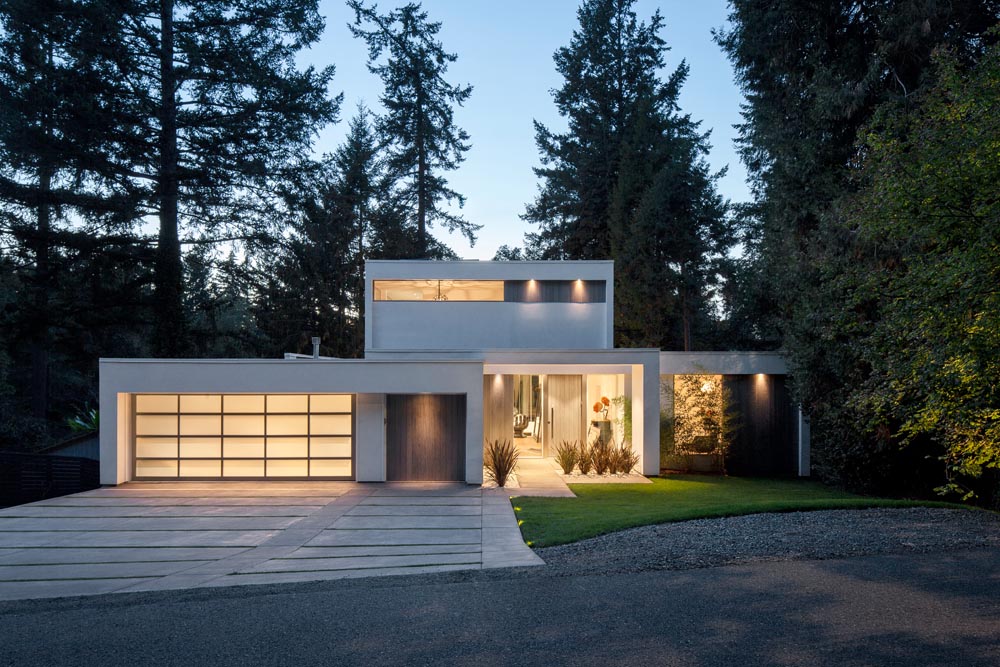
This ground-up new construction custom-built home was inspired by a Southern California aesthetic, aiming to capture maximum natural light and take advantage of the private wooded property. The front of the house only hints at what awaits once you step inside…saving the grandness for the back of the house which instantly invites you outside with the double height ceilings and walls of glass framing the rolling lawn down to the lake. Dramatic architectural arches are repeated in the front and back.
We created very intentional spaces based on the lifestyle of this family of all boys with teenagers – a soundproof movie/gaming room accessed through a secret hidden door, a second laundry room with access right off the lake for wet towels as well as a soundproof music room for the musicians in the family. The 900 sq ft indoor futsal court and home gym comes complete with slide access. Every space was thoughtfully customized so that every inch of the house really does get used.
eMZed Architecture
Architecture: eMZed Architecture
Contractor/Builder: Birdsmouth Design | Build
Interior Design: eMZed Architecture
Landscape Architect/Design: eMZed Architecture in consultation with Bothwell Landscape Studio
Photography: Peter Eckert
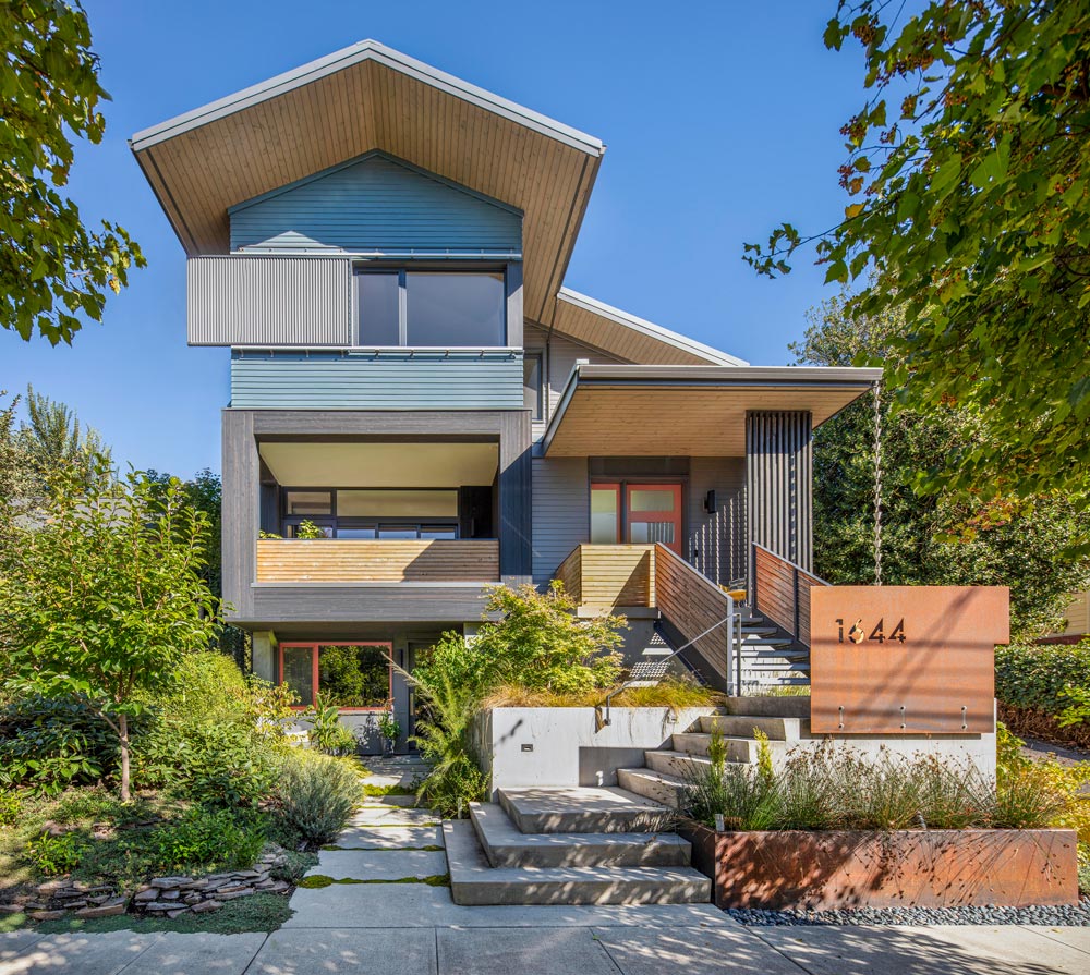
Our goal for this project was to create a net-zero energy, thoughtfully designed home for our family, along with a ground-floor studio for our architecture practice. We wanted to live and demonstrate our beliefs: Sustainable design can be beautiful and uplifting, in addition to being energy efficient, healthy, low maintenance, and comfortable. We also wanted to experiment with how to achieve all this on a tight budget, prioritizing the building envelope and high-performance mechanical systems over expensive interior materials and finishes. Interiors were kept spare and simple, with economical finishes and cabinetry used in creative ways, with emphasis on the simple beauty of changing daylight to enliven space.
A flexible/changeable ground floor plan was designed to accommodate many possible uses, including a home office, a guest suite, an ADU, or a workshop/garage, or a combination thereof (one pillar of sustainability is flexibility!). Several doorways were framed between the north and south sides of the basement to allow for variations in the use of the space.
By paying close attention to air sealing, we achieved Passive-House level air tightness, while supplying constant fresh air via an HRV. Large overhangs avoid summer overheating at south facing windows and protect the building from weather. A sliding sun-screen on the west-facing front façade is used to block heat gain and add visual interest. Operable windows on two or more sides of most rooms provide cross ventilation. These and other strategies minimize heating and cooling needs, thereby reducing the amount of energy consumed. A 9.6 kW array of solar panels on the roof provides approximately the same yearly amount of power consumed by the home and studio, earning the project net zero energy certification from Earth Advantage.
M.O.Daby Design
Architecture: M.O.Daby Design
Builder: John Mead
Interior Design: M.O.Daby Design
Landscape: EcoTone Environmental
Photography courtesy M.O.Daby Design
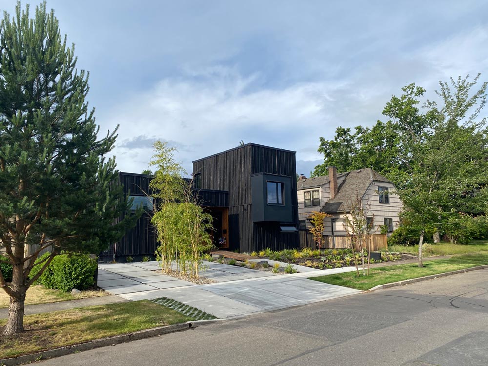
This modern home was designed with modular principles in mind, but ultimately was site built.
A very efficient 1458 square feet keeps the circulation paths simple and relies on built-ins and a strong indoor outdoor connection to allow it to feel and live larger than its total area calculation. Accessed through operable glass walls, an additional 550 square feet of decks with a built in concrete Argentine wood fire grill expand the living spaces.
The homeowner is a general contractor, who currently owns a sustainable concrete fixtures company, built the house himself including the concrete island countertop, Argentine grill, dining and outdoor fire table. The exterior is clad in “site torched” Yakisugi (Shou Sugi Ban) and cedar to express the structure as a carved volume. The composition of the house is arranged as a mediator between the scales of the neighboring houses, with the single story portion drawing lines from houses to the east and the taller section mimicking the house to the west. Further developing the dialog with the neighborhood, a bay on the front façade is an additive design element placed to align with the neighboring house’s attic level window. As much a curiosity on the interior as the exterior, this bay creates a cozy secluded nook behind a pocket door used as a get-away perch or an additional sleeping space for guests.
Focuses on natural and honest materials finish out the interior. Locally grow and sustainably harvested Oregon white oak floors, custom stained oak veneer and laminate plywood casework are paired with copper metal accents. Handmade Zellige tile accompany the homeowner made concrete integrated sinks in the bathrooms. Some drama is introduced with wallpaper that takes on natural themes. The home was built to Passive house standards with 12” thick walls and super insulated / air tight envelope. A planted roof provides additional insulation above, helps to reduce urban heat island effect, not to mention creates a pleasant green view from the second level bedroom suite. Topping the roof is a PV Solar array that provides enough energy for the homeowners use, including an electrical vehicle, for a net zero energy lifestyle. For yard irrigation, the abundant Pacific Northwest rain is collected in three 3000 gallon tanks in the yard stealthily disguised as raised vegetable garden planters.
We feel we achieved our goal of introducing a new modern home into an established neighborhood while paying respect to context and environment.
Outside Architecture
Contractor/Builder: True Blue Construction
Landscape Architect/Design: Ecotone Environmental
Photography: Caitlin Murray, Built Photo
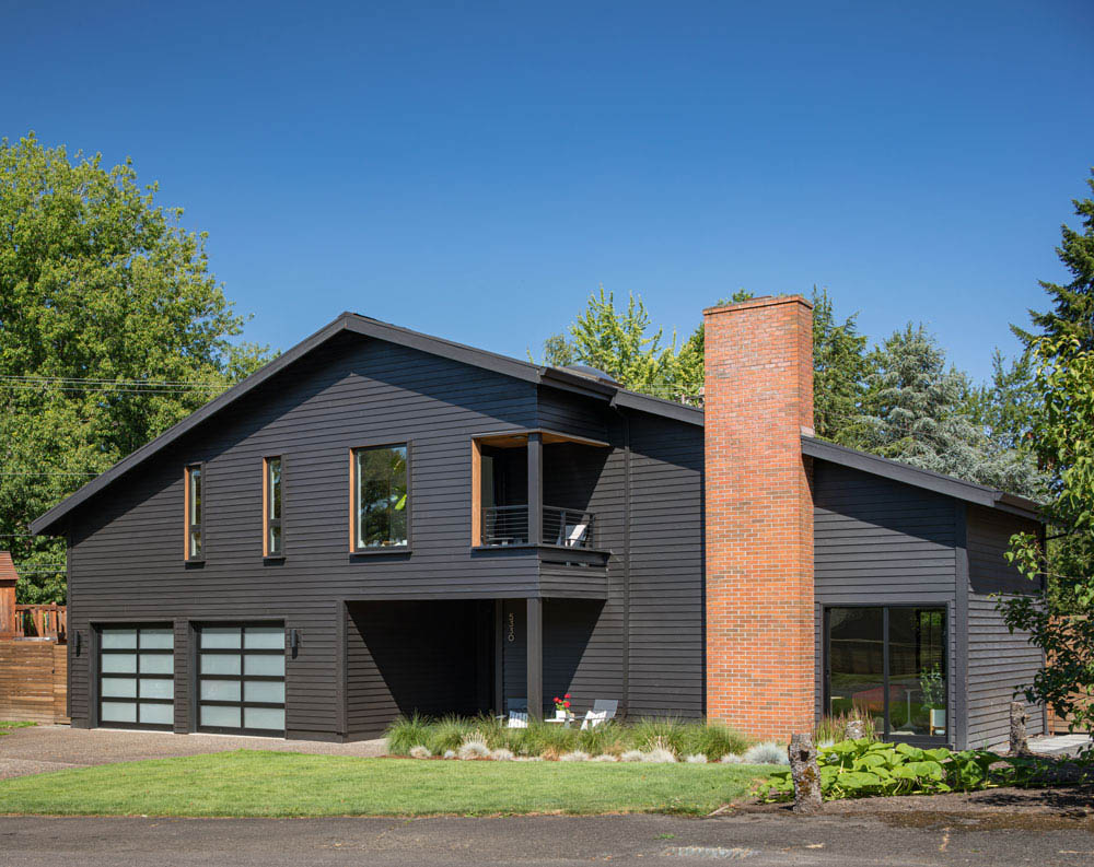
Bright, modern interiors and a strong connection to the outdoors highlight this 2-story Portland home. Designed and built by an engineer for his family in the early 1970s, the original home had a great layout and thoughtful connection of spaces both vertically and horizontally.
Our intervention modernized all the spaces and opened the house up both internally and to the landscape beyond. The front facade creates a playful, approachable interaction with the street, highlighting the covered outdoor spaces. The glassy rear facade connects the kitchen and family room to the pool terrace.
A light material palette and carefully composed openings keep this deep floor plan bright and cheerful throughout. Sight lines terminate to daylight landscapes and each room borrows light from another. Clean, modern detailing is carried throughout the 2800 sf house. The design of this home, while brave and spirited, is still understated and subordinate to the personality of the active family living here.
Oregon Homeworks
Architecture: M.O.Daby Design
Builder: Oregon Homeworks
Interiors: Cindy Melia
Photography: David Papazian
The “Electric Slide” is the latest collaboration between MODaby Design and Oregon Homeworks.
The goal of the project (and future projects using similar designs) was to add much-needed affordable housing to Portland’s landscape that doesn’t sacrifice on design, quality, livability or location. All too often affordable housing is synonymous with pedestrian floor plans, low quality finishes, and undesirable locales.
The Electric Slide turns all of these preconceived ideas about affordable housing on their respective ears by offering high design and great finishes, coupled with great spaces and generous outdoor living, all located in one of Portland’s premiere walkable neighborhoods. And at a price otherwise reserved for heavy fixers or townhome living far from the urban core.
The design every inch of the 800sf size limitation of Portland’s ADU code by marrying two 400sf stacked volumes. The volumes are shifted (the electric slide) away from each other to create a light-filled vaulted LR and a generous covered front entry/patio ideal for outdoor entertaining in a package that lives much larger than its 800sf footprint.
The ADU is then sold separately from the main house as a condo, resulting in a second detached house with its own dedicated yard, all on a single lot.
The Best Virtual Experience Ever? Here's How It Works.
We’re here to let you know we’ll be conducting our 2021 Modern Home Tour Series with a combination of in-person 360 virtual walkthroughs – see example at top – combined with realtime LIVE interactions with you, the tourgoer, the architects and designers that created these beautiful spaces, and the homeowners that live in them (if available).
What does this mean for you? Well, a few things, actually…
- The ability to “visit” those extra-special homes that the owners might not want open to hundreds of people…
- Shorter hours and less stress on Tour day…
- The chance to revisit your favorite projects long after Tour day to refresh your memory, look at a favorite detail again, or check out that inspiration piece when you upgrade your own space.
- Talk to the architects live on Tour day, and get answers to your specific questions as we all look at the property together.
- And more!
We like the idea so much that once things are back to normal, we expect to continue using the lessons we’ve learned to make our live Tours even better with bonus content and additional virtual homes… but let’s not get ahead of ourselves…
Ready to Tour? You know what to do