Tour the Homes.
Meet the Architects & Designers
GET INSPIRED!
You know “that house” you pass by every day?
The Portland Modern Home Tour is your change to GET INSIDE and meet the architects, builders and designers that made it happen – and maybe even ask a question or two about your own project playing around in the back of your mind!
How it Works
It’s as easy as:
1) Click here to get your tickets (You can preview the map and homes below!)
2) About 24 hours before Tour day begins, check your email for our printable map and any last minute instructions
3) Starting at 11AM on Tour day, visit the homes in any order you wish and at your open pace. Meet the architects and designers, and find inspiration for your own modern lifestyle!

The Portland Modern Home Tour is produced with gratitude to and the assistance of the PCC Architecture + Interior Design Club
The 2019 Portland Modern Home Tour Homes
coNstruct design LLC
coNstruct design LLC
By reconfiguring the traditional small rooms of the existing Victorian house, we greatly improved the public space and flow while adding a private master suite. Opening the back center of the house provides views that capitalize on the relationship to the backyard.
Details & Gallery
m.o.daby design
m.o.daby design
There seemed to be a quiet dialogue between the little house and the fir trees - a romantic understanding. With limited lot to expand the house and a desire to preserve the relationship with the fir trees, all options were considered.
Details & Gallery
Waechter Architecture
Waechter Architecture
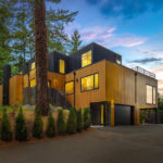
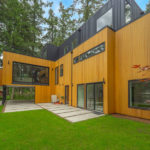
The project must find a new balance between individual and whole. In response, our concept harkened back to the process of origami, in which a single sheet of paper can be manipulated through folding to produce more complex figures in its form and play of light and shadows.
Details & Gallery
Propel Studio Architecture
Propel Studio Architecture
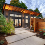
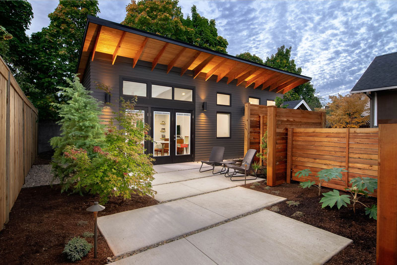
The design of The Wedge ADU takes advantage of the south facing site to create a form that maximizes the benefits of natural daylight and passive heating. The primary design goal was to create a compact, efficient, ADU that has a strong connection to the outdoors.
Details & Gallery
TempletonBUILT
Oregon Homeworks
Oregon Homeworks
Originally built in 1967 by Bob Rummer, the home owner recently completed a "to the studs" remodel, with the goal of having the mid-century modern gem shine well into its second century.
Details & Gallery
Garrison Hullinger
Interior Design
Garrison Hullinger
Interior Design
Originally built in 1971 by Robert Rummer. It has key Rummer traits of single-story, post-and-beam; floor-to-ceiling glass; atrium; vaulted ceilings and concrete floors with radiant heat. It was renovated in 2018 by Garrison Hullinger Interior Design (GHID)
Details & Gallery
Urban Housing Development
Urban Housing Development
This home features all the elements that people expect in a cozy Pacific Northwest home - but with a modern twist!
Details & Gallery
SE 26th Avenue
Architect: CONSTRUCT DESIGN
Photography: KLiK Concepts
This modestly sized home was a design challenge that lended itself nicely to a 620 s.f. addition. By reconfiguring the traditional small rooms of the existing 1007 s.f. Victorian home, we greatly improved the public space and flow while adding a private master suite. Opening up the back center of the house provides views that capitalize on the relationship to the backyard.
The new addition (phase 1) is a simply detailed modern cedar box that provides a counterpoint to the more ornate Victorian home. The new addition creates a “public” spine down the center of the house, which suits the owners modern lifestyle. The addition utilizes a troweled concrete slab-on-grade with in-floor radiant heating as both finish floor, heat source, and foundation for maximum efficiency. Special features include an exterior covered porch, wood fireplace, and a wall of glass in the living room.
Phase 2 completed the vision of the home with a full remodel of the kitchen, guest bedroom and main bathroom.
SE Ogden Street
Architect: m.o.daby design
Photography: KLiK Concepts
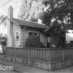
In early conversations with the owners, they expressed interest in a modern home comprised of open living spaces that jived with their modern lifestyle. It was still unclear whether we could satisfy this program through a remodel or if the existing bungalow would need to be raised to add another level or razed entirely for a new structure. The particular challenges to the program were the existing footprint of just 32′ X 24′, a small 50’x50′ parcel, & 3 large fir trees occupying a corner of the lot, towering over the house.
There seemed to be a quiet dialogue between the little house and the fir trees – a romantic understanding. With limited lot to expand the house and a desire to preserve the relationship with the fir trees, all options were considered. We concluded that if the basement level could be captured as living space and the house’s compartmentalized spaces were completely gutted that we could successfully achieve the program as a remodel.
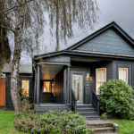
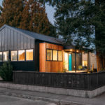
The simple gabled roof shape of these bungalows is charming We found it contextually interesting to maintain the basic shape and scale of the house and pursed this project as a case study of how to modernize a small early 20th century bungalow while respecting its neighborhood made up of similar home types. A design theory of “silhouette” was developed for this case study, exploring the idea of simplifying a form’s shape through its silhouette. We found the silhouette maintained a connection to its past shape, while simultaneously a new form emerged with a mysterious, alluring quality. Images of “shadow dancers” came to mind. As if the little bungalow slipped behind a translucent screen, it recalls its past and begins a new story. Employing this design theory allowed us to maintain the existing gable roof shape while stripping the house of unwanted features.
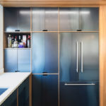
The black metal exterior cladding of the walls and roof unify the form and express its “silhouette”, while cedar cladding punctuates the entry porch. For the interior, a continuation of alluring, textural, moody materials are used. A cedar clad box clearly defines the kitchen giving it definition within the open living space. Raw steel was used for the casework doors, trimmed in walnut. A raw steel panel art piece hides behind a sliding wall only to reveal itself when concealing the passage to the bedroom suite. The use of glass at the stairs & shower provide the necessary function while achieving lightness & transparency. An existing concrete floor on the basement level was renewed by way of a dark, inky hued stain, but the story of its life is still visible and celebrated.
It was important to connect the interior spaces to the exterior, however possible, in order to expand the visual and usable space on the small footprint. Generous amounts of glazing connect the new open, main-level living space to the outside. The former plan disconnected the small, but usable, back yard. The new staircase now directly connects the main level to the backyard. Designed as a counterpoint to the open and bright main-level living space, the introverted basement-level living space has direct access to the yard by way of a cedar clad “portal”.
Careful discussion allowed us to arrange spaces to the owner’s lifestyle while only adding two 20 sqft cedar clad bays to the footprint. Through efficient planning & considered spaces, the final plan arrived at a 3 bedroom; 2-bathroom house that includes 2 living spaces in just 1484 square feet within a 32′ X 24′ footprint.
N Vancouver Avenue
Architect: Waechter Architecture
Photography: 22 Pages Photography
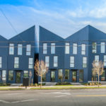
Origami is a community of homes folded into one unifying complex in the Piedmont Neighborhood of Portland, Oregon. The homes have a streamlined design aesthetic and are built with craftsmanship— a balance of artistry and functionality.
Taking up the street of one full city block, the project must find a new balance between individual and whole. In response, our concept harkened back to the process of origami, in which a single sheet of paper can be manipulated through folding to produce more complex figures in its form and play of light and shadows.
Adopting the fold as the formal driver of the project, the overall mass of the development was broken down, providing an individual articulation of each unit while maintaining the sculptural impact of the whole. A folded roof-scape connects the offset facades of each unit, linking their gables, while complicating the overall perception of scale.
SE Lafayette Street
Architect: Propel Studio
Photography: Carlos Rafael
Accessory Dwelling Units are becoming a very hot trend in the residential market place as they allow the homeowner of a single-family lot to add tremendous value and flexibility to their housing situation without the need to acquire any additional land. Perfect for urban infill opportunities. To take advantage of these opportunities, Propel Studio collaborated with a family in SE Portland to design a single-story modern ADU. The goal was to create a dwelling unit that could be rented out on Airbnb to generate supplemental income and help pay off their loans on the full property. They also have a wonderful place for friends and family to stay when they are visiting, and a future home for aging parents when needed.
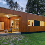
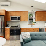
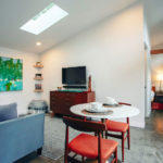
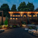
The design of The Wedge ADU takes advantage of the south facing site to create a form that maximizes the benefits of natural daylight and passive heating. The primary design goal was to create a compact, efficient, ADU that has a strong connection to the outdoors. We accomplished this by incorporating a large south-facing overhang that protects three large doors that completely open the “great room” to an outdoor private patio. The overhang is designed to create protected outdoor space, while also being optimally angled to provide shading from the sun in summer, while allowing the lower winter sun to penetrate deep into the spaces, all the way through to the back of the building.
Once the form of the building was set, we looked to local materials to create a northwest modern aesthetic. The soffit on the overhang is natural cedar and exposed locally sourced structural elements, the exterior siding is durable and economic fiber cement lap siding with 4-inch exposure. Inside, we used touches of natural wood throughout the cabinetry and finish trim to give a sense of warmth and texture.
With sustainability being one of the values the clients wanted for the project we explored a range of strategies to reduce energy and water use. The exposed concrete floor provides thermal mass to regulate temperature fluctuations and maintain a comfortable interior temperature. The design utilizes advanced framing to optimize the use of lumber, reduce the amount of wood and thermal bridging in the exterior walls, and allow for more efficient insulation. We specified low-flow plumbing fixtures and high-efficiency LED lighting throughout the ADU and looked for locally sourced wood and other products whenever possible to reduce transit costs and related emissions.
South Shore Boulevard
TempletonBUILT
Photography courtesy TempletonBUILT
Previously best described by the owner and builder as “a shack on the lake,” this stunning home has been thoroughly rebuilt into a three-story domicile that takes full advantage of the location and sighting. Wood from the east coast, double insulated walls, and heated floors make this much more than just a “lake house.”
NW Perimeter Drive
Builder: Oregon Homeworks
Original Builder: Robert Rummer
Original Design Consultant: A. Quincy Jones
Originally built in 1967 by Bob Rummer, the home owner recently completed a “to the studs” remodel, with the goal of having the mid-century modern gem shine well into its second century.
One of 29 “Rummers” in the Oak Hills neighborhood, and a purported 500+ throughout Portland, the home is architect A. Quincy Jones’ iconic “Double Gable” design, first made popular in the 1960s by Joseph Eichler in the San Francisco Bay area.
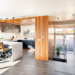
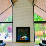
The remodel left the original floor plan mostly intact, including the classic interior atrium, vaulted living room, post & beam construction, floor-to-ceiling windows, and exposed T&G ceilings. A wall separating the kitchen and family room from the dining room was removed to open the flow throughout the living spaces, and two rear-facing windows were added in the dining room to maximize light and backyard views. The “hobby” room off of the garage, which was a popular feature of many Eichler/Rummer homes, has been converted into a mudroom, second master closet, and home office. And the original layout of the hall bath and laundry closet has been altered to maximize functionality.
In addition to these floor plan edits, the remodel included new windows, insulation, plumbing, wiring, HVAC, drywall, cabinets and hard surfaces throughout. And the original slab-on-grade concrete floor has been fully exposed and polished.
SW Heather Court
Interior Designer: Garrison Hullinger Interior Design
Original Builder: Robert Rummer
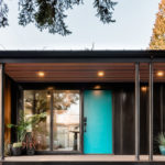
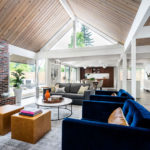
This house was built in 1971 in Beaverton, Oregon, by Robert Rummer. It has key Rummer traits of single-story, post-and-beam; floor-to-ceiling glass; atrium; vaulted ceilings and concrete floors with radiant heat. It was renovated in 2018 by Garrison Hullinger of Garrison Hullinger Interior Design (GHID). The goal of the remodel was to maintain the integrity of an iconic Rummer while updating it for today’s living. Key areas of focus for the remodel were to make the atrium an inviting center piece for the house, modernize the kitchen, make the bathrooms, laundry room, and master bedroom as functional as possible, and add lighting and storage throughout the home.
After the remodel the home has been featured in both Oregon Home and Old House Journal magazines.
SW Carolina Street
Builder/Developer: Urban Housing Development
Architect: Massie Home Designs
Photography: PDXVTOURS
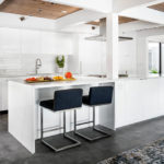
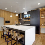
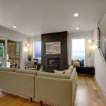
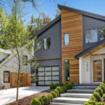
Modern Pacific Northwest Design at its finest, in one of the hottest areas of Southwest Portland. This recently completed, new construction home was built by Urban Housing Development where the neighborhoods of Multnomah Village and Hillsdale intersect. The homes in this area are tucked neatly into the hills, often with little room to spare for new construction in this desirable part of Portland. Urban Housing Development purchased a neglected home on SW Carolina St. that had an extended side yard covered in overgrown bushes and blackberry brambles. While a modern style renovation was taking place on the existing house, UHD cleared the unused area of all the thorny mayhem and laid the foundation for a beautiful new family home. This home features all the elements that people expect in a cozy Pacific Northwest home but with a modern twist. Large windows that highlight the surrounding trees, an open kitchen and living space with inset fireplace, and a private master suite with vaulted ceilings, walk in closet, spacious bathroom, water closet…the works. It’s amazing how modern design can transcend time periods, simultaneously blending in with the character of the surrounding neighborhood while standing out with its extraordinary character and elegance.
2019 Portland Modern Home Tour Map
FAQ
Most frequent questions and answers
It’s easy! Just buy your tickets, then about 48 house before the Tour you’ll receive an email with links to your Tour map. Then, on Tour day, start at any house and proceed in any order at your own pace to the homes that interest you the most – or to all of them!
Unfortunately due to repeated issues, we must request that no children under 12 attend the Tour. This is a new restriction for 2019, and we sincerely apologize for any inconvenience. However, we do realize that some of our best guests are aspiring architects and designers and we therefore invite kids 12 and up to learn about the exciting world of architecture and design!
Giving back to the communities and homeowners that so generously welcome us every year is one of the most important things we do. That’s why we partner with a housing or education organization in every Tour city, and why we are working to establish a scholarship fund for aspiring architects and designers.
